Results visualization
N.B. For smaller screen sizes, 13 inches or smaller, we recommend that you collapse the left side panel to allow enough room for proper rendering of the viewer.
Select the analysis to view
Navigate to My analyses in the left sidebar, locate your completed analysis, and click the Results icon under Actions to open the results. Depending on the data type of the dependent variables, the results will be displayed in the relevant viewer. The Results section for all analyses will include Model specification and Model run summary. Results from analyses of tabulated data will have Tabulated outputs, and results from analyses of vertex-wise or voxel-wise data will have Image outputs and ROI results will have both. Use the links below to navigate to the relevant results visualization.
Surface viewer
Load the results
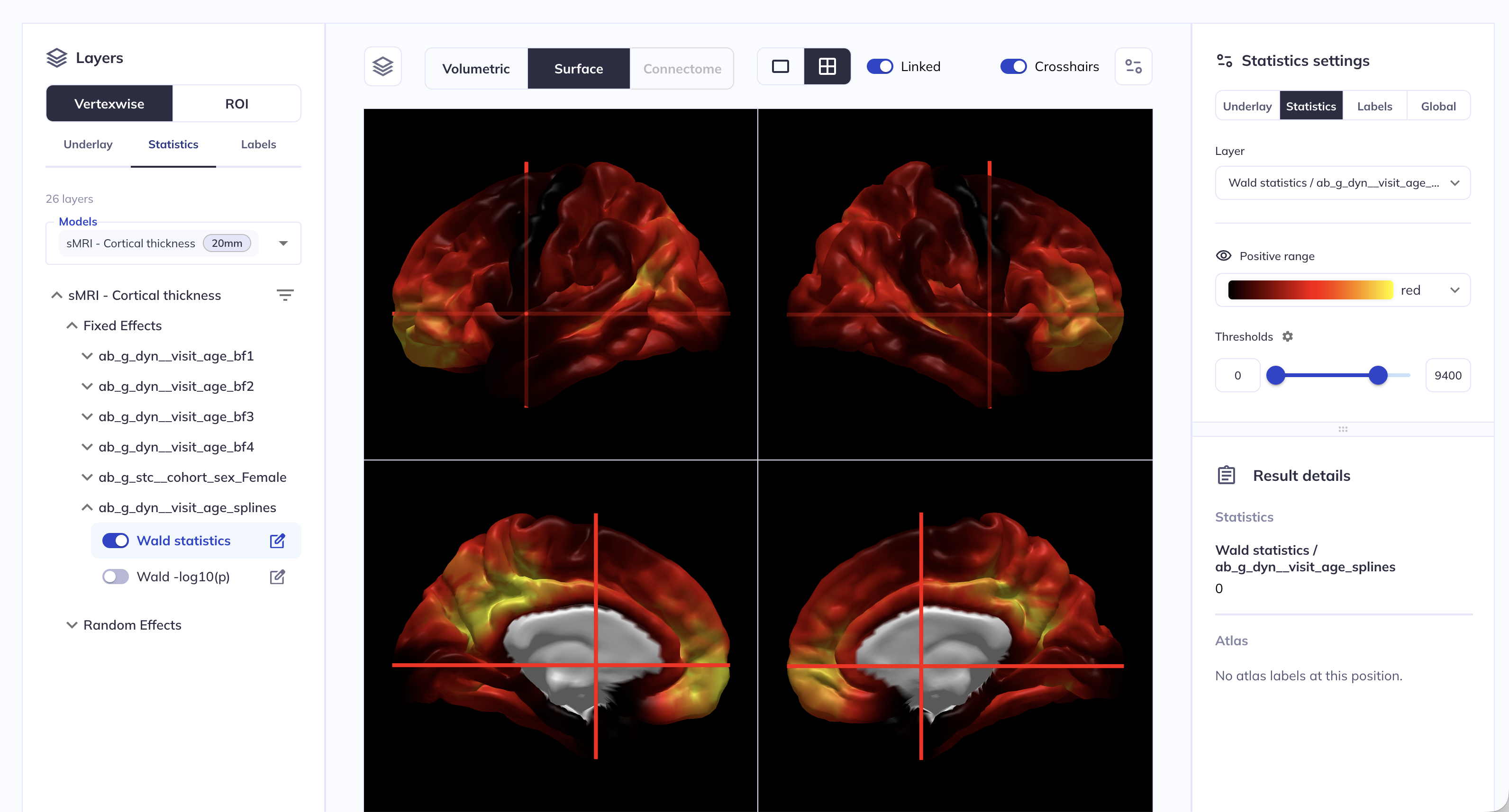
For vertex-wise data, clicking on the Results icon will open the surface viewer.
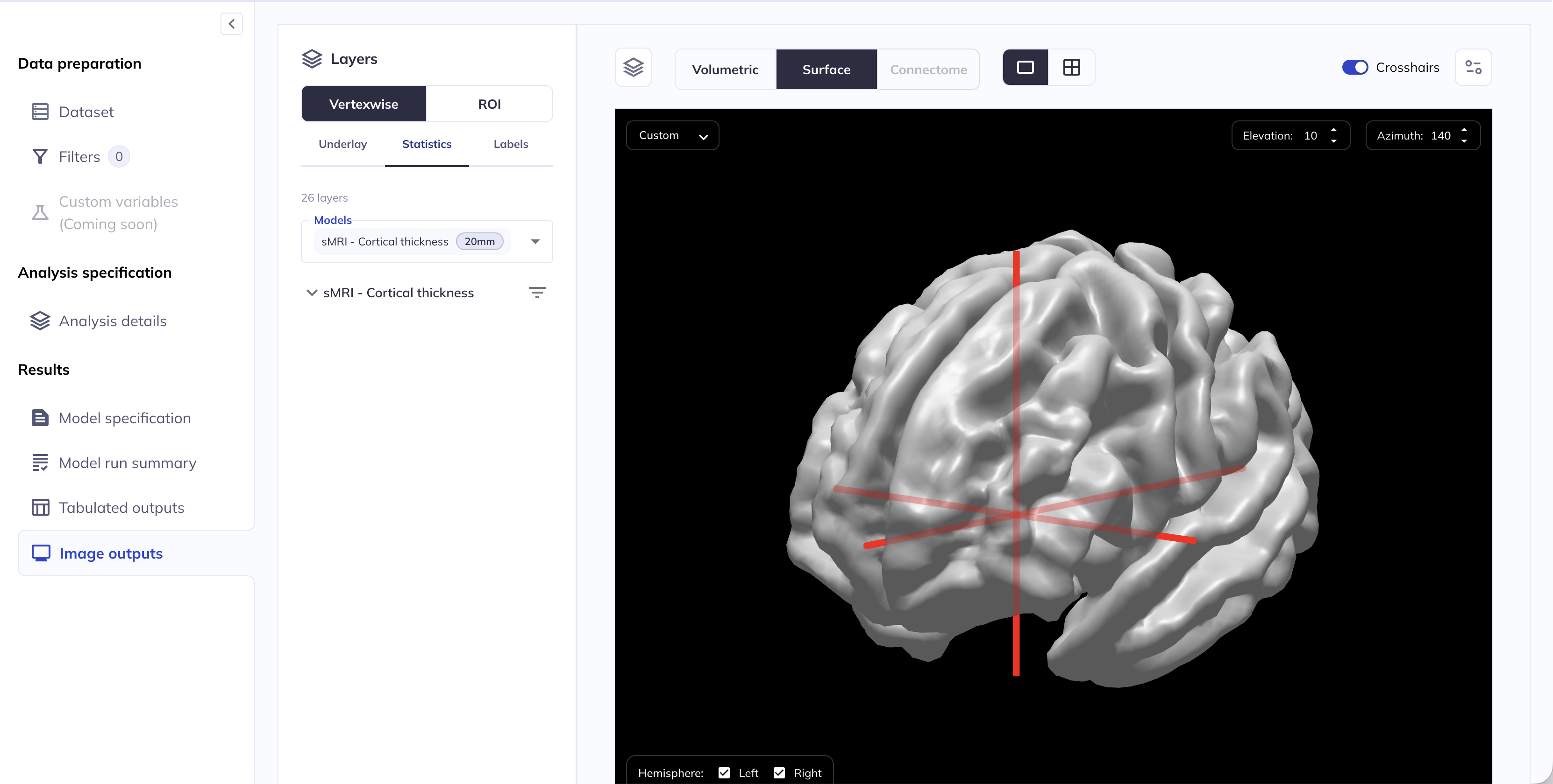
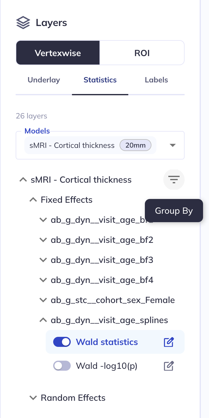
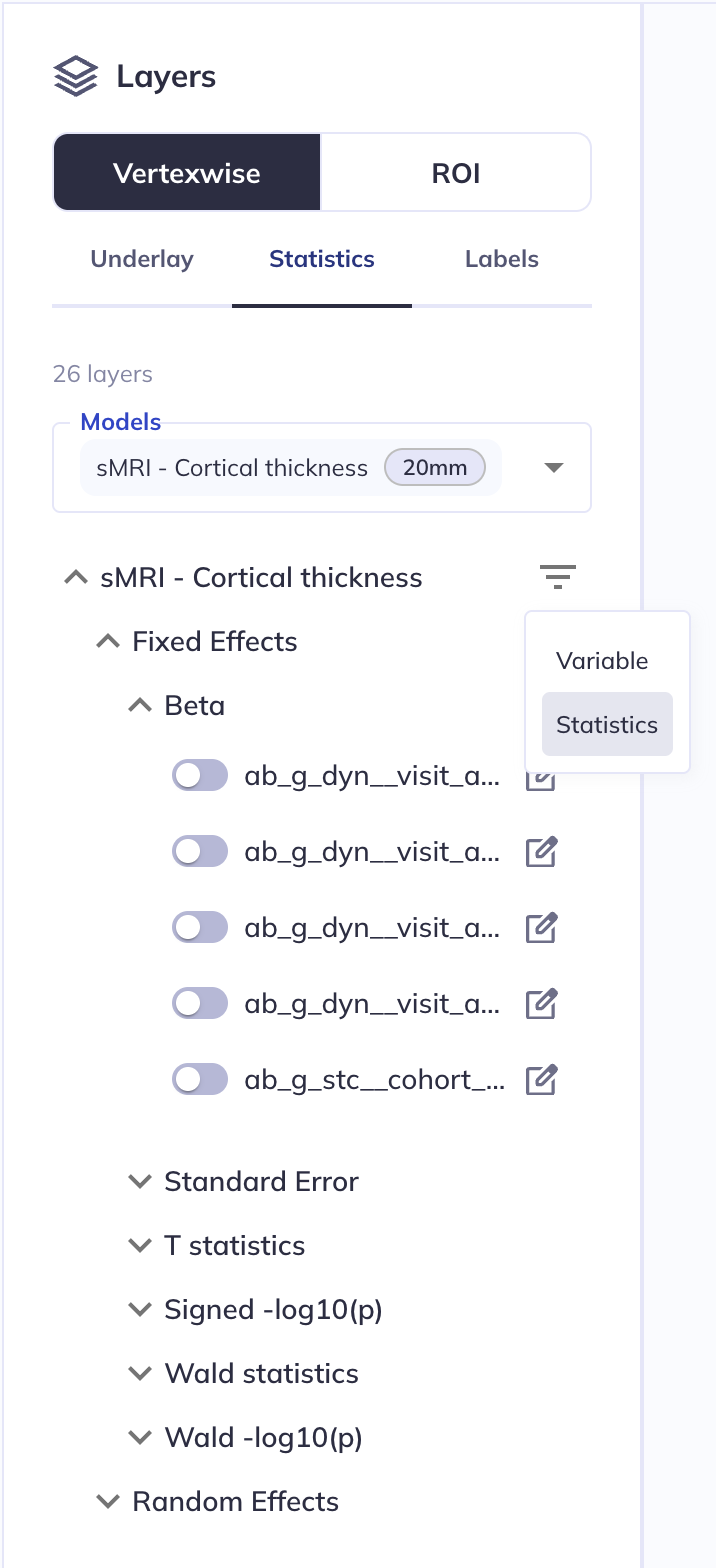
Select layers to display
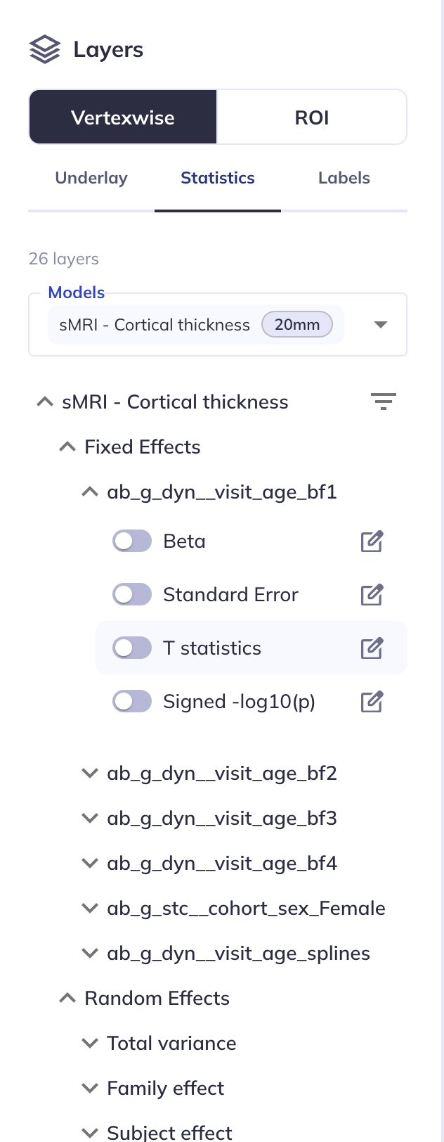
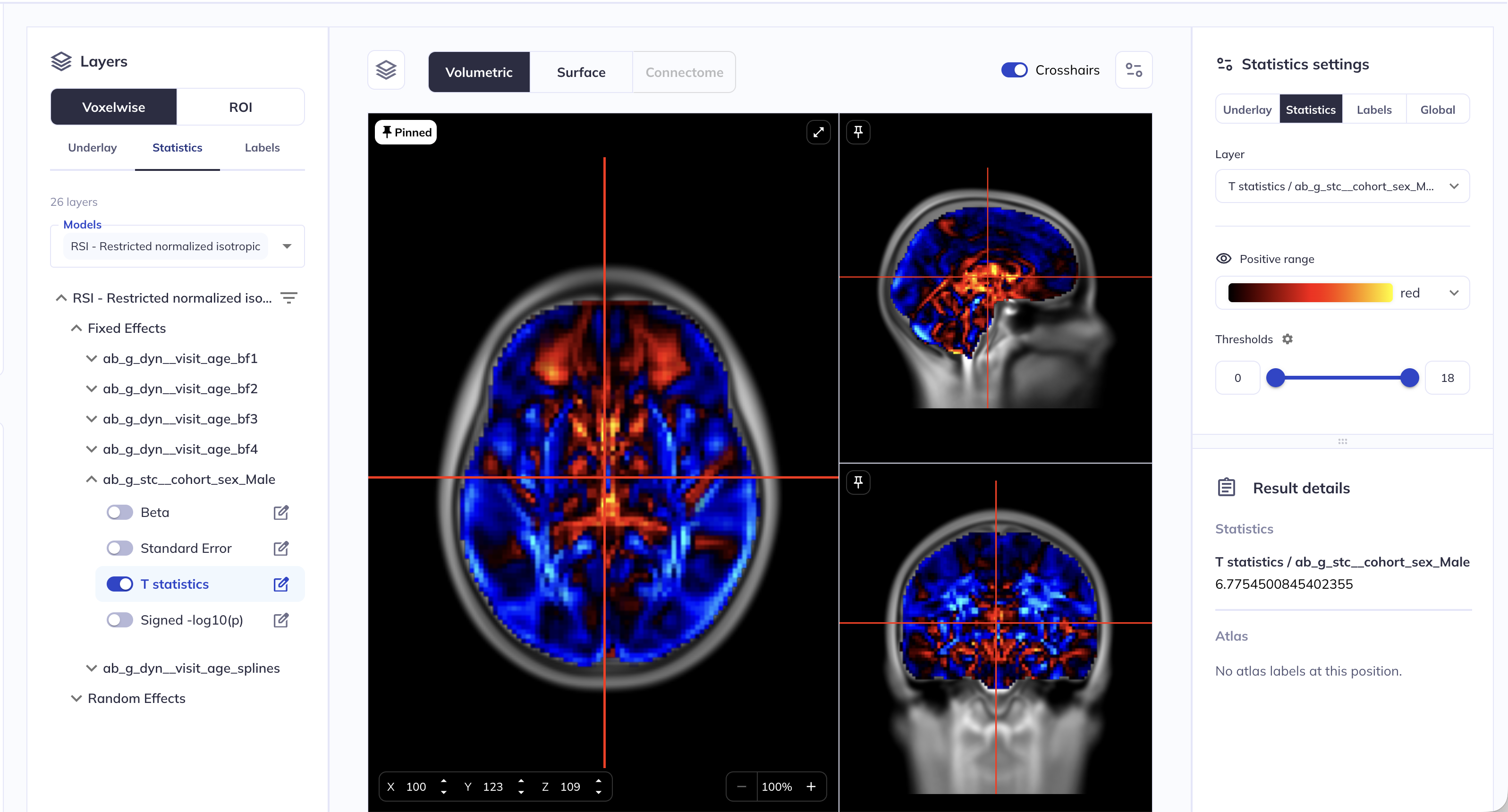
Select which statistics layers for which fixed and random effect covariates to display using the drop-down menu under the Statistics tab.
Hint: Collapse the side panel with the Data preparation, Analysis specification and Results sections for more space.
Customize the surface viewer
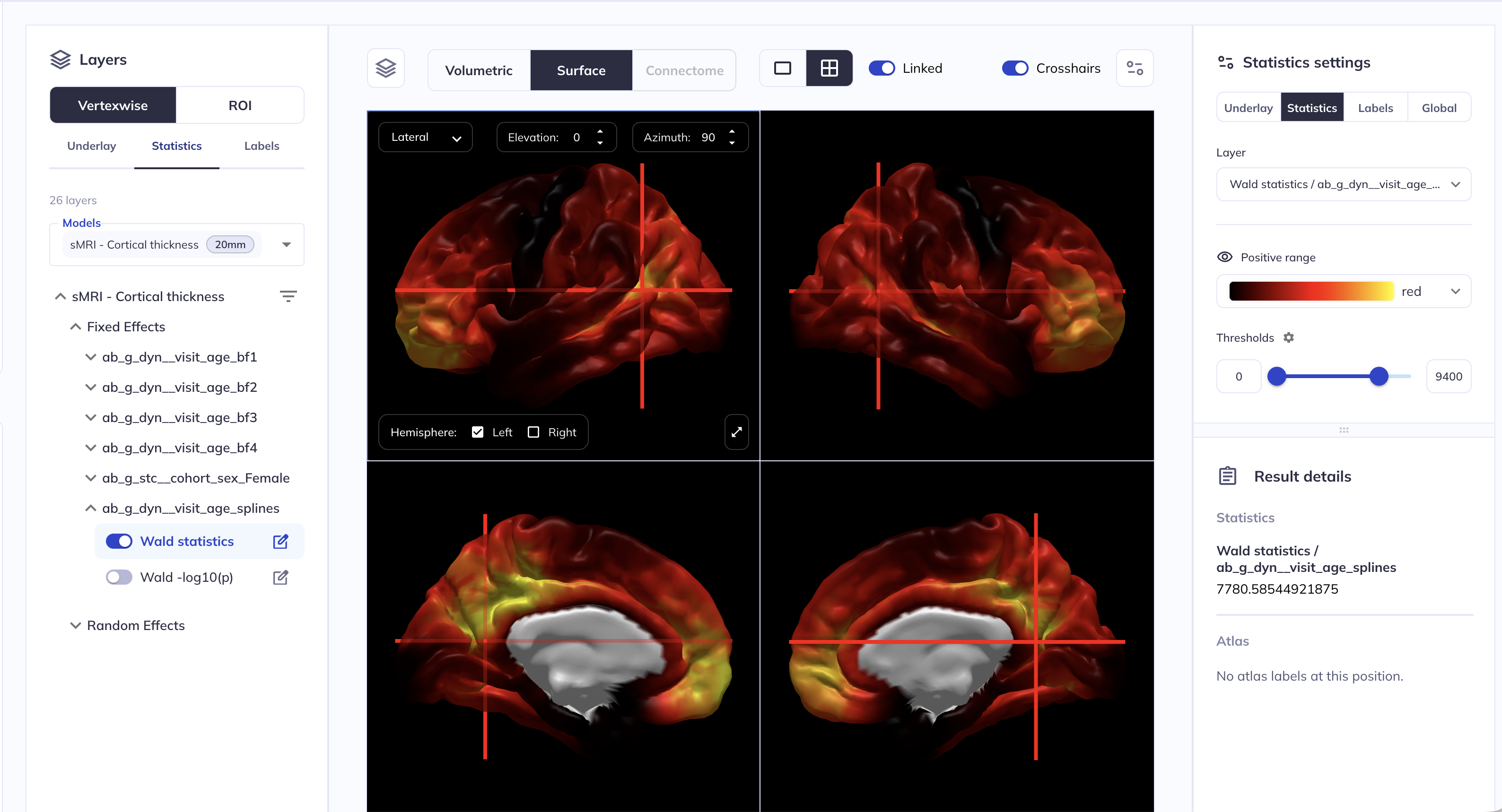
Toggling on a statistics layer, for example the Wald statistics layer for the ab_g_dyn__visit_age_splines fixed effect, will open the Statistics settings panel on the right. The default shows both hemispheres in a single view. You can customize your view by:
- showing one hemisphere,
- selecting preset view orientations (
Anterior,Posterior,Superior,Inferior,Left,Right) or custom orientations. - adjusting view settings from the sidebar,
You can also display a mosaic view of the data by clicking on the ⊞ icon. When the Linked option is selected, the same rotation is applied to all panels; turning linking off allows you to rotate panels independently.
Layers may be grouped by Variable, i.e. showing the Betas, Standard errors, Test statistics, Signed -log10(p), Wald statistics and Wald -log10(p) layers together for each variable, as above, or by Statistic, i.e. showing all T statistics or all Signed -log10(p) together.
Double-click a location on the cortical surface to show numeric values for the active layer in the Results details panel.
Add parcellation overlays
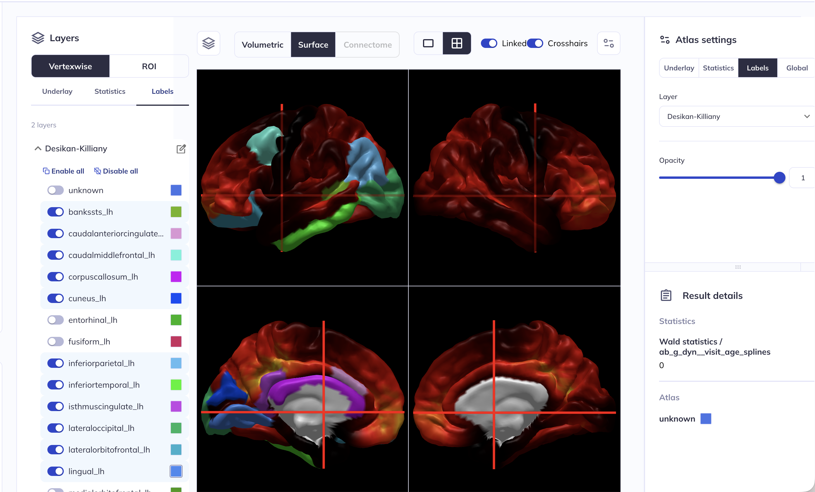
To overlay ROIs, navigate to the Labels tab on the left. For cortical surfaces, there are two parcellations you can choose from, Desikan-Killiany or Destrieux.
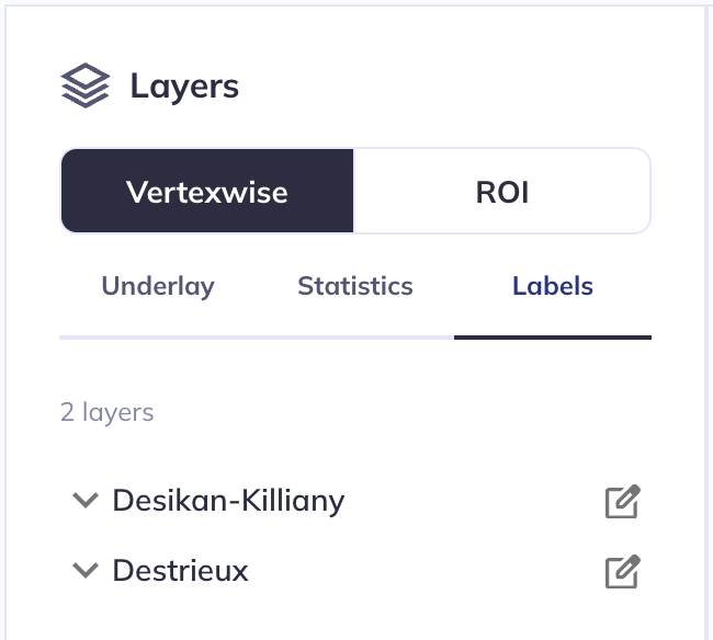
From here you can toggle on and off the ROIs you wish to display. You can change the ROI color by clicking on the color swatch next to the ROI name. From the Labels panel on the right, you can change the overlay opacity.
Hint: Instead of using the slider, you can enter a custom number in the box right next to the slider bar
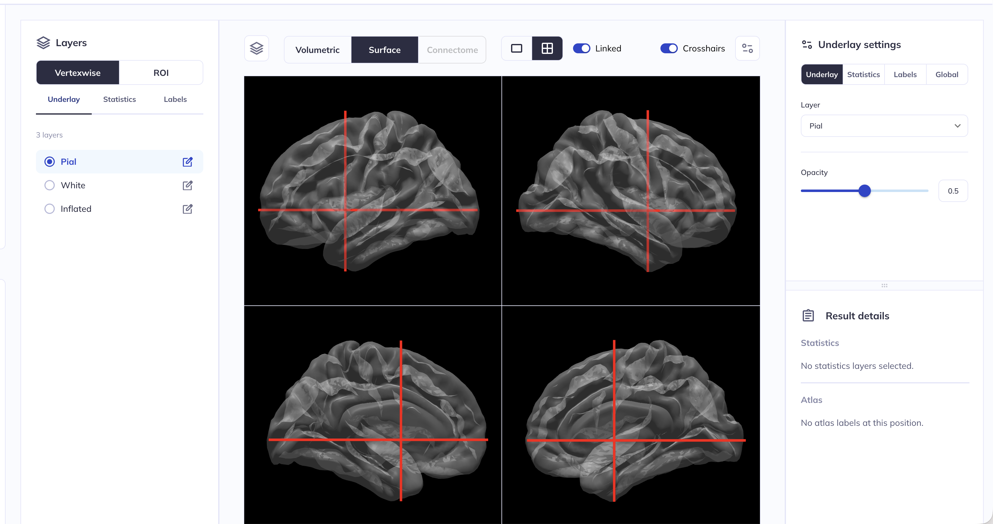
Changing and customizing the underlay
The underlying surface can be changed by clicking on the Underlay button in the left side panel. Valid options are Pial (default), White or Inflated - toggling between them changes the underlying surface file.
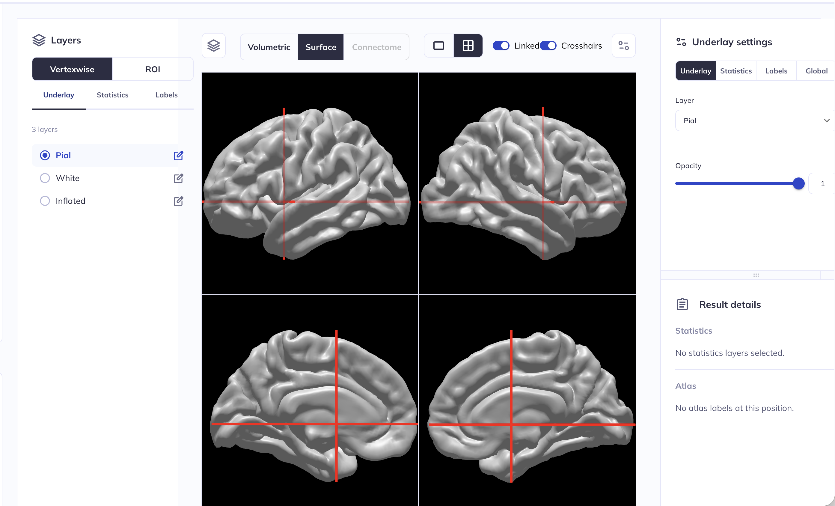
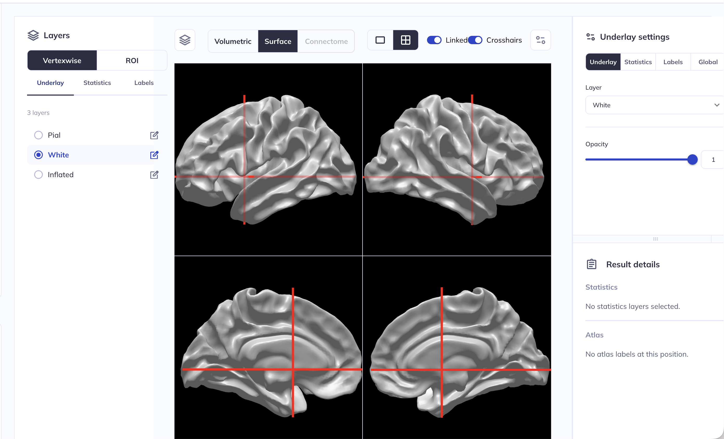
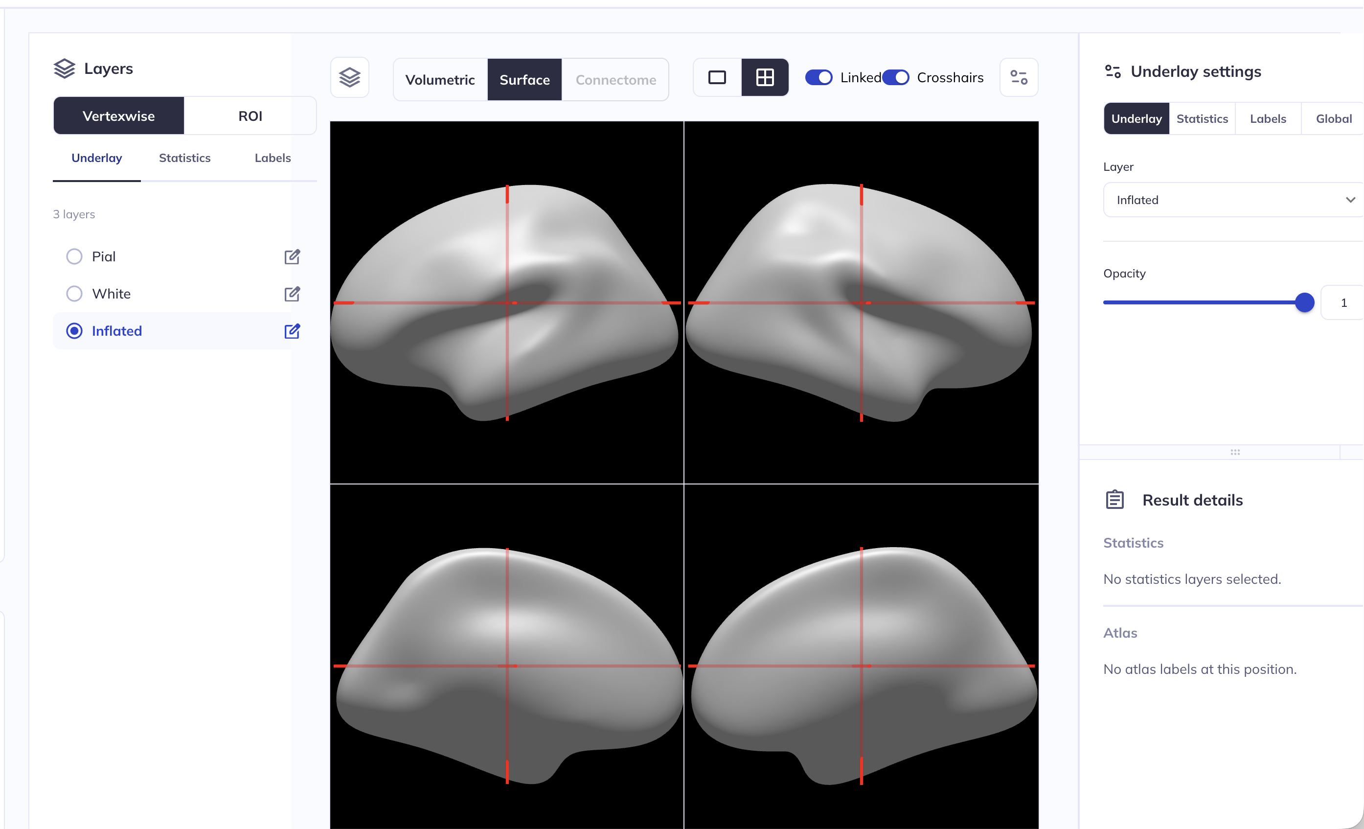
The opacity of the underlay can be customized in the right side panel. In the example below, we have set the opacity of the pial surface underlay to 0.5 or 50%.
Hint: clicking on the ![]() icon will collapse/expand the right side panel.
icon will collapse/expand the right side panel.
Hint: Instead of using the slider, you can enter a custom number in the box right next to the slider bar
Volumetric viewer
Select layers to display
Selecting the analysis and choosing statistical layers works analogously to the surface viewer above, see the Select layers to display section for details.
Customize the volumetric viewer
Many of the features are the same between the surface and volumetric viewers. Two major differences are:
- Layout:
- You can choose between the default orthographic view (displays a single slice of the coronal, sagittal, and axial planes) or click the ⤢ icon to display a single-plane view.
- Atlases:
- for more details on the ABCD3 atlases see the documentation for the ABCD Concatenated data
- Three atlases are available:
ABCD3_cor10_fiber: White matter fibers using the AtlasTrack labels.ABCD3_cor10_aseg: Subcortical regions using the FreeSurferaseglabels.ABCD3_cor10_aparcaseg: Subcortical and cortical regions using the FreeSurferaparc+aseglabels.
- Atlases are probabilistic maps: to set the threshold, use the threshold control in the right panel. For example, a threshold of 0.75 means that in 75% of scans in the reference construction, that voxel was assigned to that ROI.
- A single click on a voxel will display the numeric value for the active layer in the Results details panel.
Changing and customizing the underlay
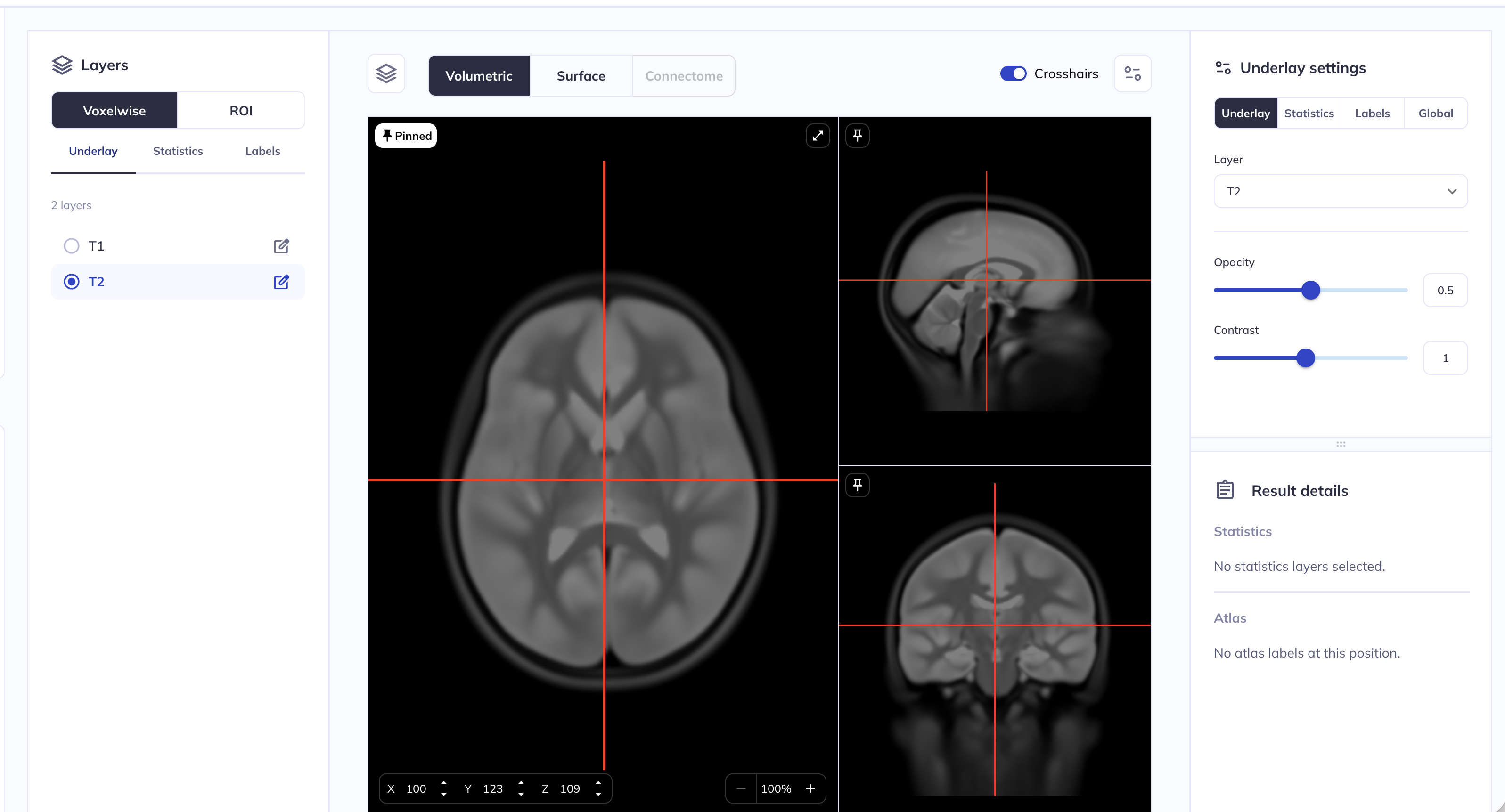
The underlying volume can be changed by clicking on the Underlay button in the left side panel. Valid options are T1 (default) and T2 - toggling between them changes the underlying volume.
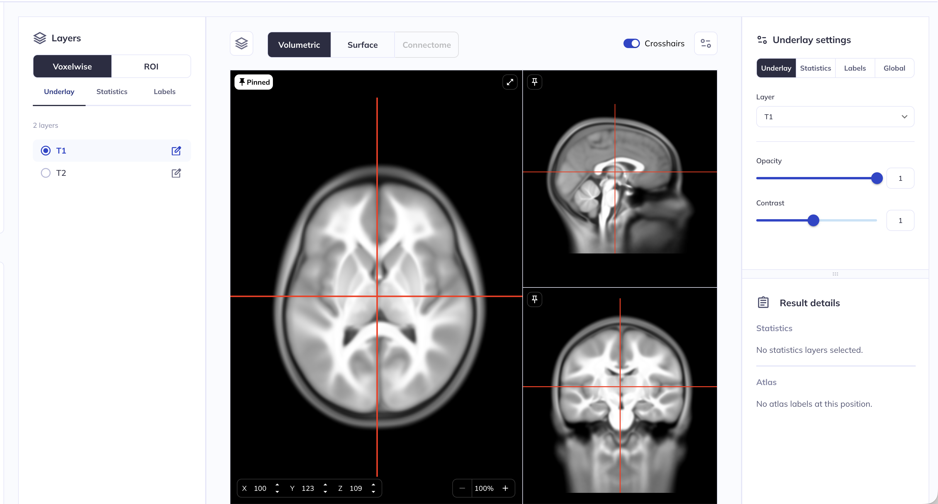
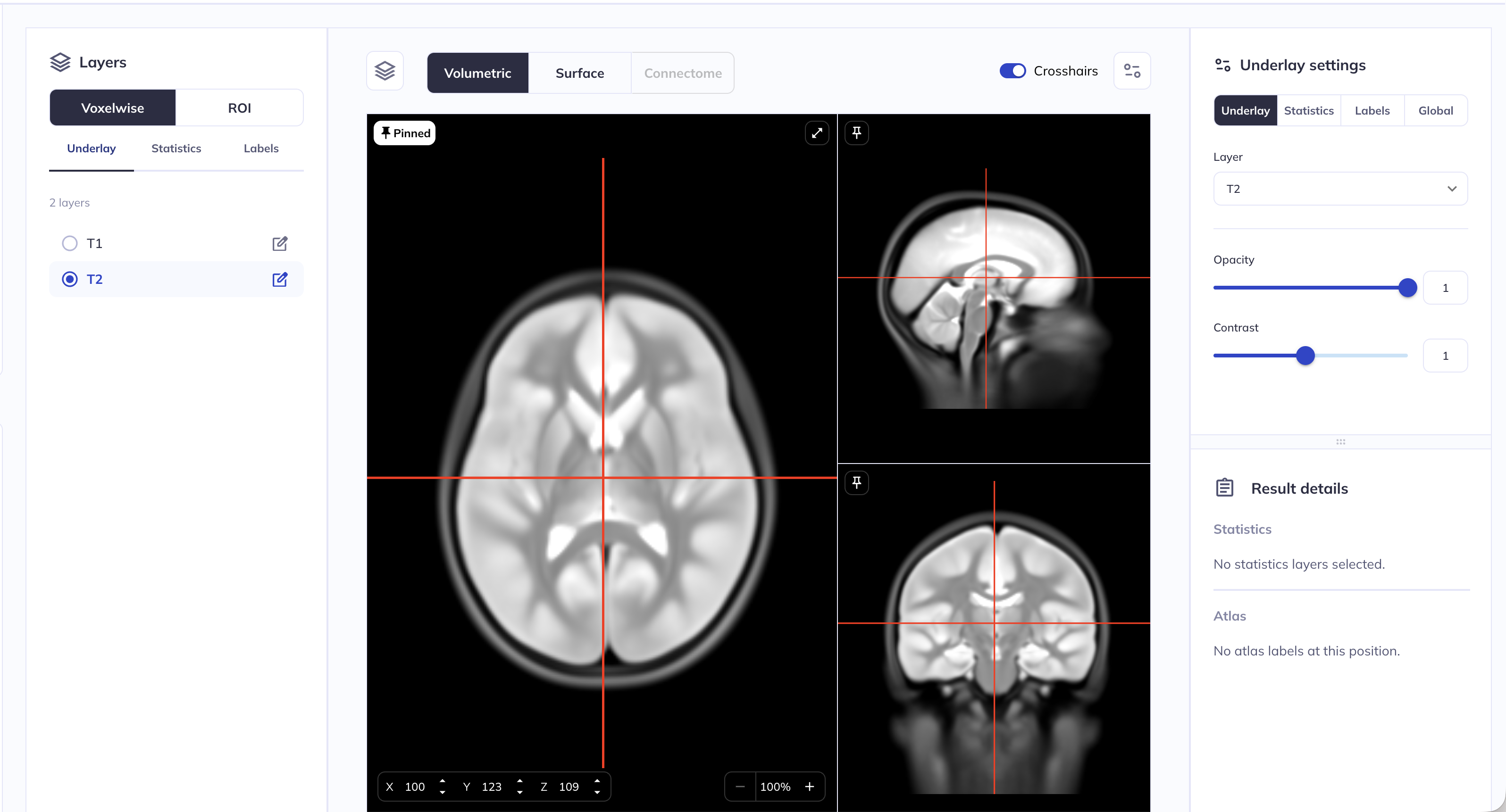
The opacity and contrast of the underlay can be customized in the right side panel. In the example below, we have set the opacity of the T2 underlay to 0.75 or 75%.
Hint: clicking on the ![]() icon will collapse/expand the right side panel.
icon will collapse/expand the right side panel.
Hint: Instead of using the slider, you can enter a custom number in the box right next to the slider bar
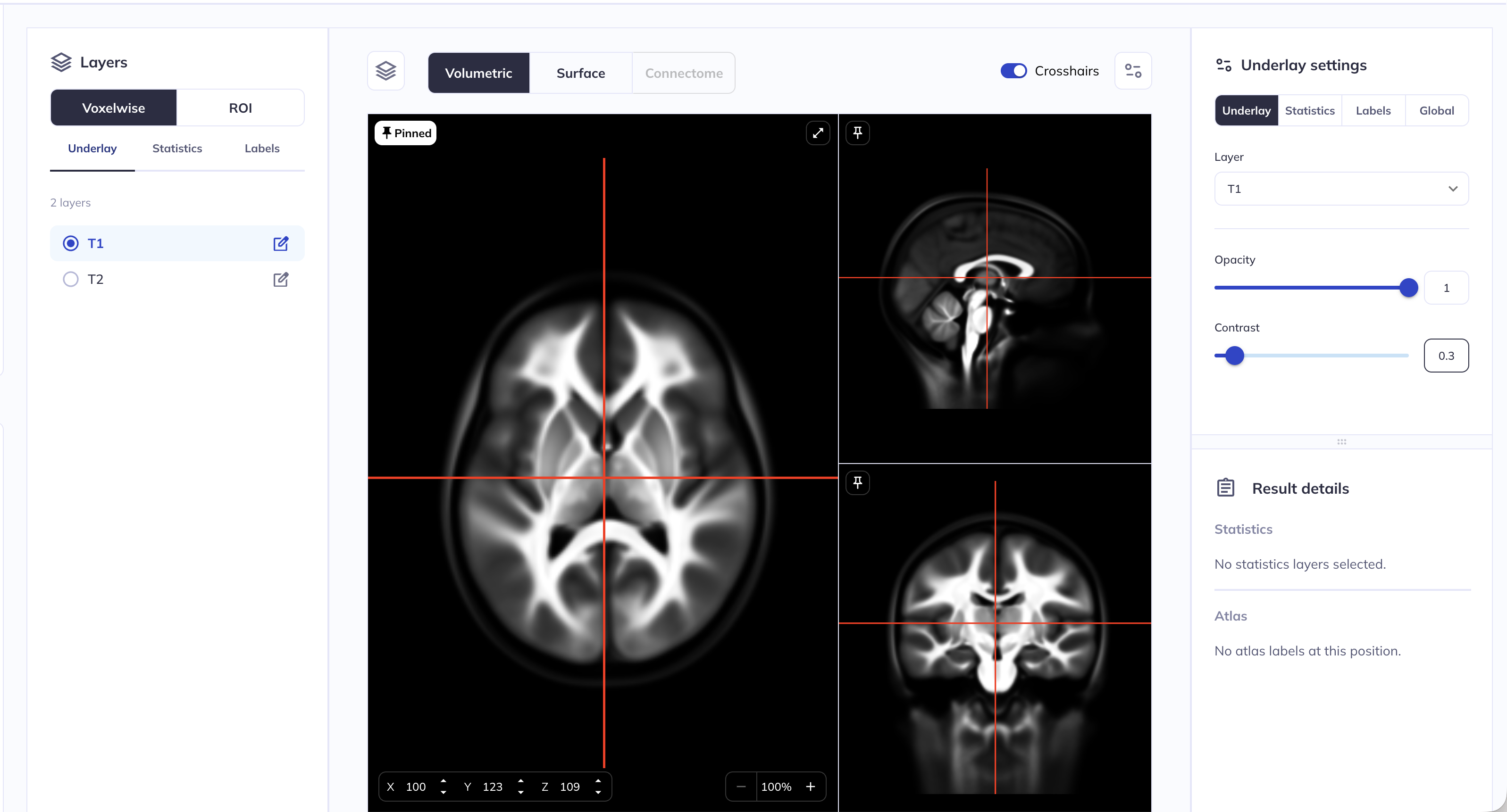
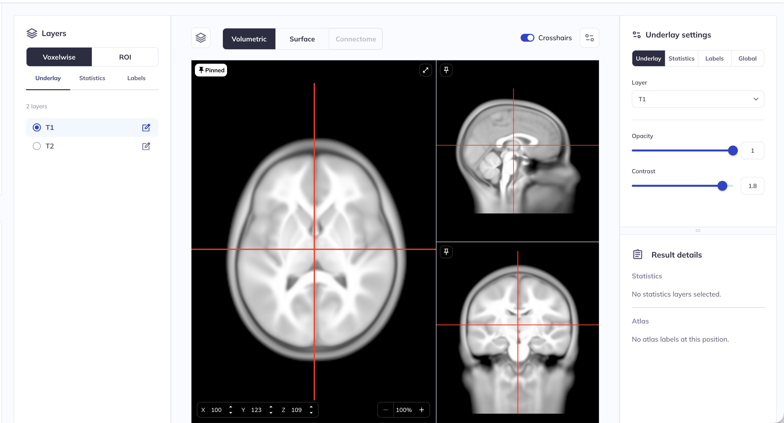
The contrast of an image is the difference in brightness between the light and dark areas of an image. This can be tweaked for the underlay using the Contrast slider in the right side panel in the Underlay settings. In the examples below, we have changed the contrast of a T1 underlay from the default value of 1 to 0.3 (left) and to 1.8 (right)
Customizing the statistics settings
N.B. the snapshots below use surface viewer as an example; the same settings and customization options are available in volume viewer as well.
Color range and color maps
Once you have loaded a statistics layer and enabled it (see above for instructions), you can customize the range of statistic values that are rendered as well as the corresponding color map.
The Statistics settings side panel has the following options
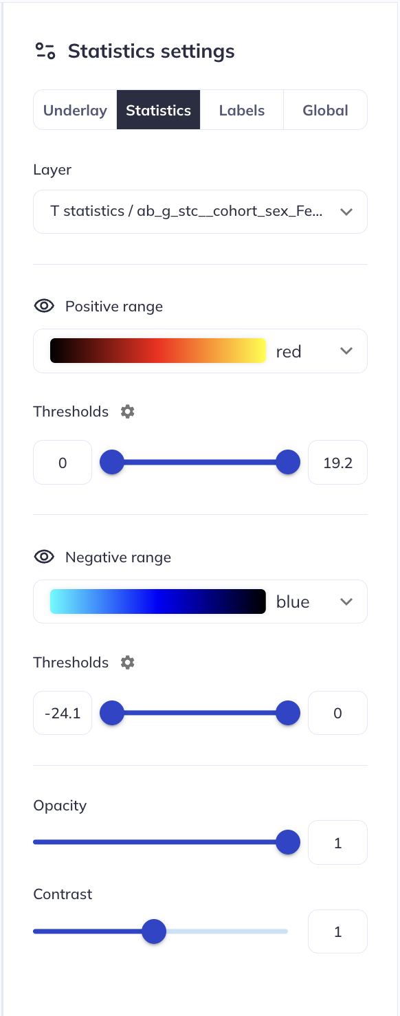
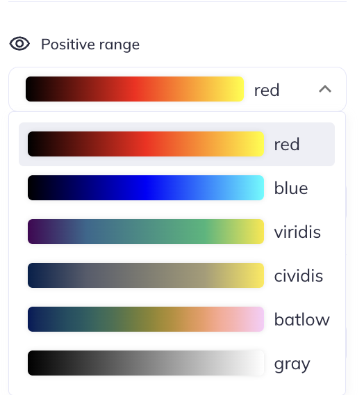
The Positive range section can be used to customize the positive statistics. The color map (default red) can be changed by clicking on the color map
The Thresholds slider can be used to customize the lower and upper limit of the positive range. The lowest possible value is 0 (because these are positive valued statistics), and the highest value is auto-determined by the range of statistics in the loaded layer. Changing the lower limit of this threshold will stop statistics values lower than the limit from being rendered (i.e., the positive lower limit controls the minimum positive value to display). Changing the upper limit of this threshold will update the colormap such that the peak statistics are mapped to the upper extreme of the colormap (i.e., the positive upper limit controls the most positive value to display).
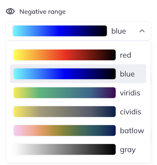
The Negative range{.block_grey} section can be used to customize the negative statistics. The color map (default blue) can be changed by clicking on the color map
The Thresholds slider can be used to customize the lower and upper limit of the negative range. The largest possible value is 0 (because these are negative valued statistics), and the lowest value is auto-determined by the range of statistics in the loaded layer. Changing the lower limit of this threshold will update the colormap such that the peak statistics are mapped to the upper extreme of the colormap (i.e., the most negative value to display). Changing the upper limit of this threshold will stop statistics values greater than the limit from being rendered (i.e., it controls the minimum negative value to display).
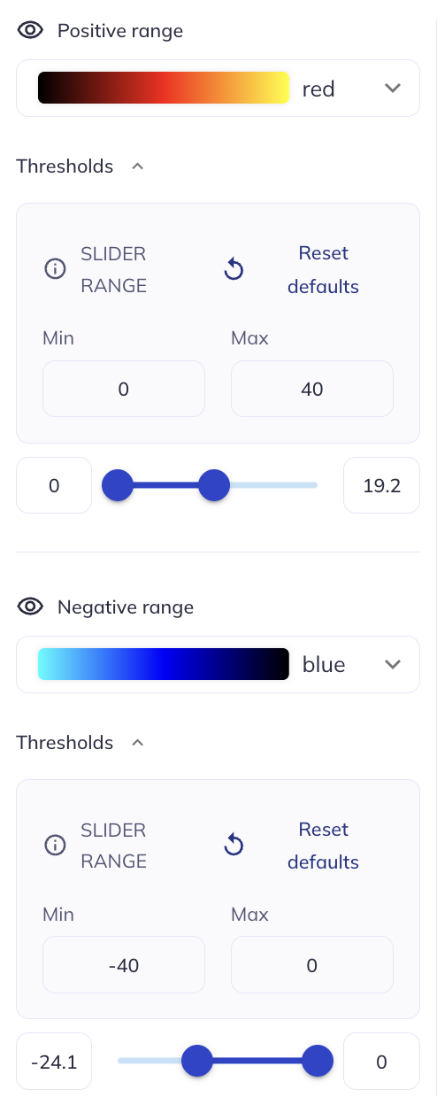
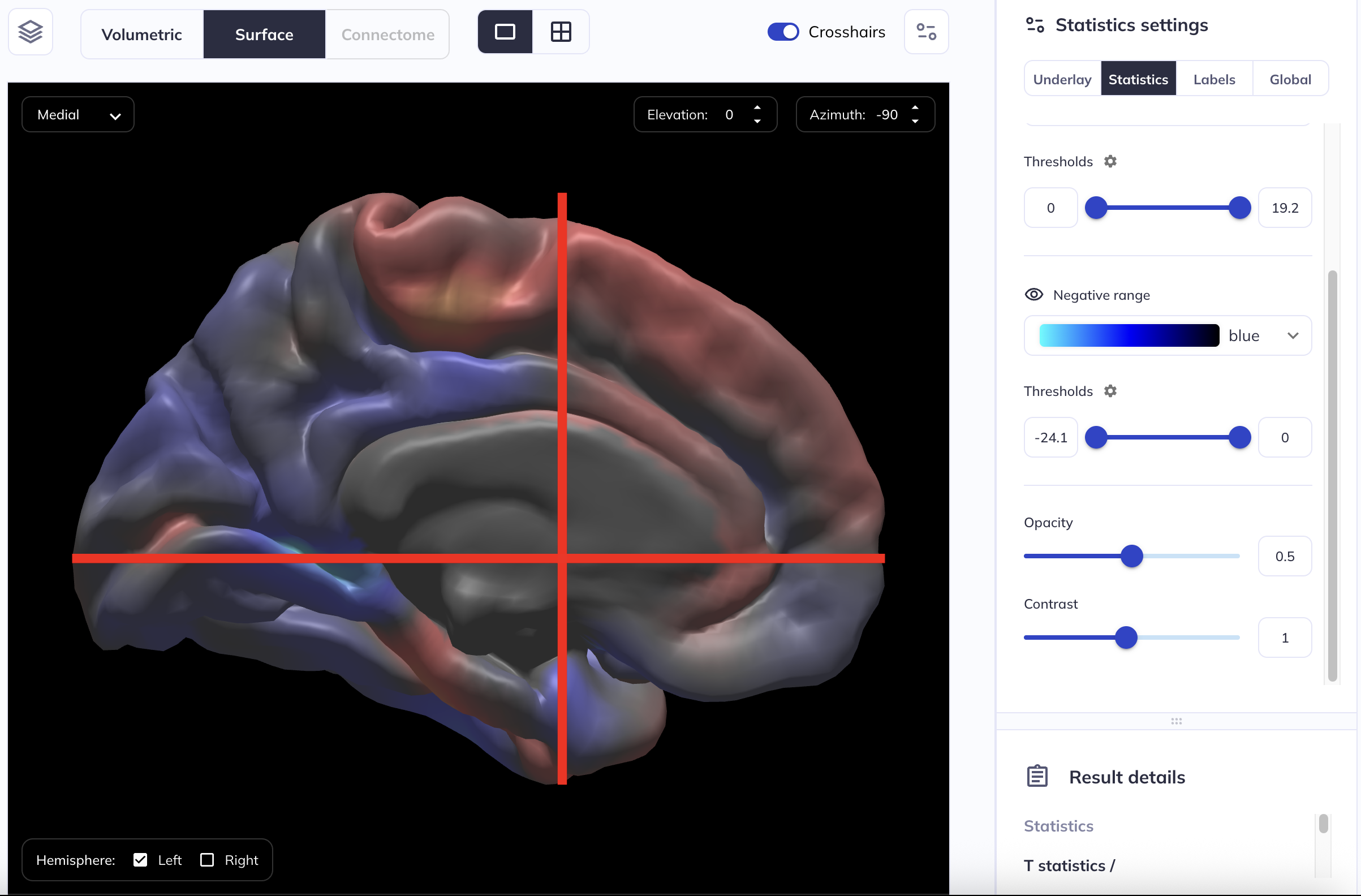
For both the positive and negative range, clicking on the ⚙ icon right next to the Thresholds will show an additional panel that allows you to customize the limits of the colormap. For example, in the snapshot below, we have changed the upper limit of the positive colormap to 40 and the lower limit of the negative colormap to -40: this means that the “brightest” red will now correspond to a value of 40 and the “brightest” blue will now correspond to a value of -40.
Opacity
For the statistical overlay, it is possible to use the Opacity slider in the Statistics settings in the right side panel to control the opacity of the overlaid statistical map. For example, in the snapshot below, we have set the opacity of the statistical layer to 0.5 or 50% transparent.
Hint: Instead of using the slider, you can enter a custom number in the box right next to the slider bar
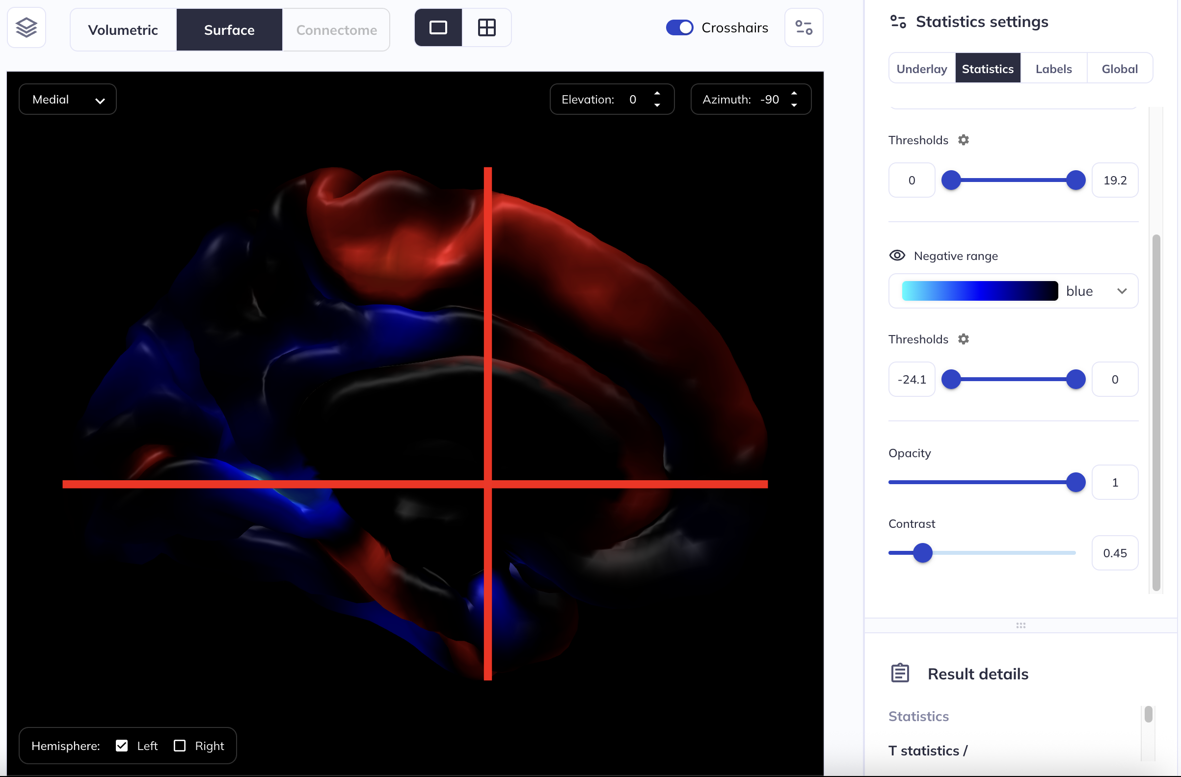
Contrast
The contrast of an image is the difference in brightness between the light and dark areas of an image. This can be adjusted for the statistical layer using the Contrast slider in the right side panel in the Statistics settings. In the examples below, we have changed the contrast from the default value of 1 to 0.45.
Hint: Instead of using the slider, you can enter a custom number in the box right next to the slider bar
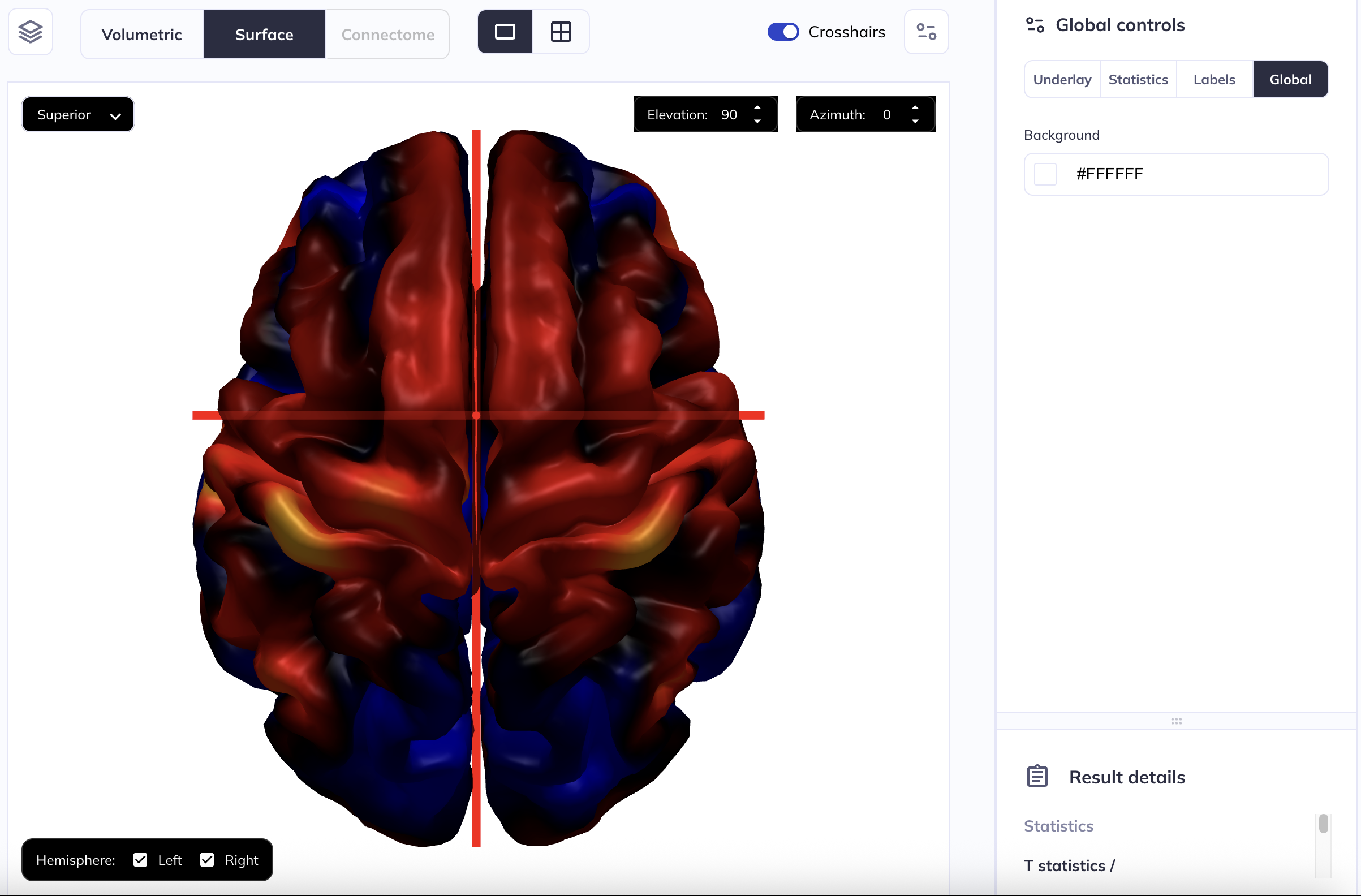
Customizing the background
N.B. the snapshots below use surface viewer as an example; the same settings and customization options are available in volume viewer as well.
You can edit the background color for both volume viewer and the surface viewer. To do so, click on the ![]() icon to expand the right side panel. Then, select Global to open Global controls settings. Under this, you can find Background. This defaults to
icon to expand the right side panel. Then, select Global to open Global controls settings. Under this, you can find Background. This defaults to #000000 which is the Hex equivalent of black. Clicking on the color swatch this will allow you to choose any color you want for the background. For example, in the example below, we have changed the background color to white (hex: #FFFFFF)
Hint: Instead of using the RGB spectrum, you can edit the color code directly; enter a valid hex code and the background will change to that color.
Tabulated results
When an analysis of tabulated data is completed, the results will be displayed in the Tabulated outputs section. Results are displayed in two formats: as Tables and as Regression coefficient plots.
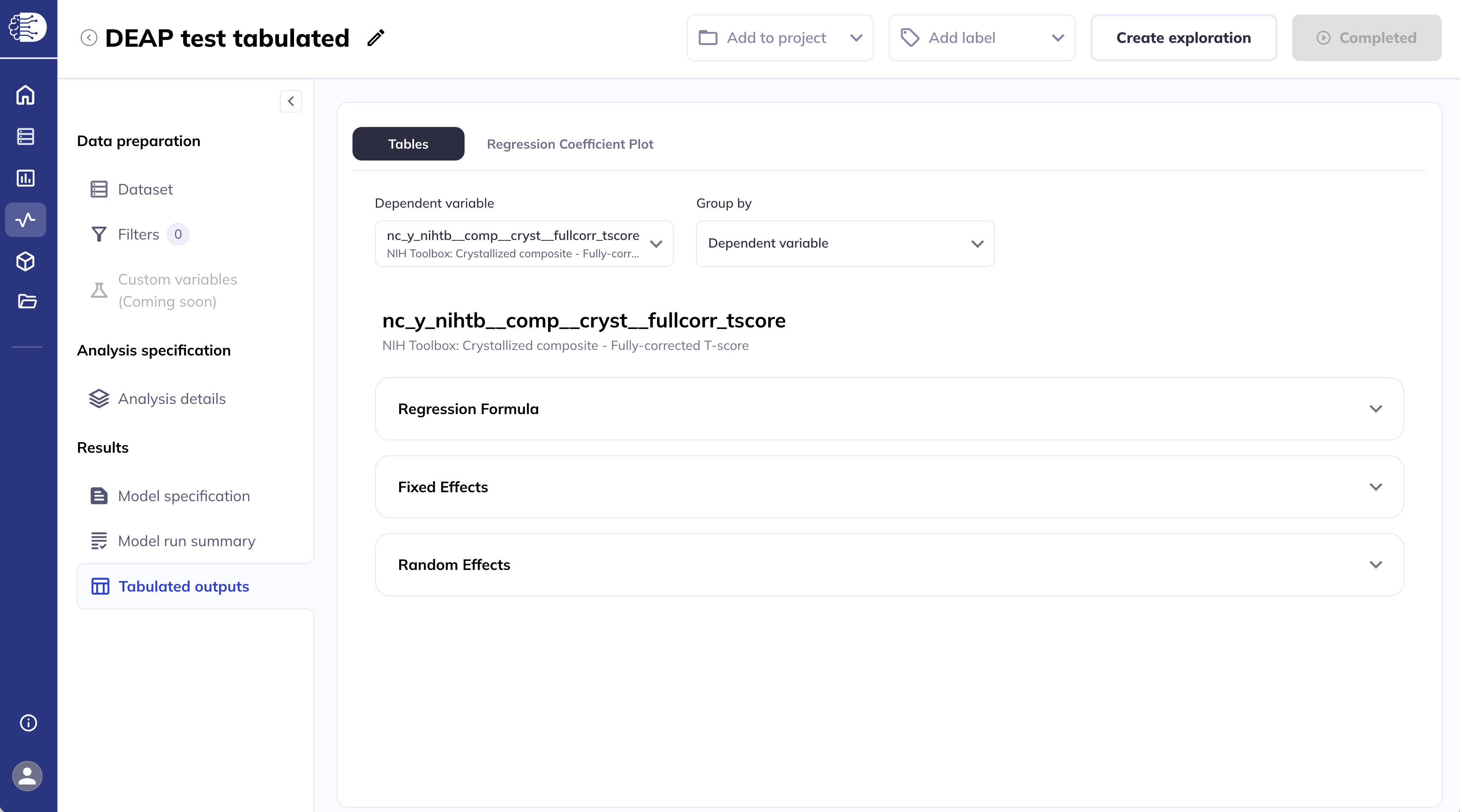
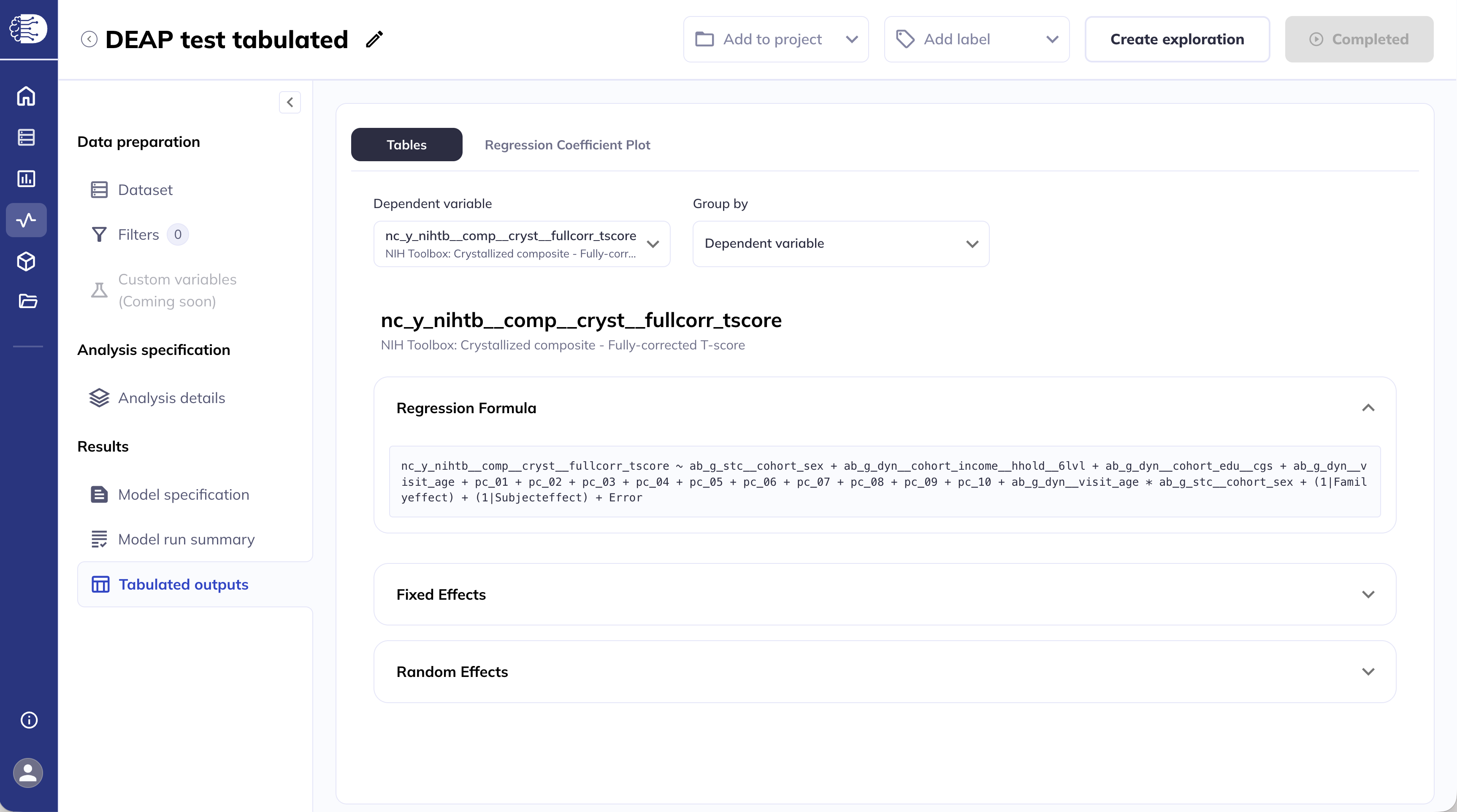
Tables
The Tables section displays the results in two formats: either grouped by dependent variable or grouped by fixed effect, which is set using the Group by drop-down menu. To the left of the Group by drop-down menu is a Dependent variable/Fixed effect drop-down menu that allows you to navigate between dependent variables and fixed effects, respectively. The Tables view is the default view on first arriving on this screen and the first dependent variable is selected for you, by default.
Grouped by dependent variable
In this view, you select a single dependent variable (outcome) from the drop-down, and the results table displays rows for each fixed effect in the model. This allows you to answer the question: “What predicts this one outcome?” Each row represents a different predictor — including covariates, spline terms, and interaction terms — showing Beta, Standard Error, T statistic, Signed -log10(p), and additionally Wald statistics and Wald -log10(p), if applicable. This view gives a comprehensive picture of everything driving a particular outcome.
N.B.: The column Signed -log10(p) shows \(-\log_{10}(p)\) values, where the sign is the sign of the beta coefficient.
Hint: Collapse the left side panel to allow more space for the table.
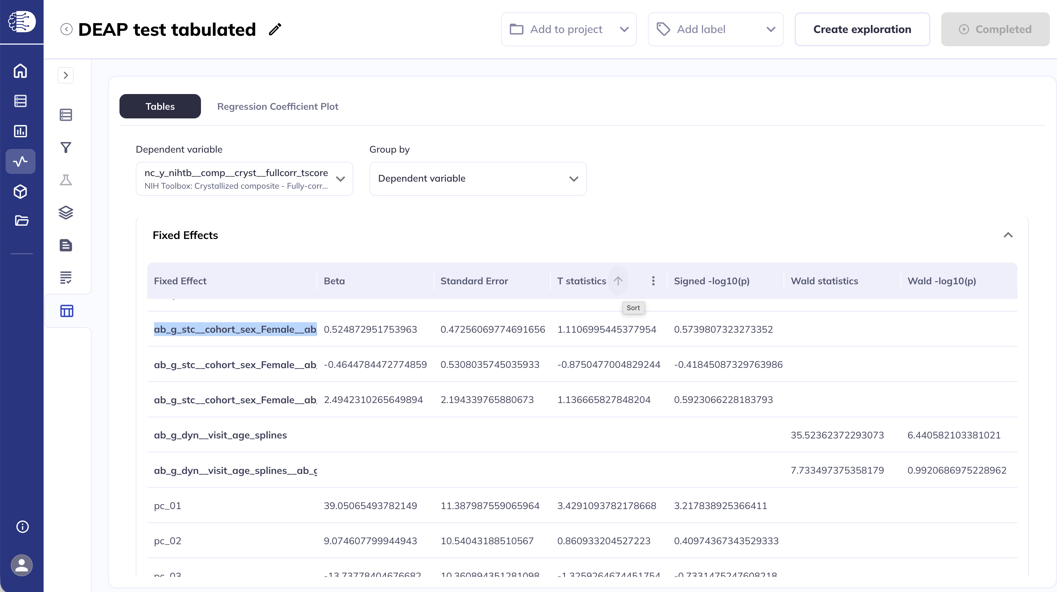
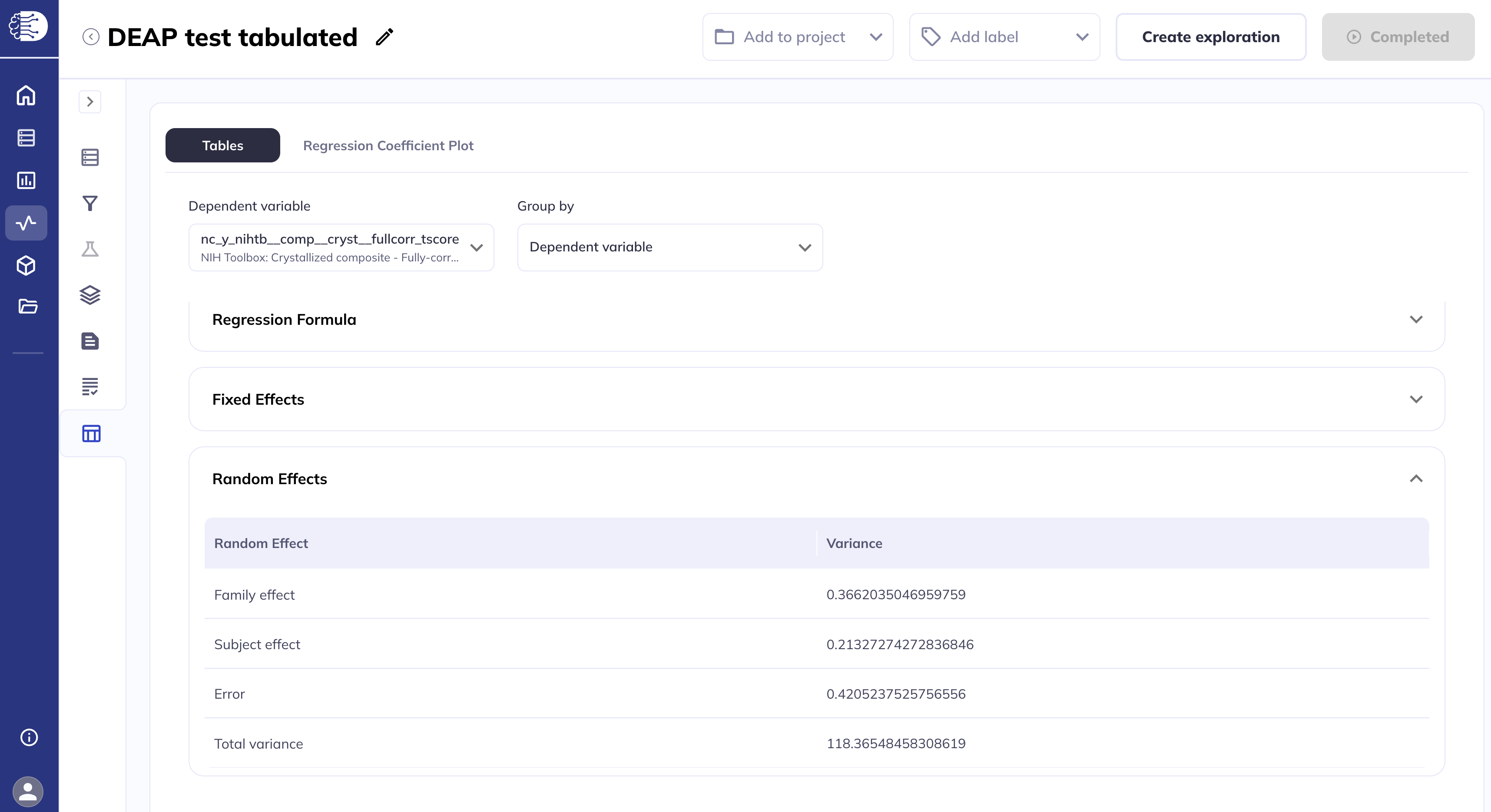
The random effects are displayed similarly.
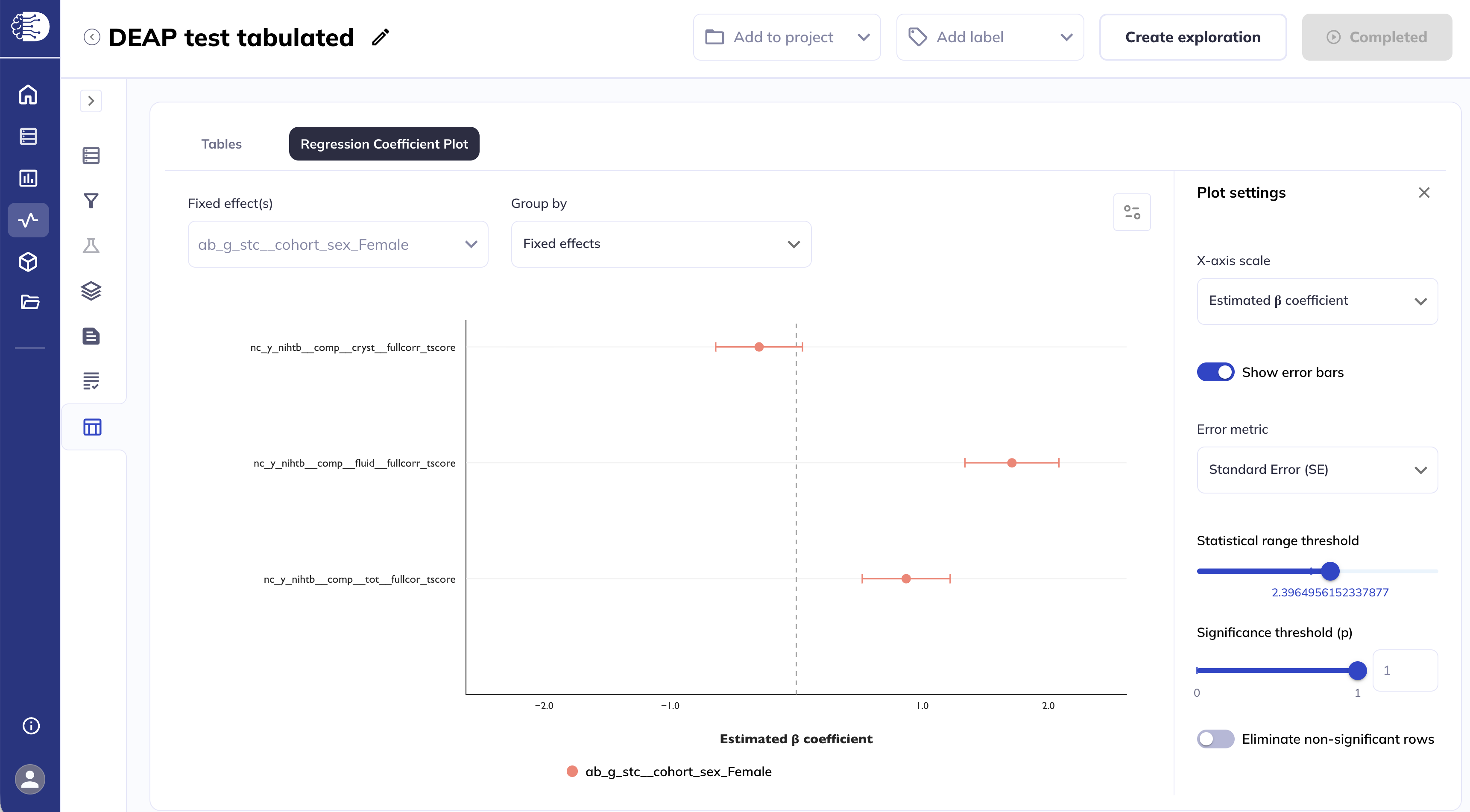
Grouped by fixed effect
In this view, you select a single fixed effect of interest from the drop-down, in this example ab_g_stc__cohort_sex_Female, and the results table displays rows for each dependent variable in the model. This allows you to answer the question: “How does this one predictor relate to each outcome?” Each row shows the Beta, Standard Error, and T statistic, and Signed -log10(p) or Wald statistics and Wald -log10(p), for that fixed effect’s relationship with a different dependent variable, making it easy to compare the strength and direction of one predictor across multiple outcomes simultaneously.
N.B.: The column Signed -log10(p) shows \(-\log_{10}(p)\) values, where the sign is the sign of the beta coefficient.
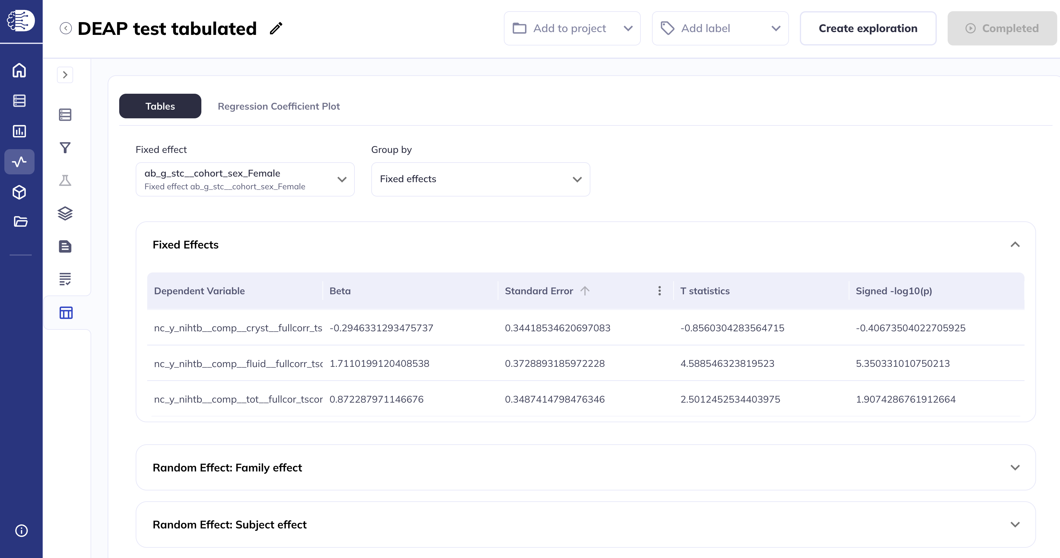
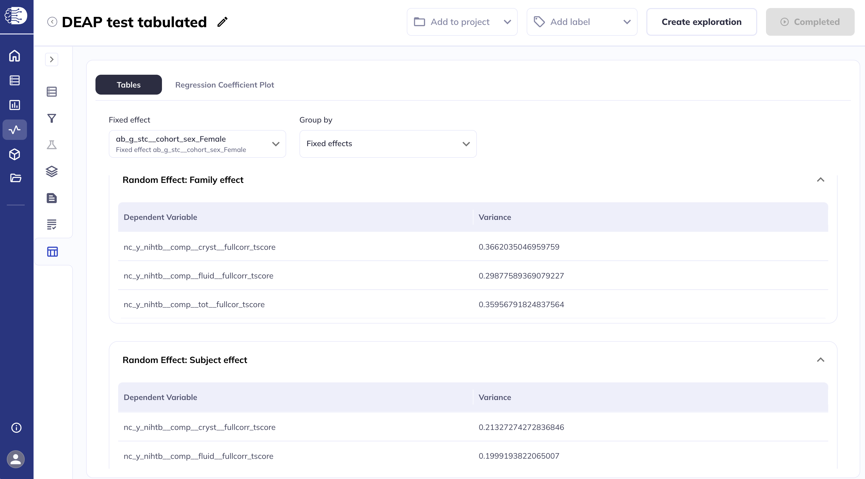
The random effects are displayed similarly.
Regression formula
The Regression formula displays the full regression formula used to fit the model. The formula shown here is based on the Wilkinson notation. The dependent variable, in this case nc_y_nihtb__comp__cryst__fullcorr_tscore is shown on the left, followed by a tilde ~ symbol separating the independent variable (and the random effects). The random effects are towards the end of the formula line; for example, in the snapshot below, (1|Familyeffect) and (1|Subjecteffect) indicate that the model included random intercepts for the family IDs and subject IDs. Depending on the model specification, this formula may look a bit different. For example, if fitting unstructured covariance model, the random effects will look like us(eid+1|Familyeffect) which indicates a separate intercept for each event ID (eid) for every family ID.
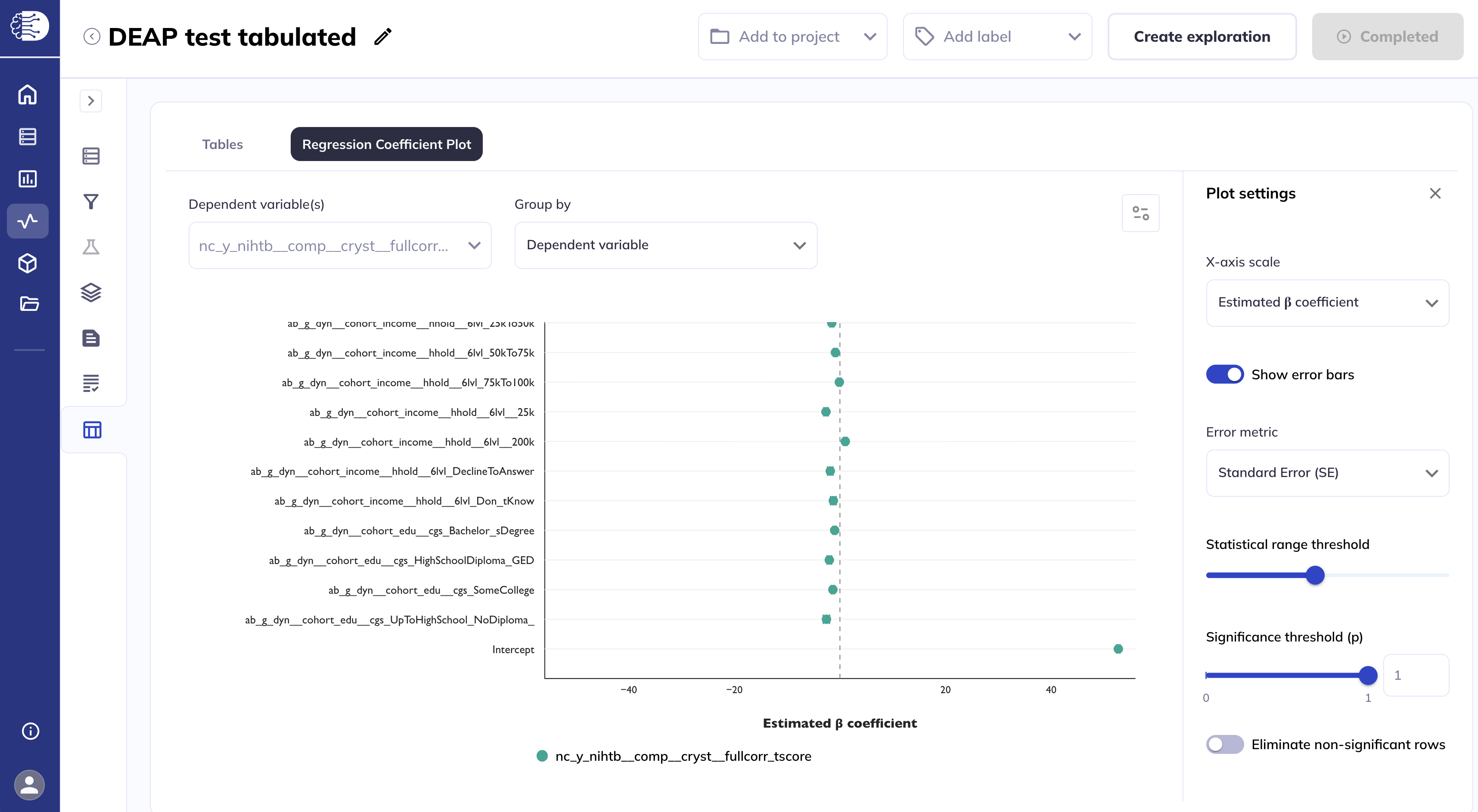
Regression coefficient plots
The Regression coefficient plots tab displays the statistics estimates as Cleveland plots. The settings selected for the Tables tab are applied to the Regression coefficient plots tab and vice versa.
Clicking the ![]() icon will collapse/expand the Plot settings side panel.
icon will collapse/expand the Plot settings side panel.
Grouped by dependent variable
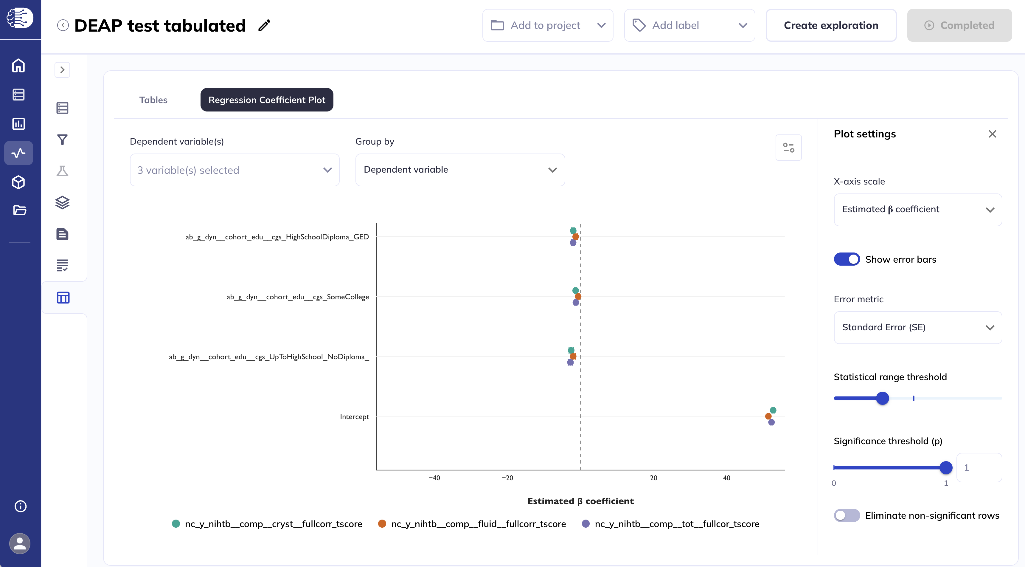
When grouped by dependent variable, you can display each dependent variable, one at a time.
Or select multiple dependent variables to display simultaneously by clicking on the Dependent variable drop-down menu and selecting the desired variables.
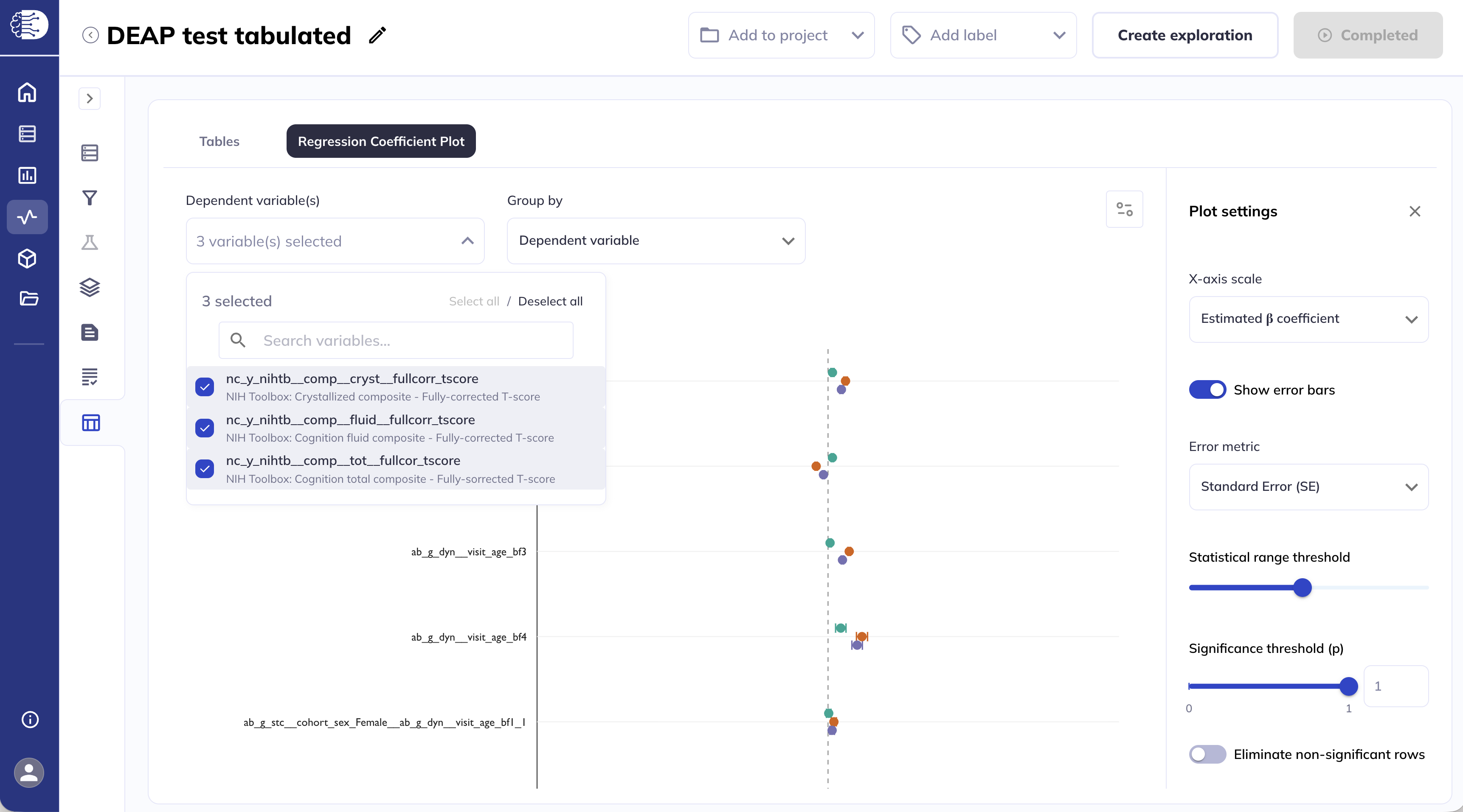
A legend will be added at the bottom of the plot to indicate the color of each dependent variable.
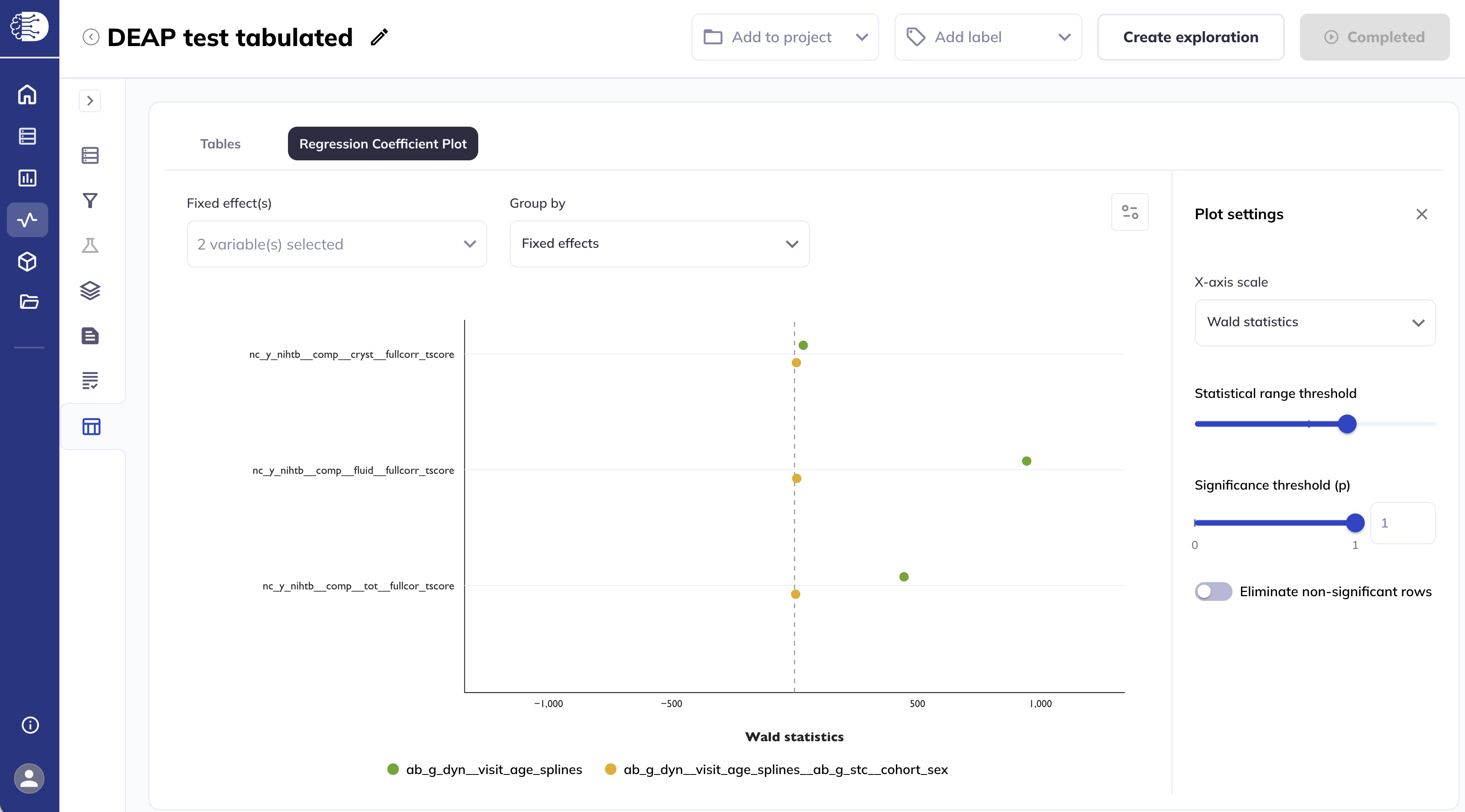
Grouped by fixed effect
Similarly, when grouped by fixed effect, you can display each fixed effect one at a time.
Or select multiple fixed effects to display simultaneously by clicking on the Fixed effect drop-down menu and selecting the desired fixed effects.
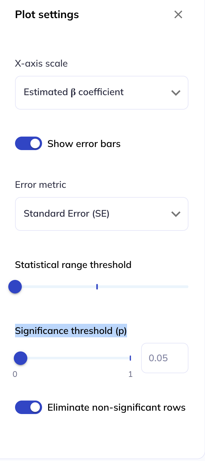
Plot settings
The Plot settings side panel allows you to customize the appearance of the plots.
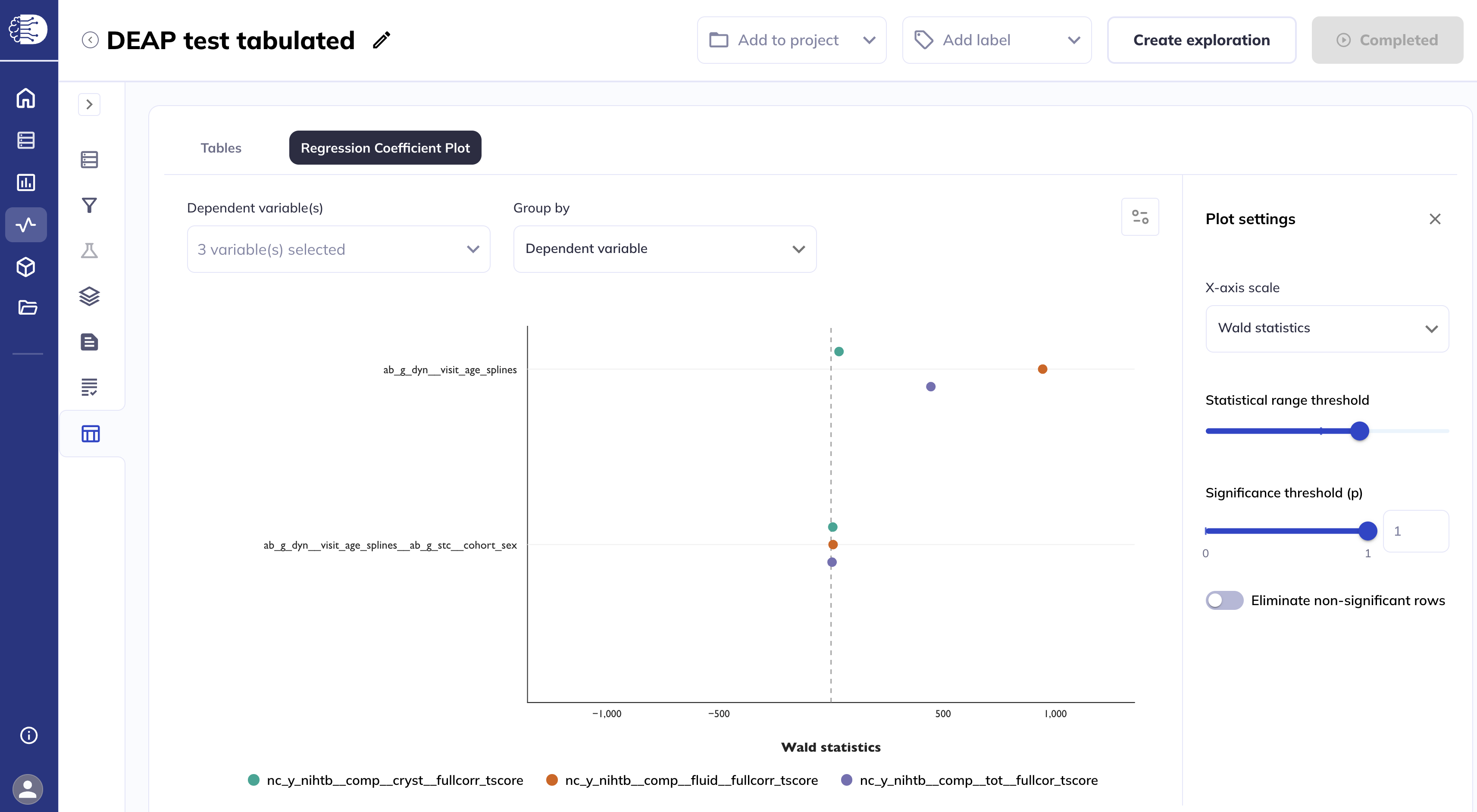
You can set the X axis scale to display different statistics estimates on the x-axis. The default is Estimated β coefficients, other options are T statistics and Wald statistics.
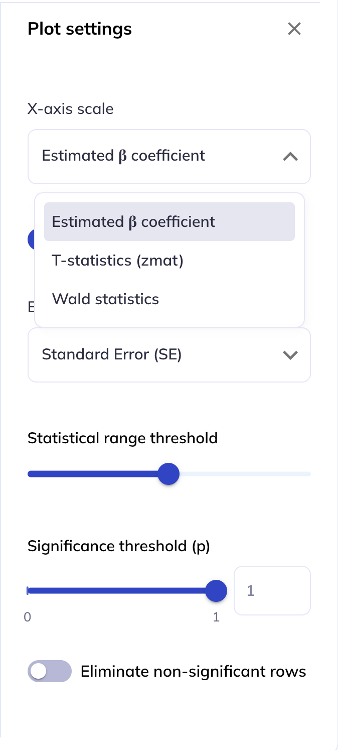
Selecting Wald statistics will only display variables which have been modeled as splines.
#
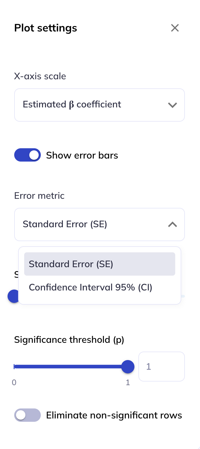
When the X axis scale is set to Estimated β coefficients, you can choose whether to display error bars on the plot, and you have the option to either use the Standard Error or the Confidence Interval 95% (CI).
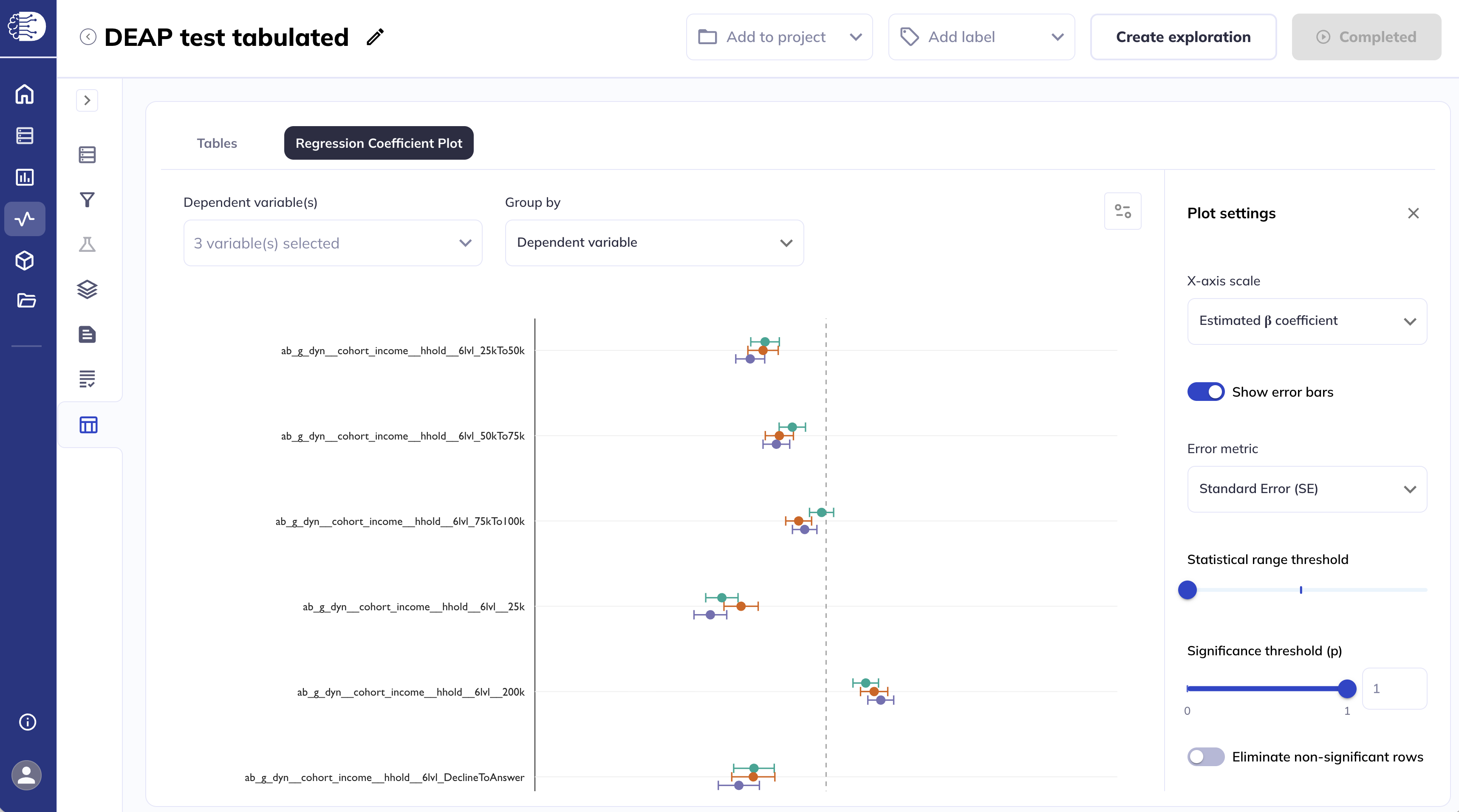
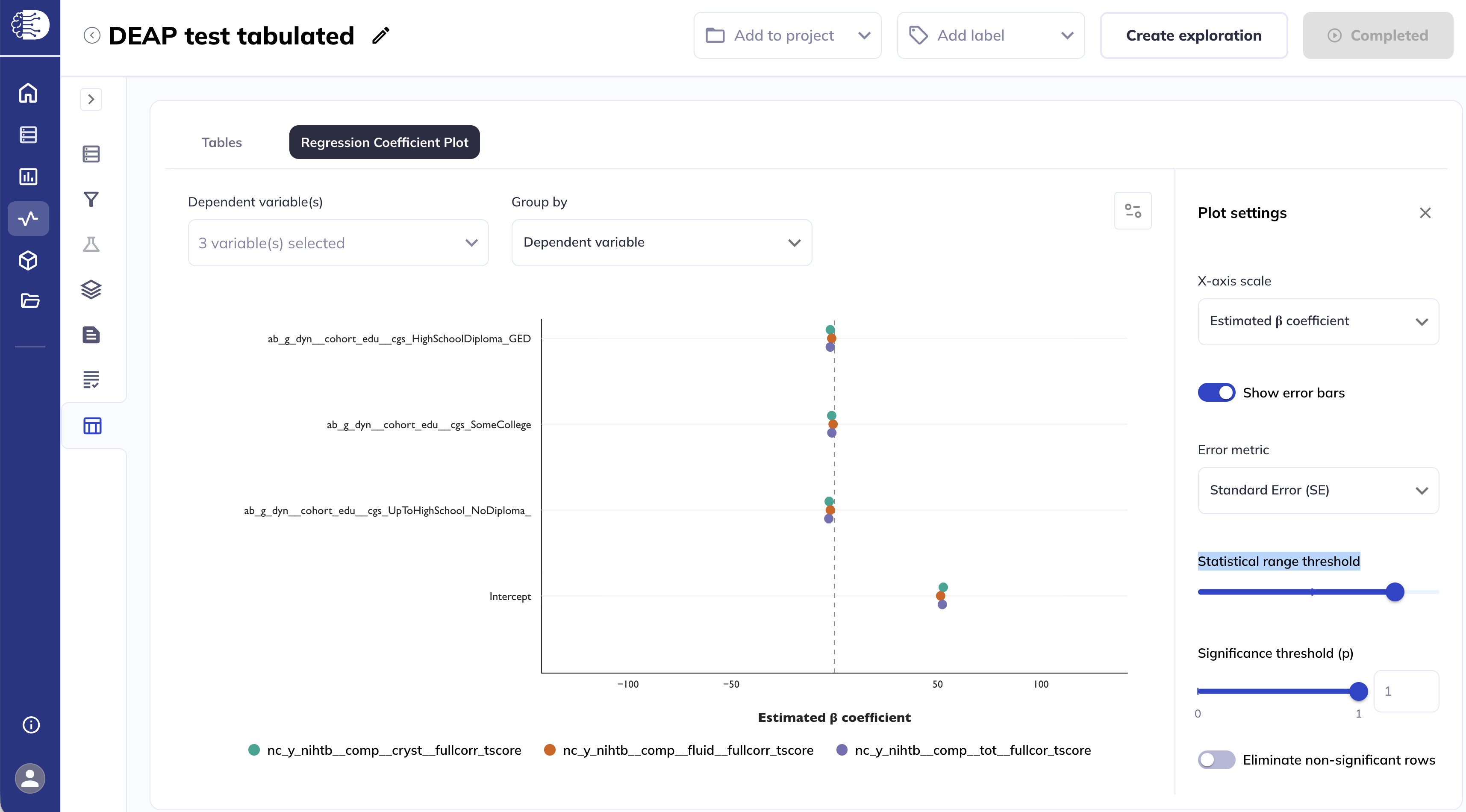
The Statistical range threshold slider sets the symmetrical range for the x-axis. Decreasing the threshold will display a smaller range on the x-axis.
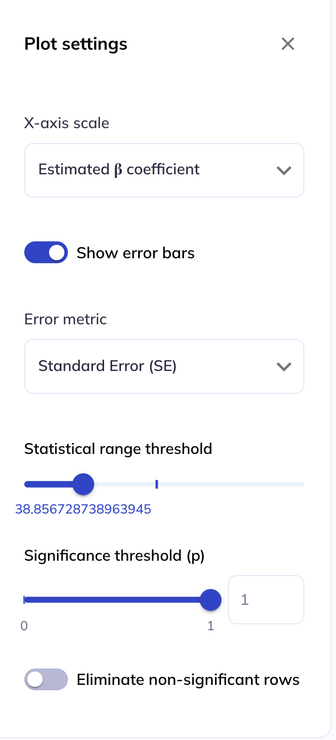
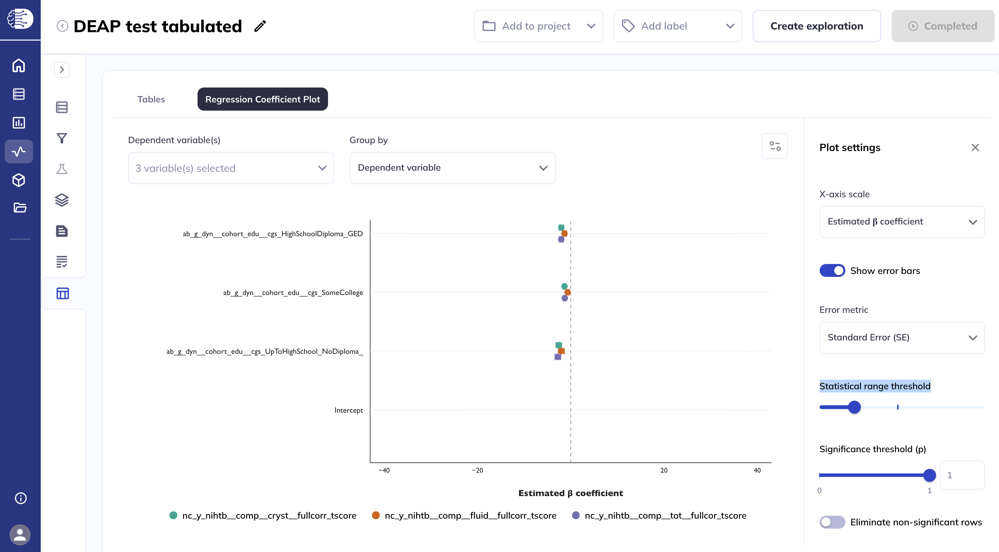
Increasing the threshold will display a larger range on the x-axis.
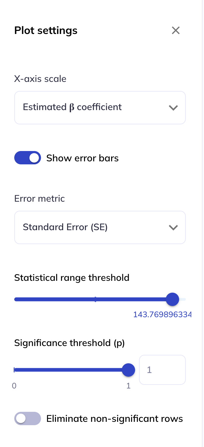
Adjusting the Significance threshold (p), either via the slider or by entering a custom number, will change the opacity of variables which have a p-value greater than the threshold.
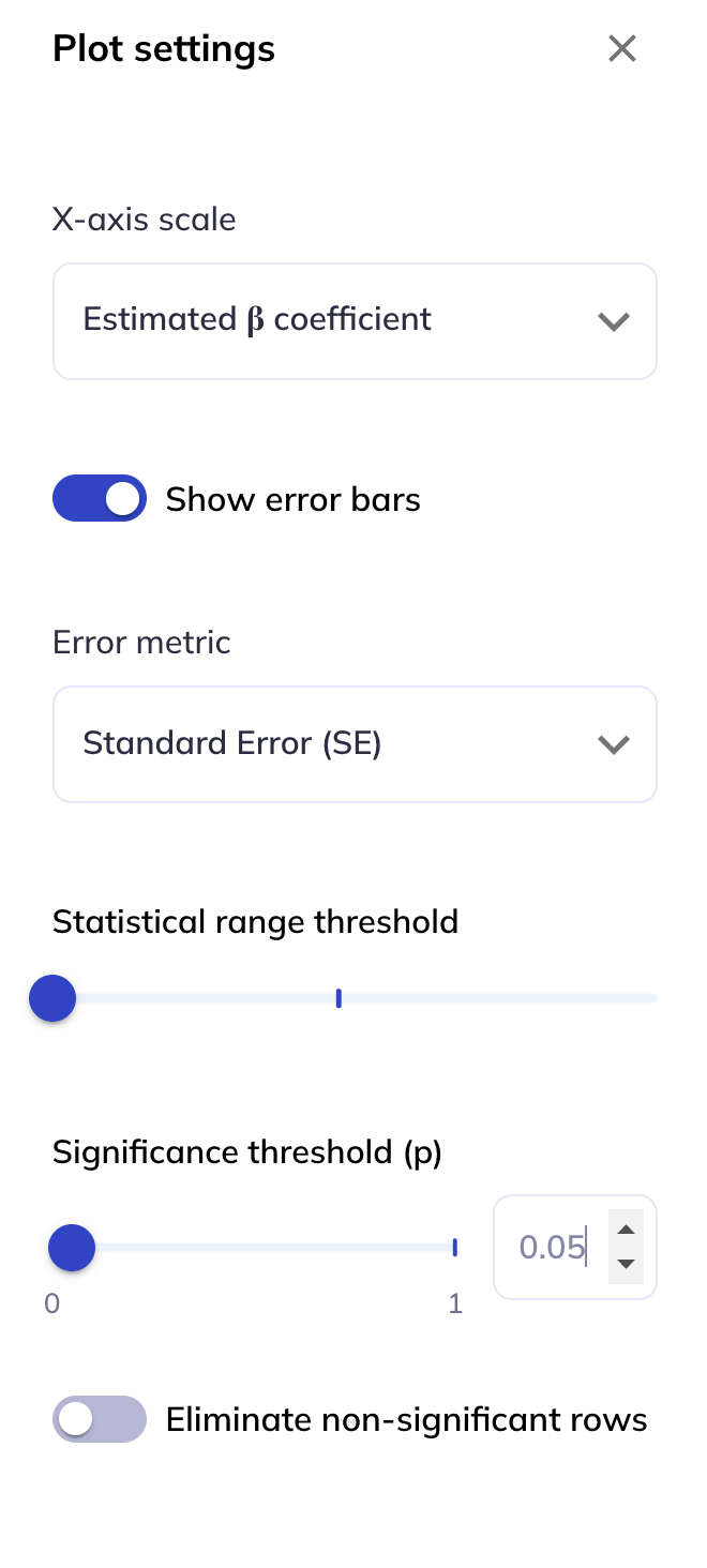
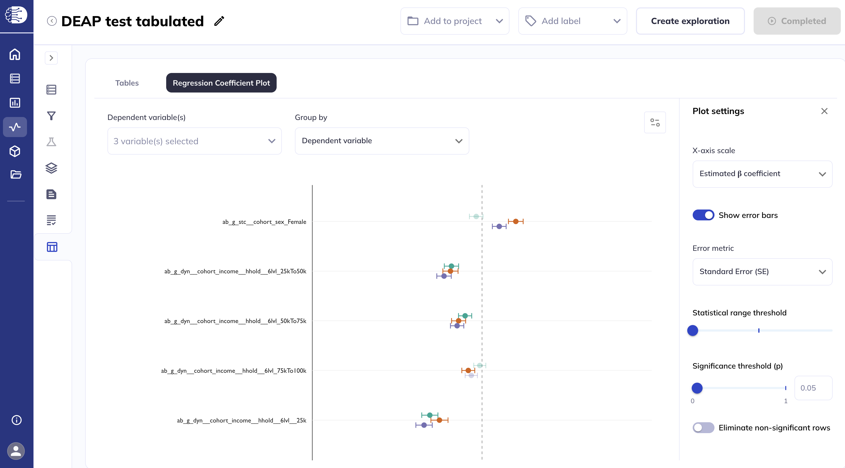
Selecting the Eliminate non-significant rows will remove variables from the plot which have a p-value greater than the Significance threshold (p).
Region of interest results
Region of interest (ROI) analyses will result in both Tabulated outputs and Image outputs results. The Tabulated outputs results will be displayed exactly as described in the Tabulated results section, with each ROI being a separate dependent variable. Image outputs will share many of the same features as the Surface viewer and Volumetric viewer, which viewer is loaded will depend on whether the ROIs are derived from a cortical surface atlas or a volumetric atlas.
The cortical surface atlases are the Desikan-Killiany atlas (contain dsk in the DEAP table name) and the Destrieux atlas (contain dst in the DEAP table name). The volumetric atlases are the subcortical parcellations from the Desikan-Killiany atlas (contain aseg in the DEAP table name) and the AtlasTrack white matter atlas (contain at in the DEAP table name). Depending on which atlas is analyzed, the Surface viewer or Volumetric viewer will be loaded automatically.
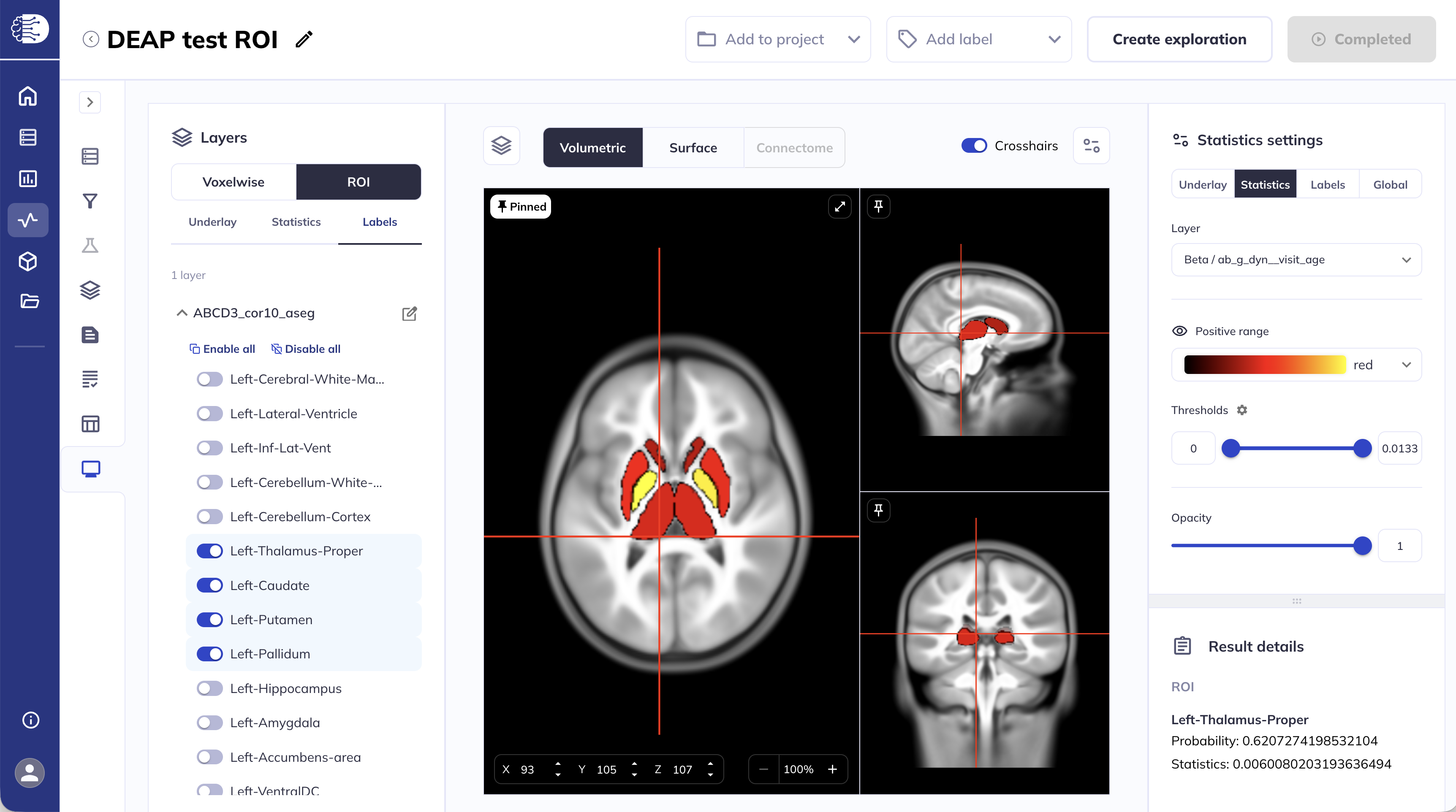
Subcortical and white matter ROI results
Subcortical and white matter ROI results will be displayed in the Volumetric viewer. This section will focus on functionalities specific to viewing ROI outputs in the volumetric viewer, for shared functionalities please follow the links to the corresponding sections in the Volumetric viewer.
The viewer will load the statistics layers automatically.
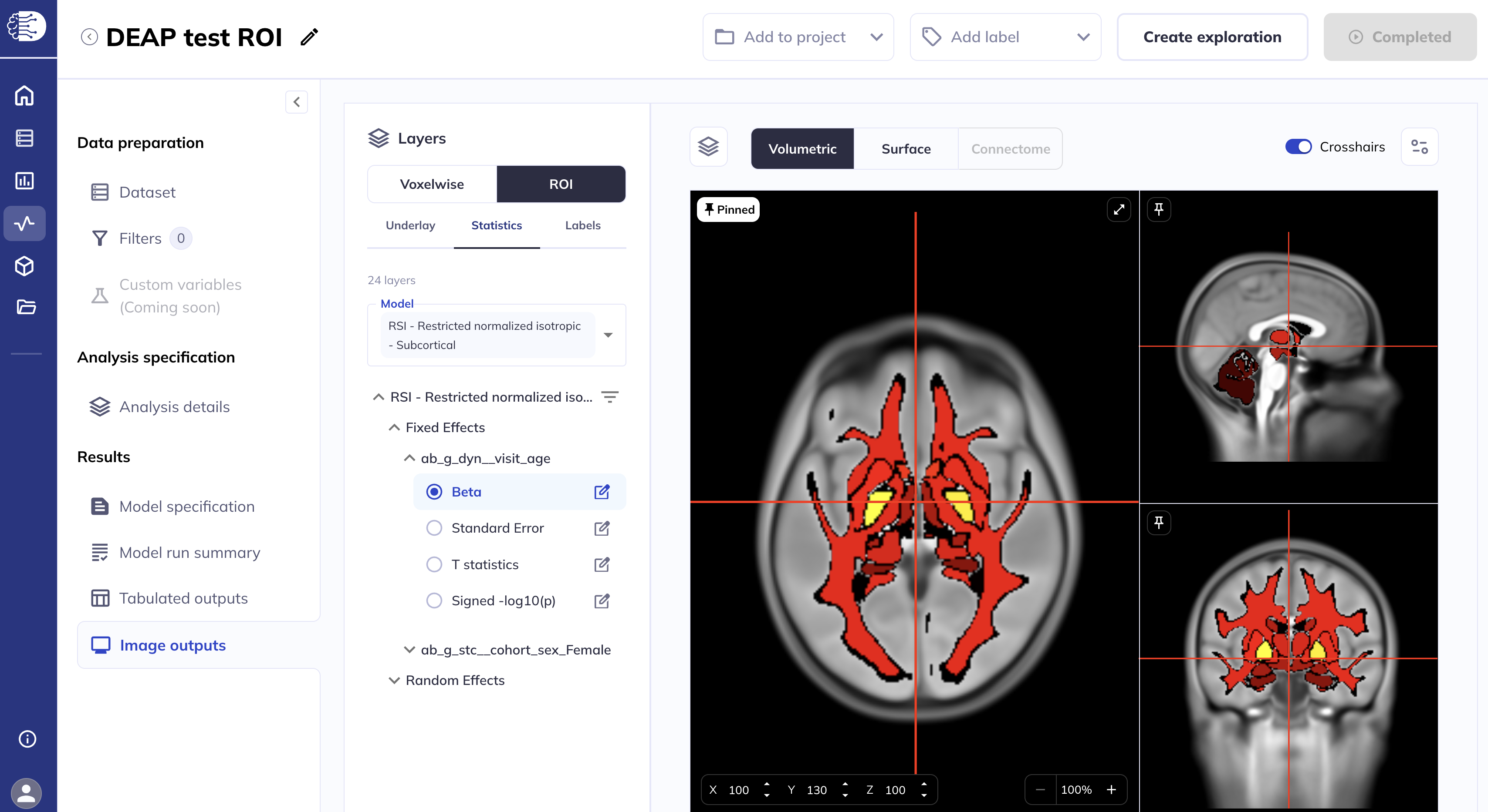
If you ran multiple volumetric ROI analyses, the Model section has a drop-down menu from which to select the desired ROI analysis{#multi-model}.
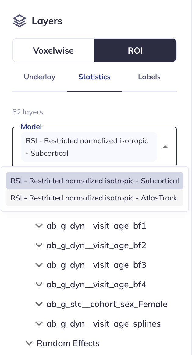
To select the statistical layers, see the Select layers to display section for details. An important distinction for ROI analyses is that statistical layers cannot be overlaid, only one layer can be displayed at a time.
You can collapse the left side panel to allow more space for the viewer and expand the viewer settings panel by clicking the ![]() icon. For details see the Customizing the statistics settings section.
icon. For details see the Customizing the statistics settings section.
Click the icon in the viewer toolbar to collapse/expand the layers panel.
The Labels section allows you to select which display the ROI labels are displayed.
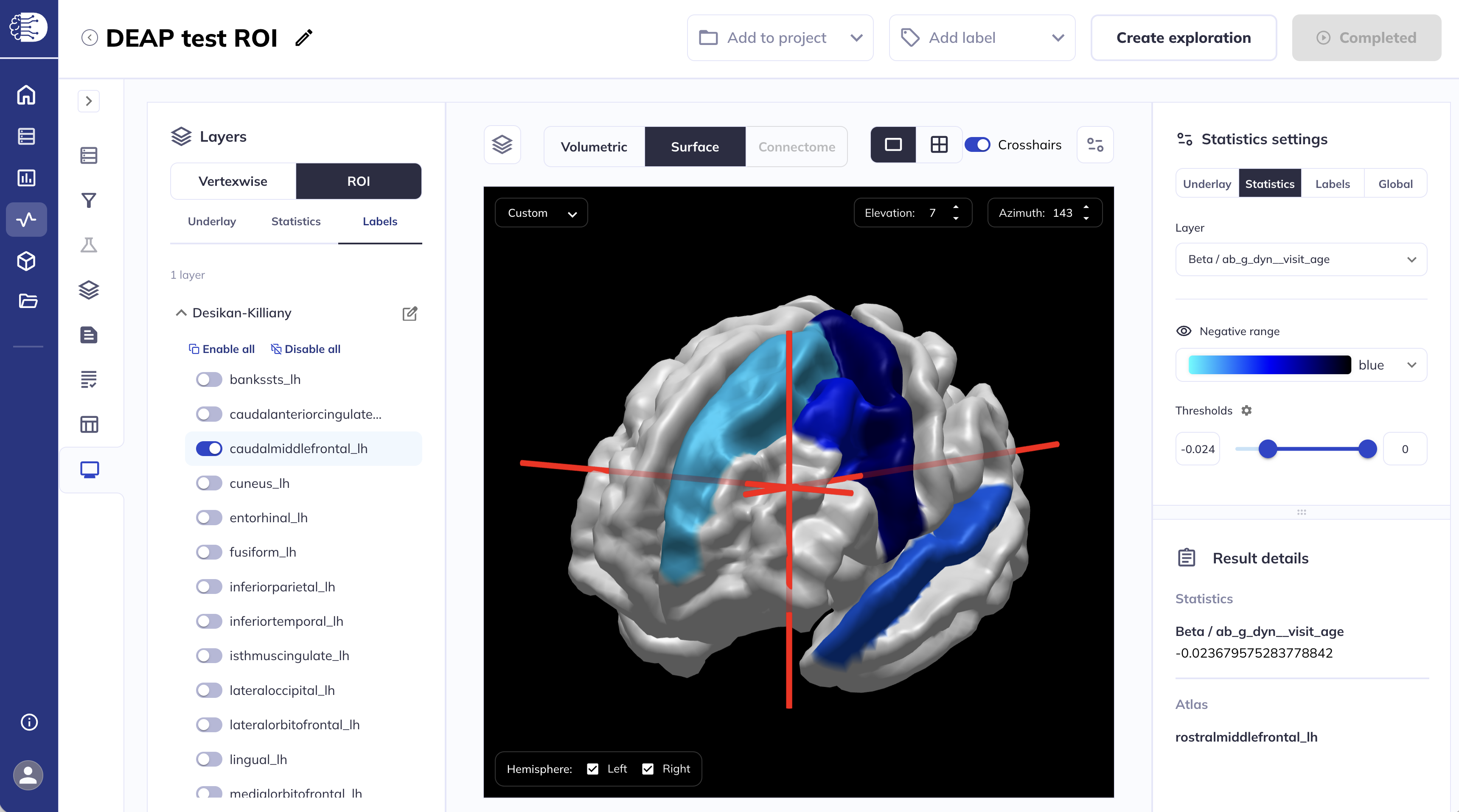
Cortical surface ROI results
Cortical surface ROI results will be displayed in the Surface viewer. This section will focus on functionalities specific to viewing ROI outputs in the surface viewer, for shared functionalities please follow the links to the corresponding sections in the Surface viewer.
The viewer will load the statistics layers automatically.
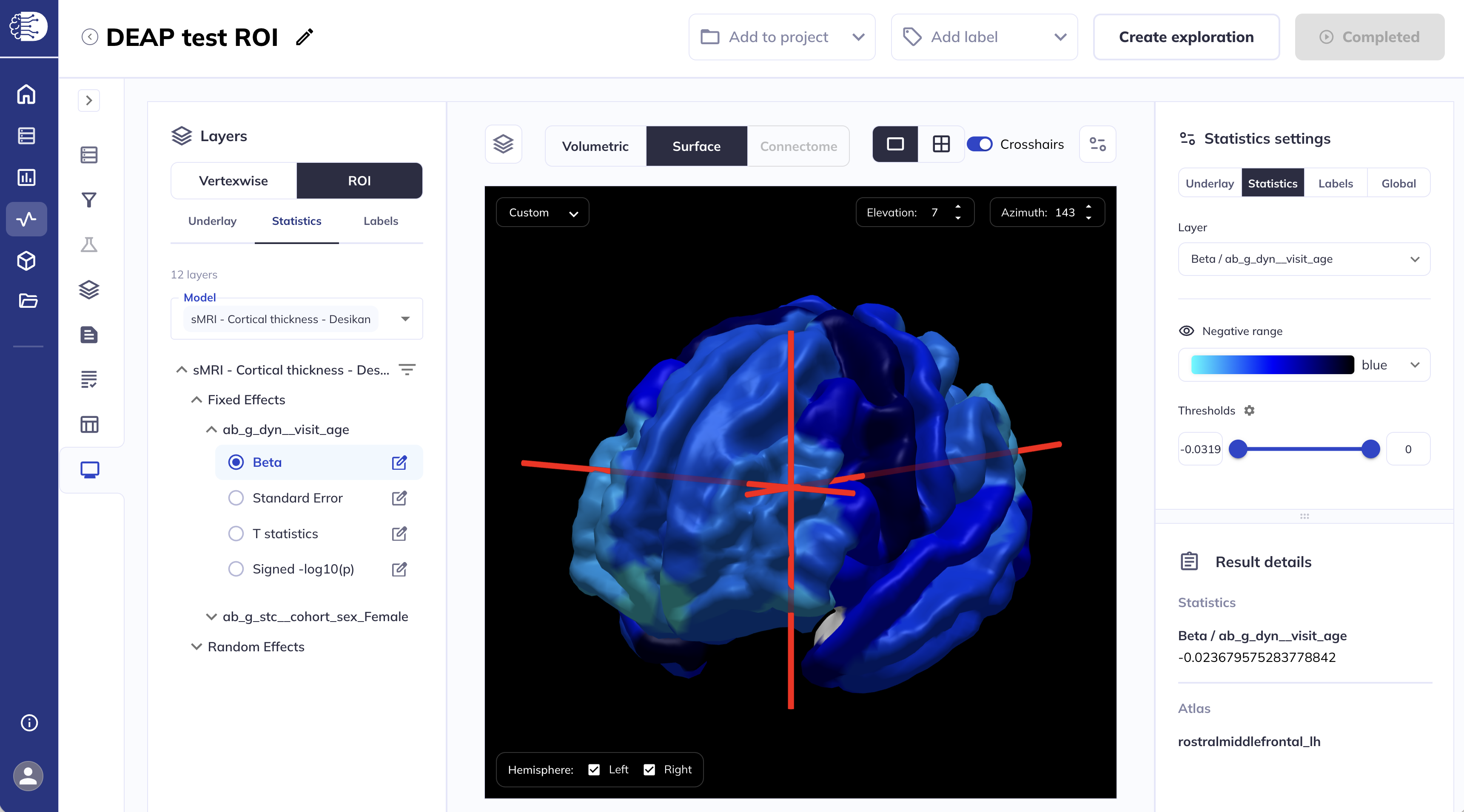
If you ran multiple surface ROI analyses, the Model section has a drop-down menu from which to select the desired ROI analysis, as shown here.
To select the statistical layers see the Select layers to display section for details. An important distinction for ROI analyses is that statistical layers cannot be overlaid, only one layer can be displayed at a time.
You can collapse the left side panel to allow more space for the viewer and expand the viewer settings panel by clicking the ![]() icon. For details see the Customizing the statistics settings section.
icon. For details see the Customizing the statistics settings section.
The Labels section allows you to select which display the ROI labels are displayed.