Create an exploration
The Explorations module is used as an interactive workspace for quickly browsing, summarizing, and visualizing datasets before doing formal analyses. It lets users inspect variable distributions, check data quality, identify missingness patterns, and explore relationships between measures across participants, sessions, or timepoints. The goal of Explorations is to support early-stage understanding of the dataset so researchers can detect anomalies, refine hypotheses, and decide which variables or subsets are appropriate for further statistical modeling.
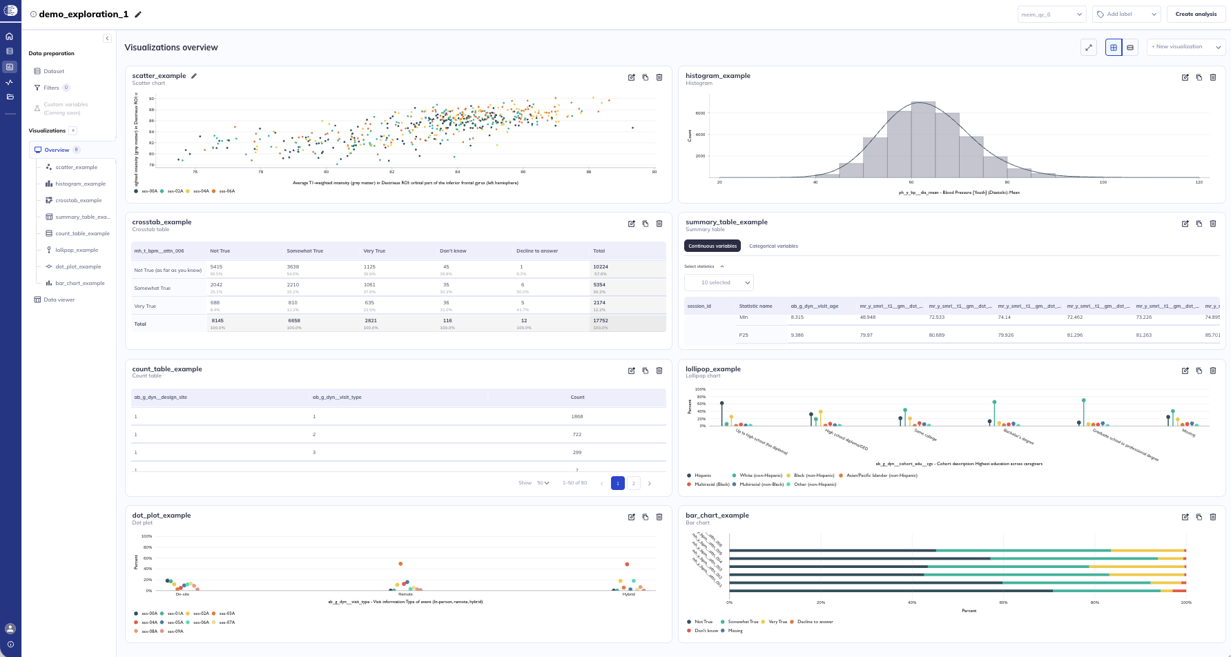
Explorations will allow users to create their own personal dashboard of visualizations that can be updated on an ongoing basis from release to release or as you refine your dataset. Explorations also allows qualified users to use a Data viewer to explore their dataset in a tabulated format (like a csv) without having to download the data.
Start exploring
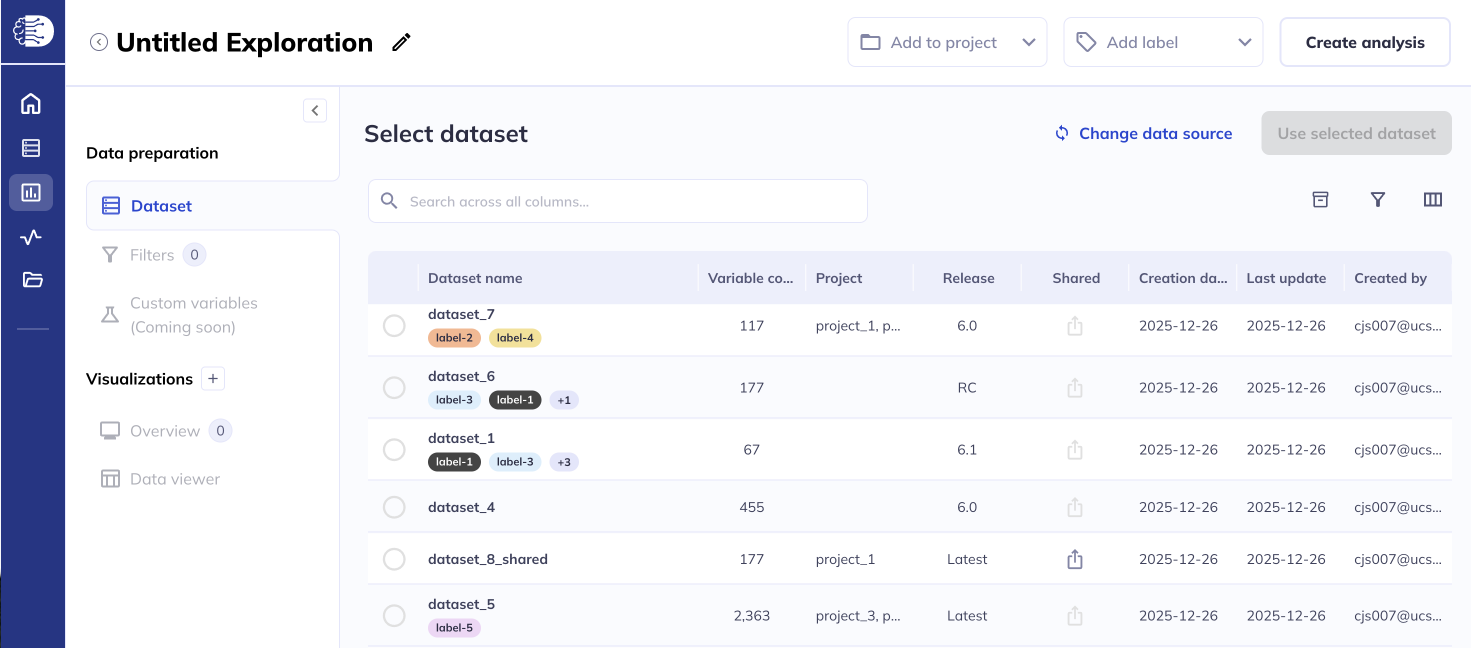
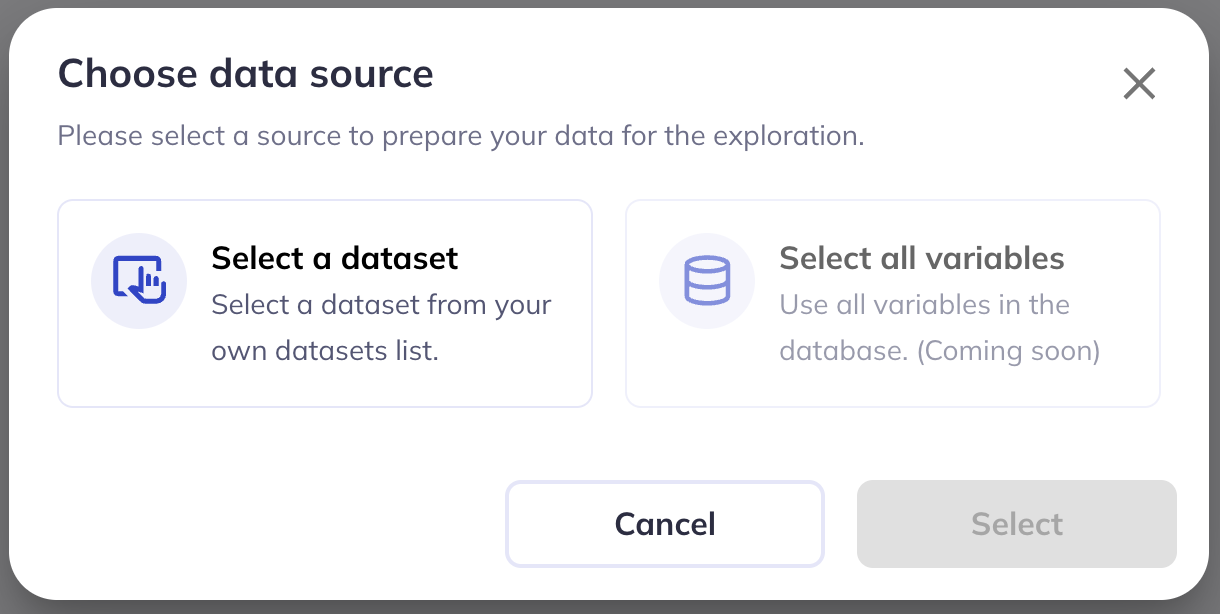
There are two places to initiate creating an exploration from. To start from a specific dataset go to My Datasets () and click the icon. This will autoselect the dataset you would like to use in your visualizations. You can also start from the My Explorations () tab and click New Exploration. This will launch an exploration where you can then select the dataset you would like to use.
Once you have selected your dataset you can review your dataset from within the explorations menu to re-familiarize yourself with the variables & plan your visualizations.
In the near future we plan to add the ability for users to generate explorations without selecting a dataset and will instead offer the ability to explore all variables as a built in feature.
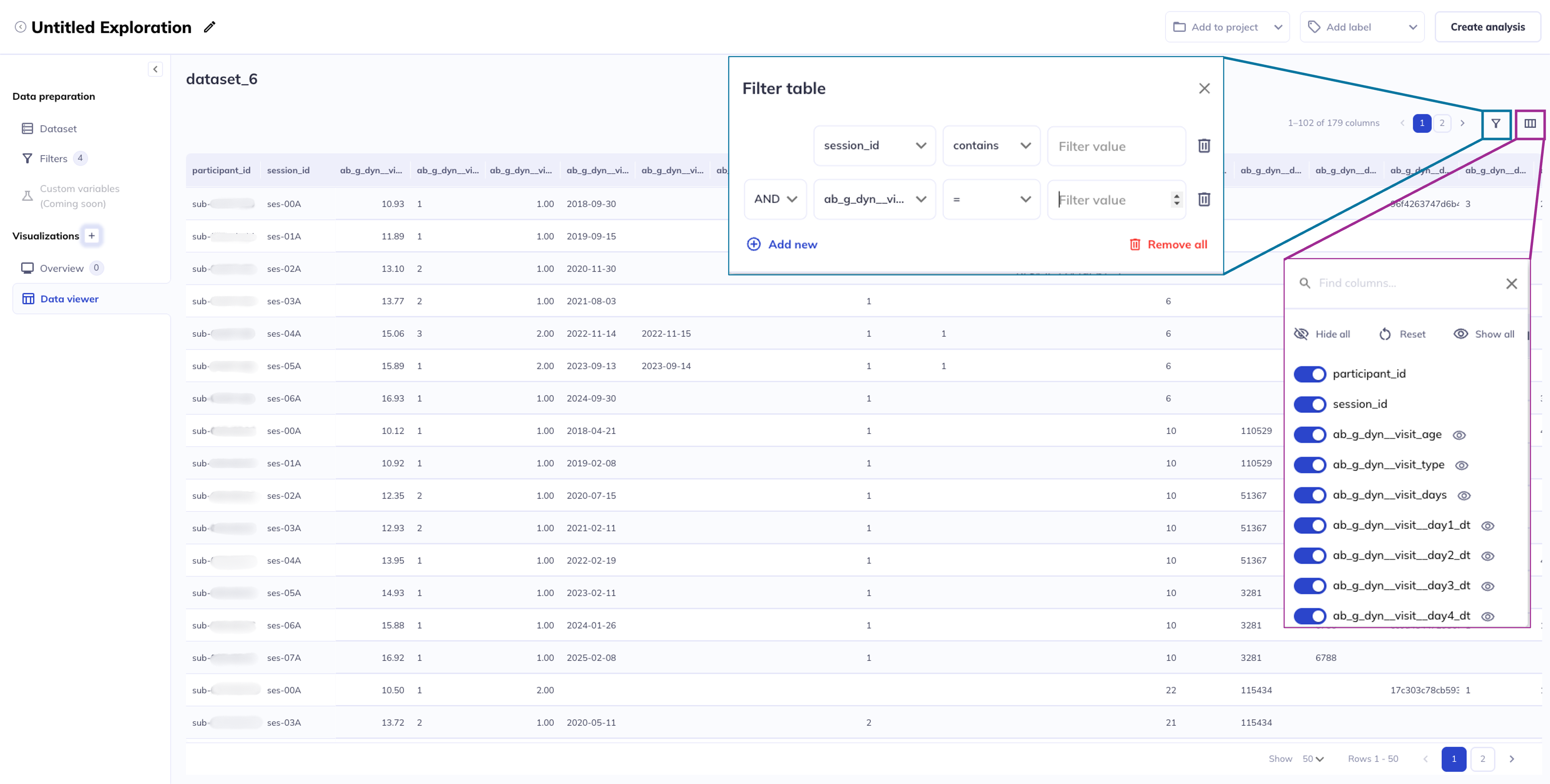
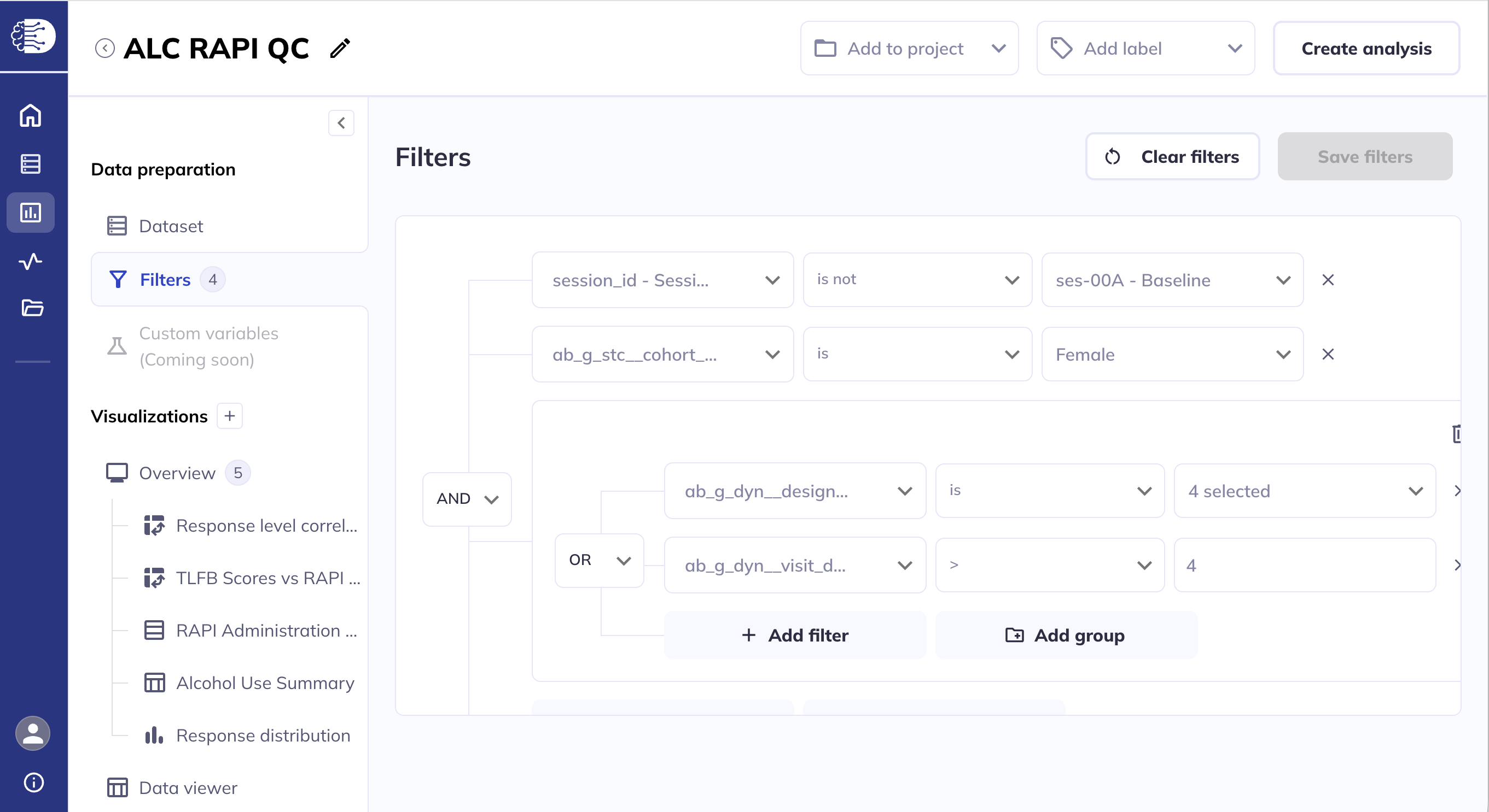
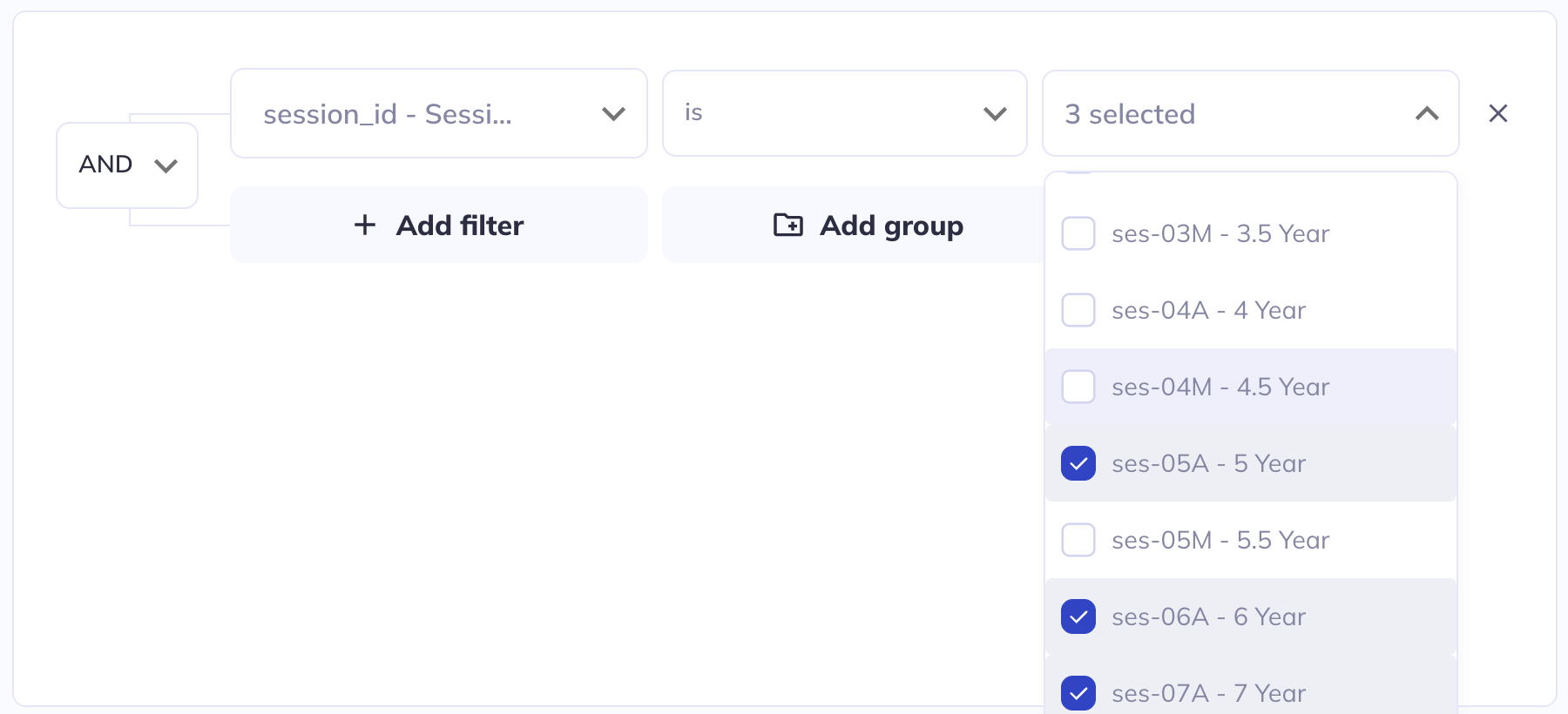
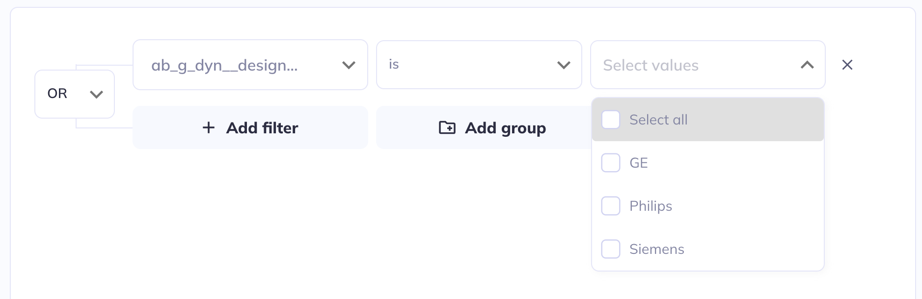
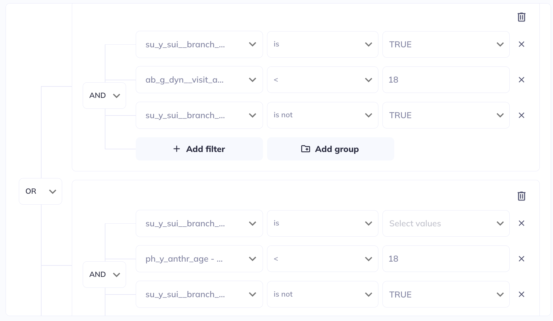
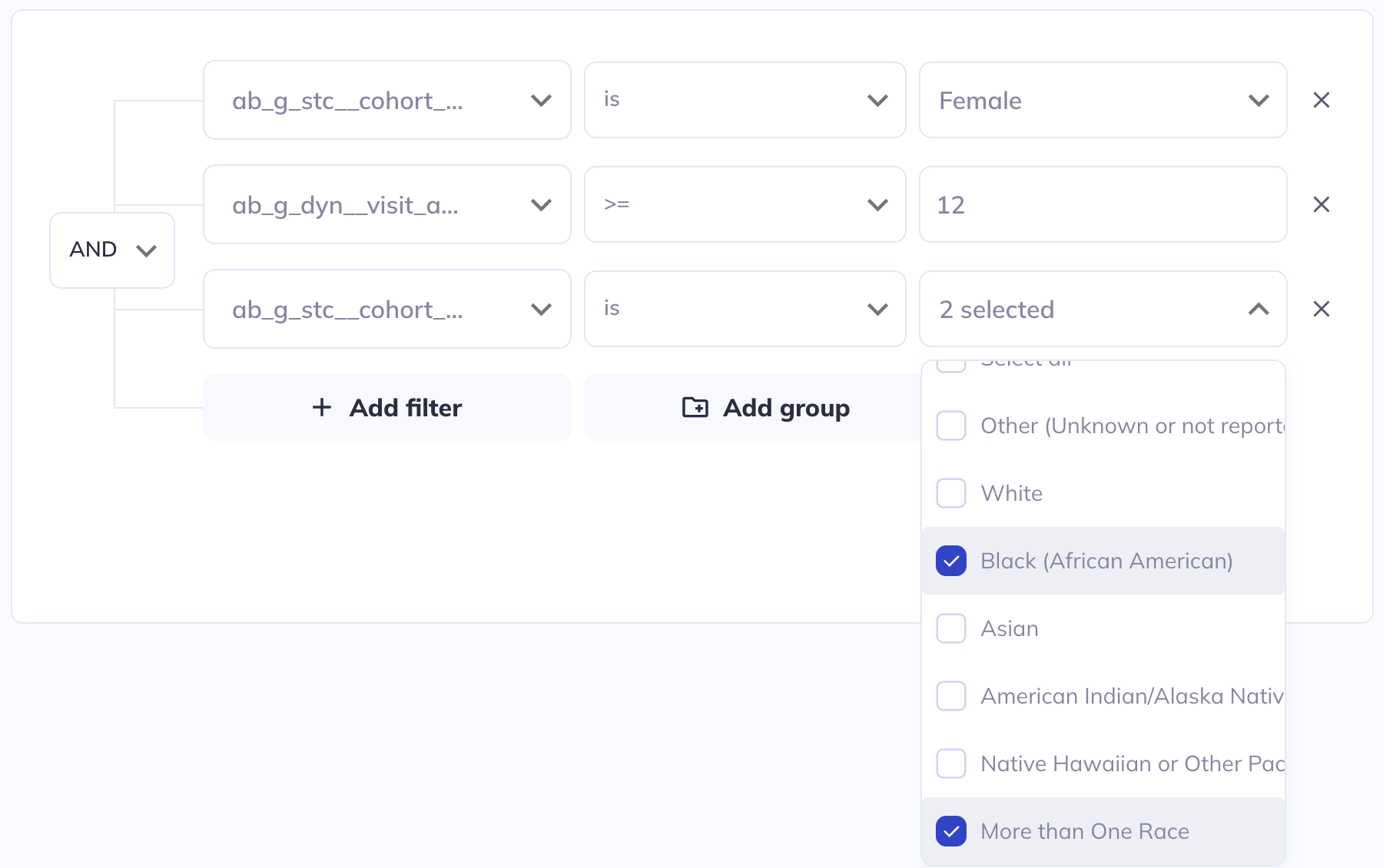
Filtering
If in your exploration you only want to look at a subset of participant-sessions you can filter your dataset (some exploration types also allow filtering within the visualization). Use a series of AND / OR statements as well as nested groups to limit the sample you want to visualize. After creating your filters click Save filters to store your selections, otherwise they will erase when you leave the page.
If you add filters after visualizations are already created the filters will affect the existing visualizations. You can clear your filters and start over by clicking Clear filters.
Examples
Visualization types
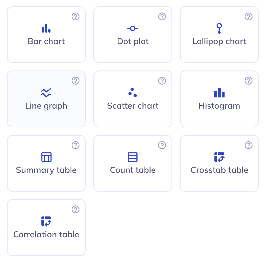
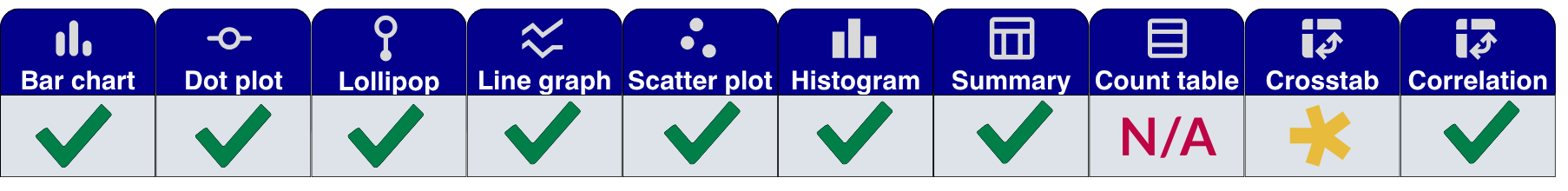
There are ten types of visualizations you can generate in DEAP Explorations currently. We intend to continue to expand on that list; if you have feedback on exploration types that we should prioritize us please send us a ticket. You can create as many visualizations as you need to understand your dataset and are not limited to one use of each visualization type, allowing you to modify individual factors to compare differences.
To learn more about the specific use cases or intricacies of each visualization see here.
Building your visualization
Once you select your visualization type you will be presented with a blank visualization and on the right sidebar the ability to select your focus variable(s). DEAP will only allow you to select variables that are relevant for that type of visualization; for example, categorical variables cannot be selected for a histogram. Once you have selected all required components your chart will generate.
DEAP Explorations is built on VictoryCharts. Review their documentation to learn more about how the styling available in DEAP is generated.
Customization
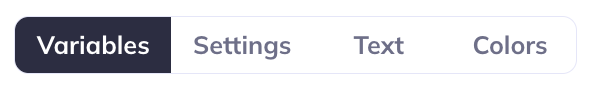
All visualization types offer some level of customization across the tabs: Variables, Settings, Text, and Colors. To learn more about what is available for each visualization type see the Visualizations tab.
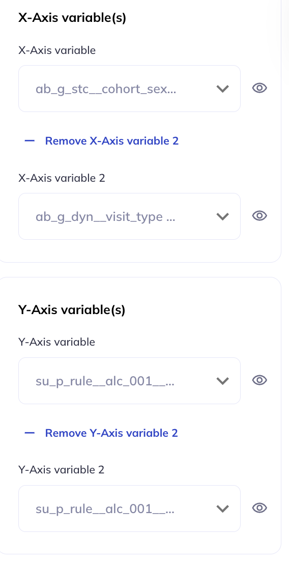
Variables
Multi-variable plots
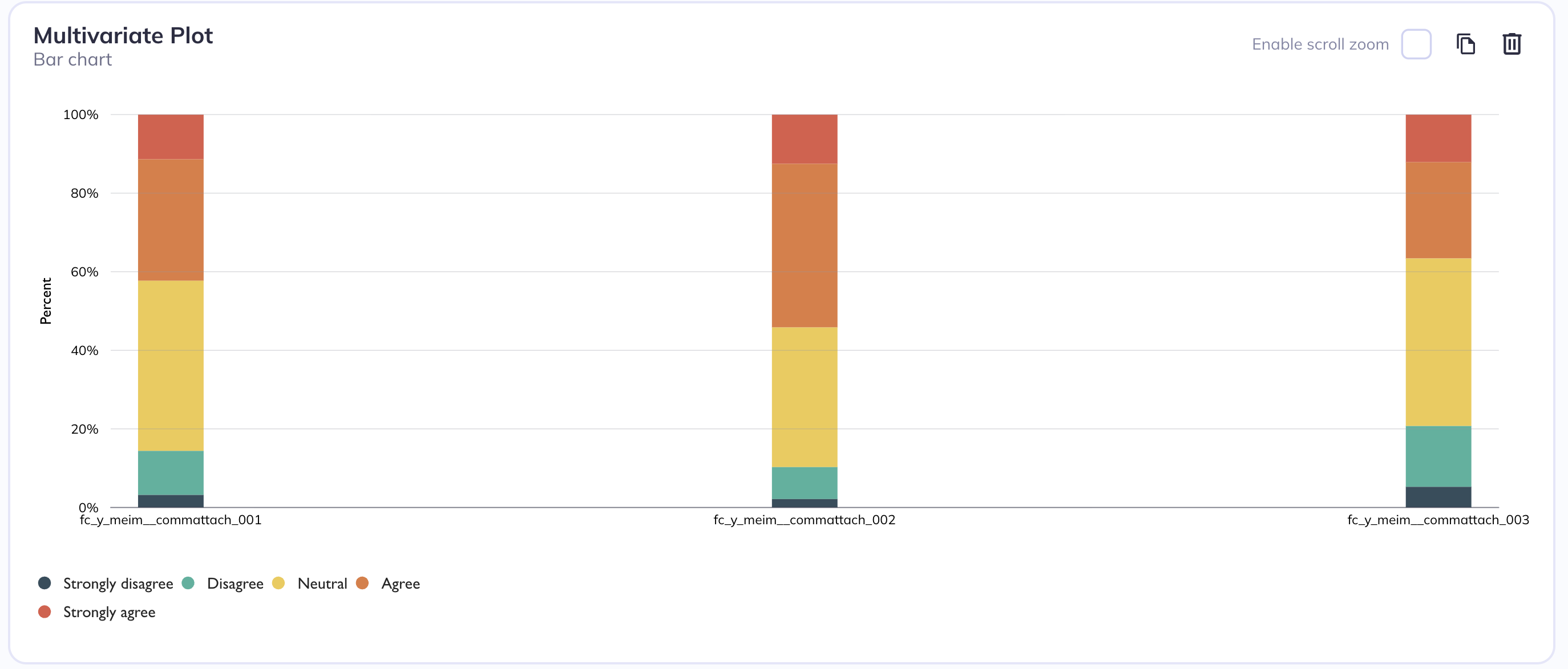
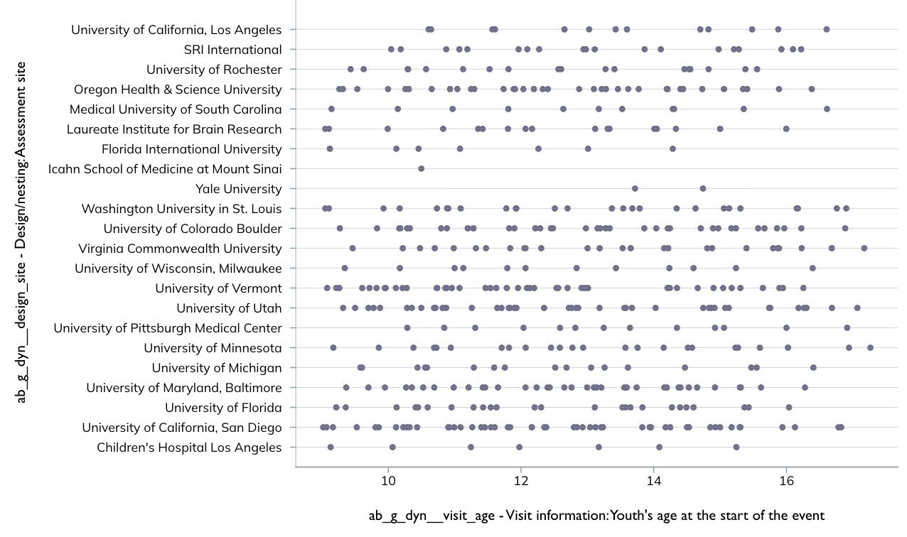
You can choose to create single-variable (univariate) plots or visualize multiple variables (multivariate) together. Generally univariate plots are useful for understanding distribution, spread, and general behavior of that single dataset. You may create a multivariate plot if you want to review the relationships, patterns, or interactions across variables. Multivariate plots are also useful for reviewing multiple variables in quick succesion even if you are not interested in the relationship between them.
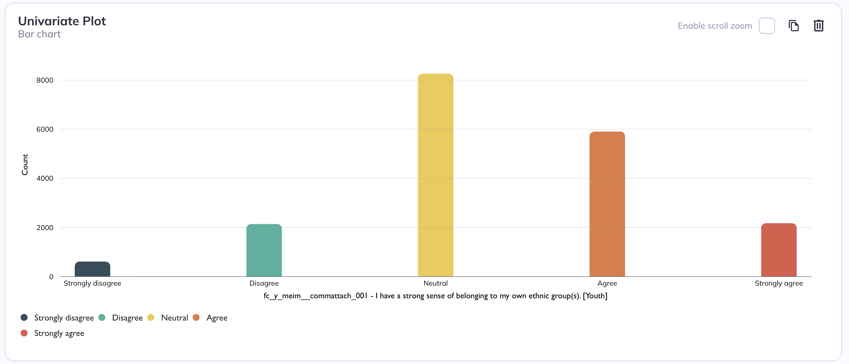
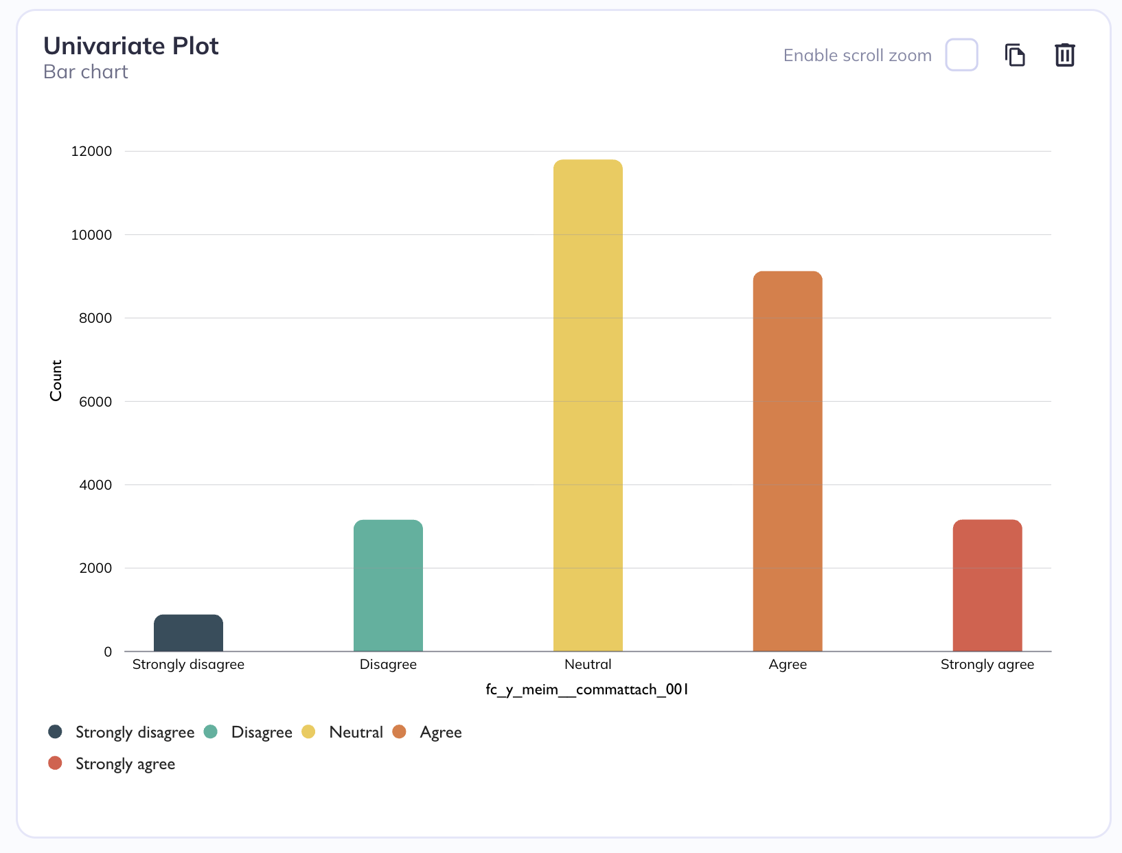
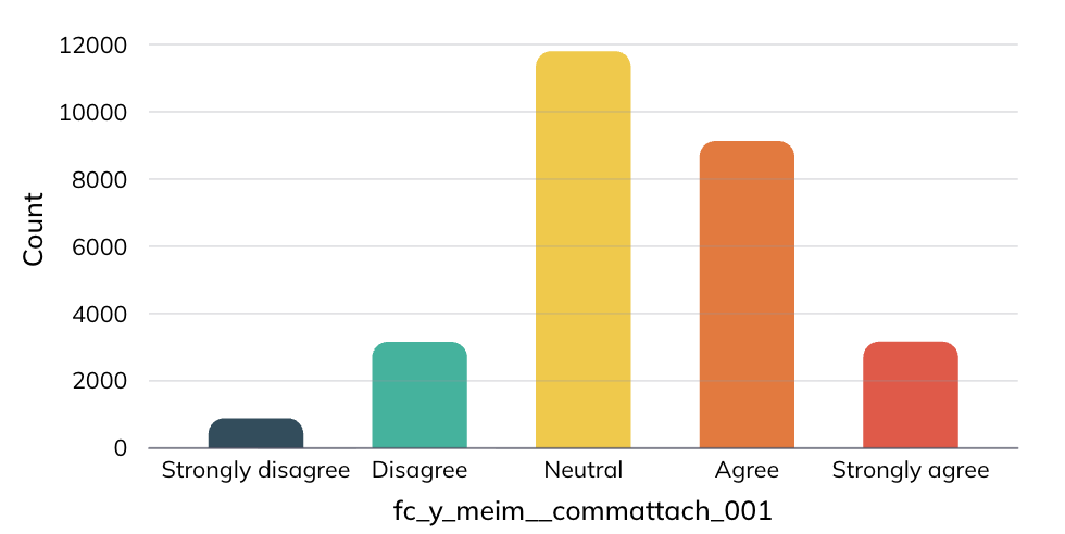
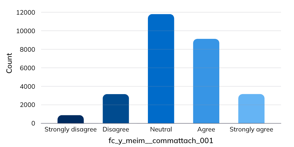
Univariate barchart
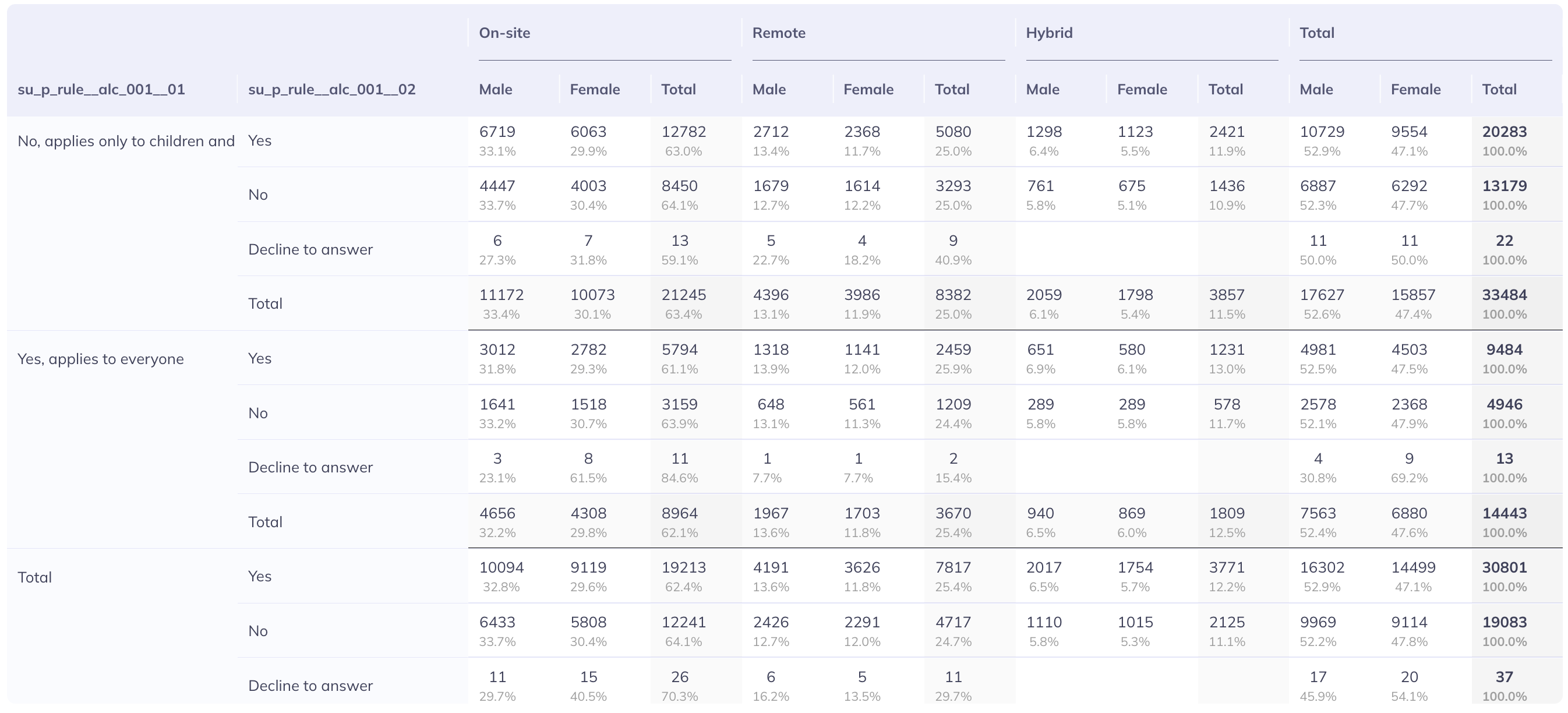
Multivariate stacked barchart
Grouping

For categorical plots (such as bar, dot, or lollipop charts), you can introduce a second dimension by grouping the data according to the categories of another variable. This means that instead of showing only one set of values per category on the x-axis, each category is further divided into subgroups based on the second variable. As a result, the chart displays multiple grouped elements within each main category.
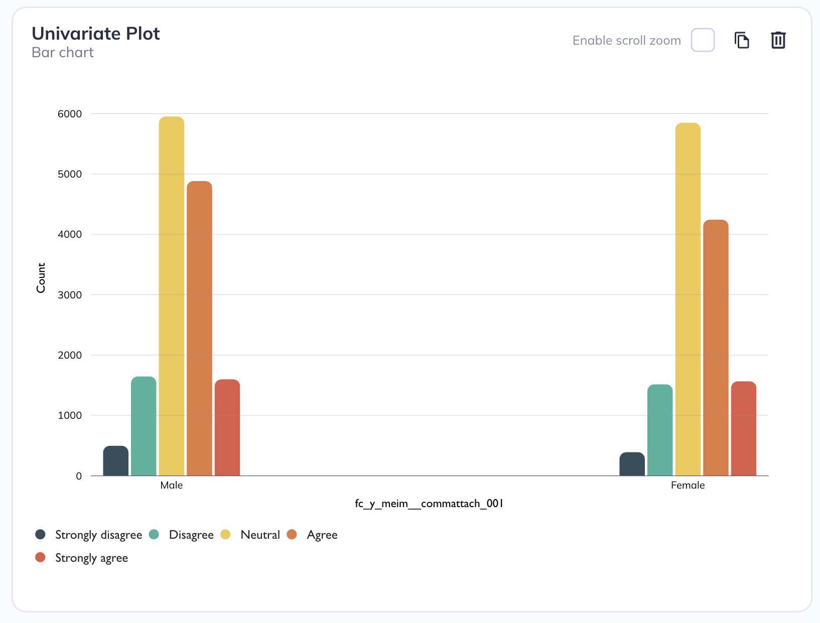
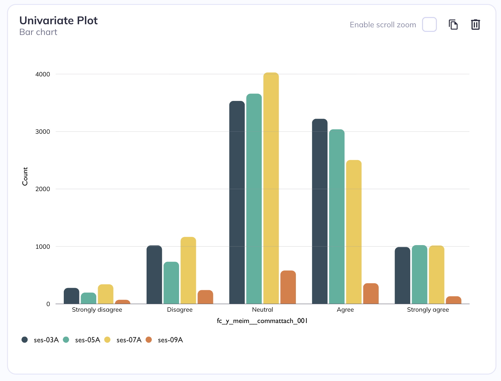
Grouped by sex
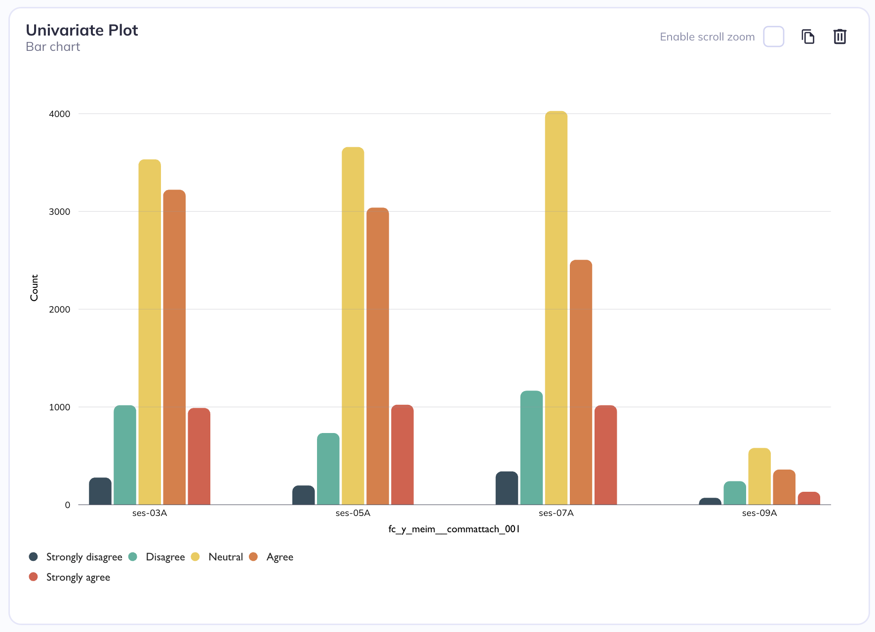
Grouped by session
Coloring

Coloring a bar chart by a second categorical variable means using color to represent an additional layer of grouping within your data. Normally, a bar chart shows one categorical variable on the x-axis (like product type, region, or department) and count or percentage on the y-axis. When you introduce a second categorical variable, you assign different colors to its categories so you can see how that second variable interacts with the first.
Colored (and grouped) by categorical level
Colored by session
Stratification
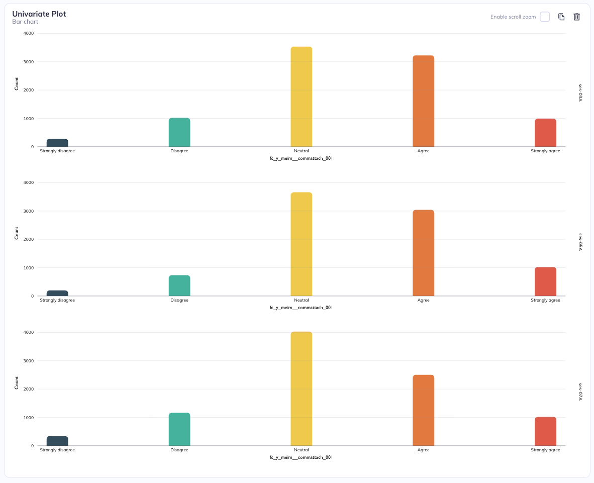
Stratification adds a second categorical variable by splitting the visualization into separate panels rather than overlaying everything in a single plot. In this approach, one categorical variable is used to define the main axes of the plot (for example, categories on the x-axis and values on the y-axis), while a second categorical variable is used to divide the chart into a grid of smaller plots. These panels can be arranged in rows or columns. When stratifying by rows, each category of the second variable gets its own horizontal strip of plots stacked vertically. When stratifying by columns, each category gets its own vertical strip placed side by side. This creates a matrix-like layout of related but separate charts.
Stratification by row
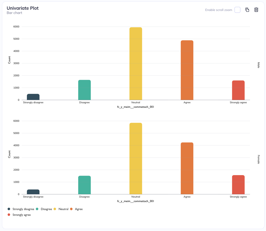
Stratification by sex (row)
Stratification by session (row)
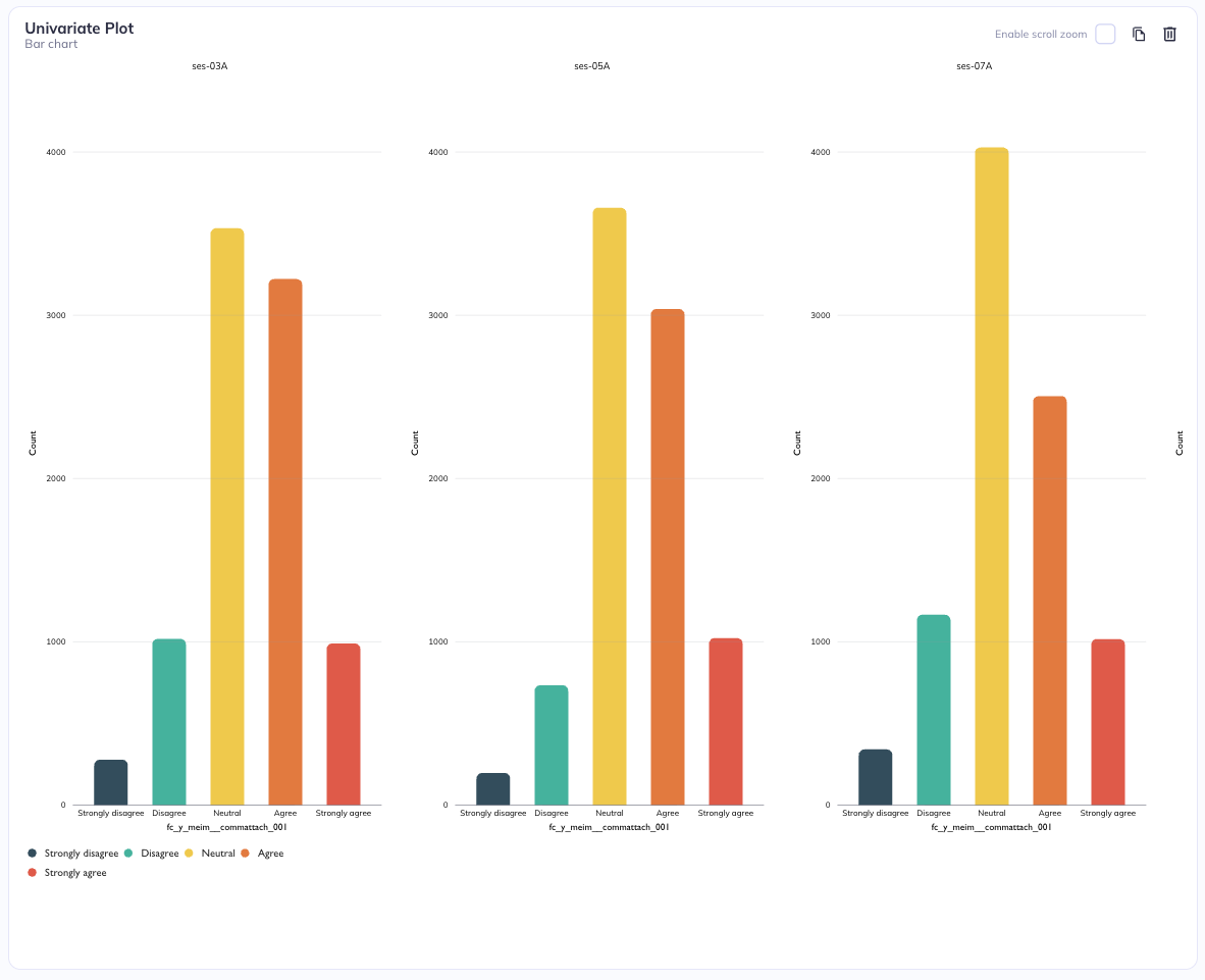
Stratification by column
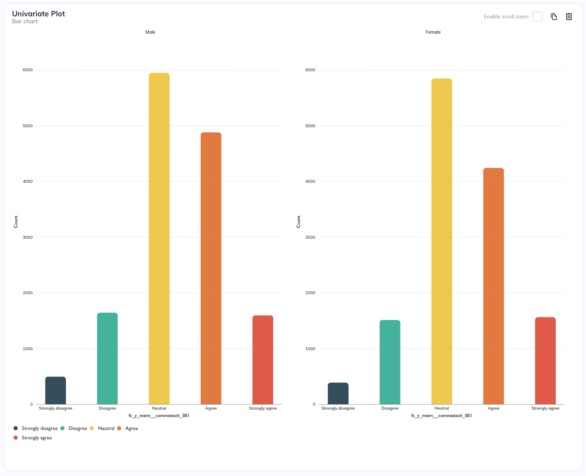
Stratification by sex (Column)
Stratification by session (Column)
You cannot add a stratification level in the same way you can for other plot types but crosstab visualizations allow you to add up to two X-axes and two Y-axes dimensions per table.
Settings
Additional chart settings are available depending on the chart type. For example, you can toggle displays between counts or percentages; flip axes; (a)syncronize axes scales; or toggle the types of analyses being performed. The settings available varies by chart type, to learn more about the chart specific settings visit the visualizations tab.
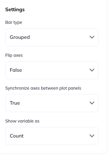
Bar chart settings
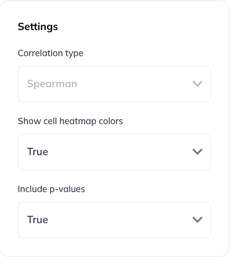
Correlation table settings
Text
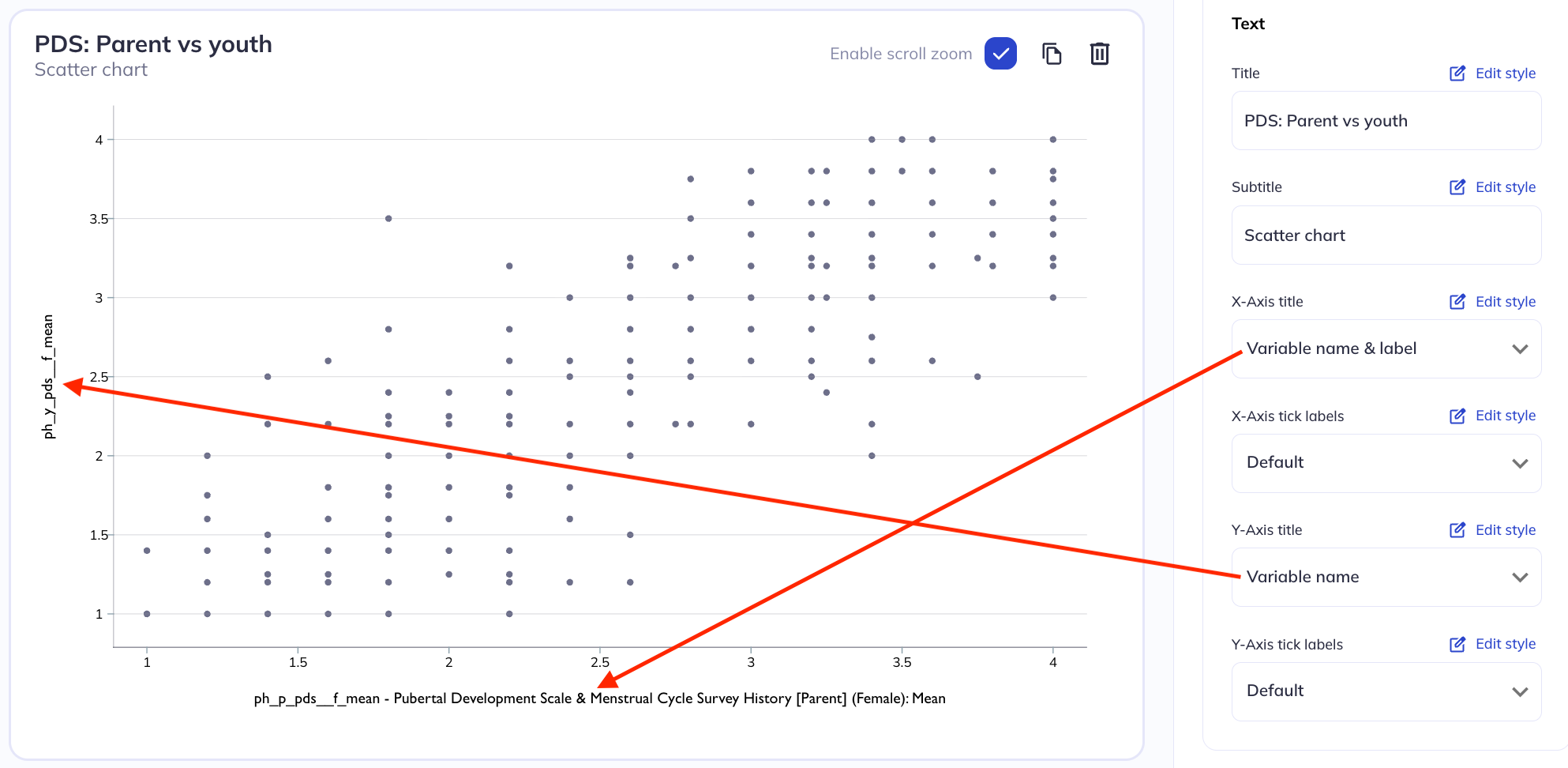
In the text tab you can make modifications to the titles, axes, and labels in your visualization. You are able to define titles & subtitles for charts, choose between using the variable name, label, or custom text for the axes. You are also able to hide axes ticks if not relevant.
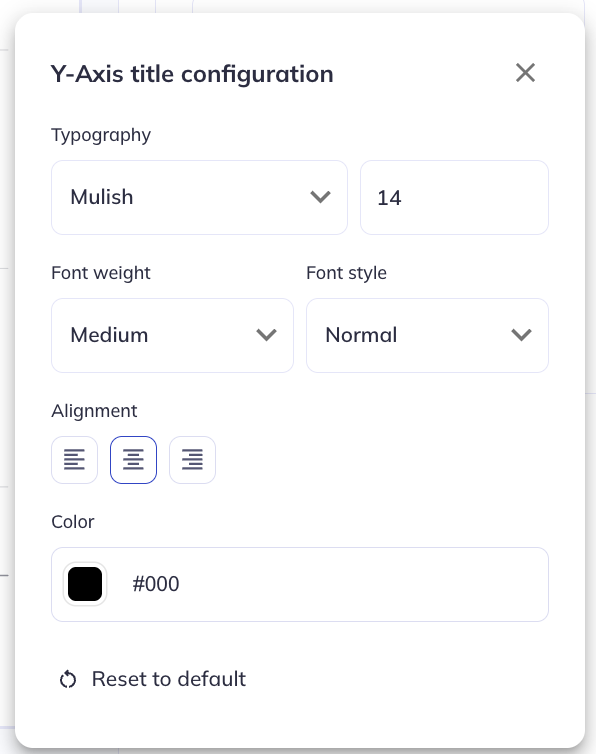
For each text type you can modify its:
- Typeset (Font)
- Size
- Weight & style
- Angle, position, and padding relative to the axes
- Alignment
- Color
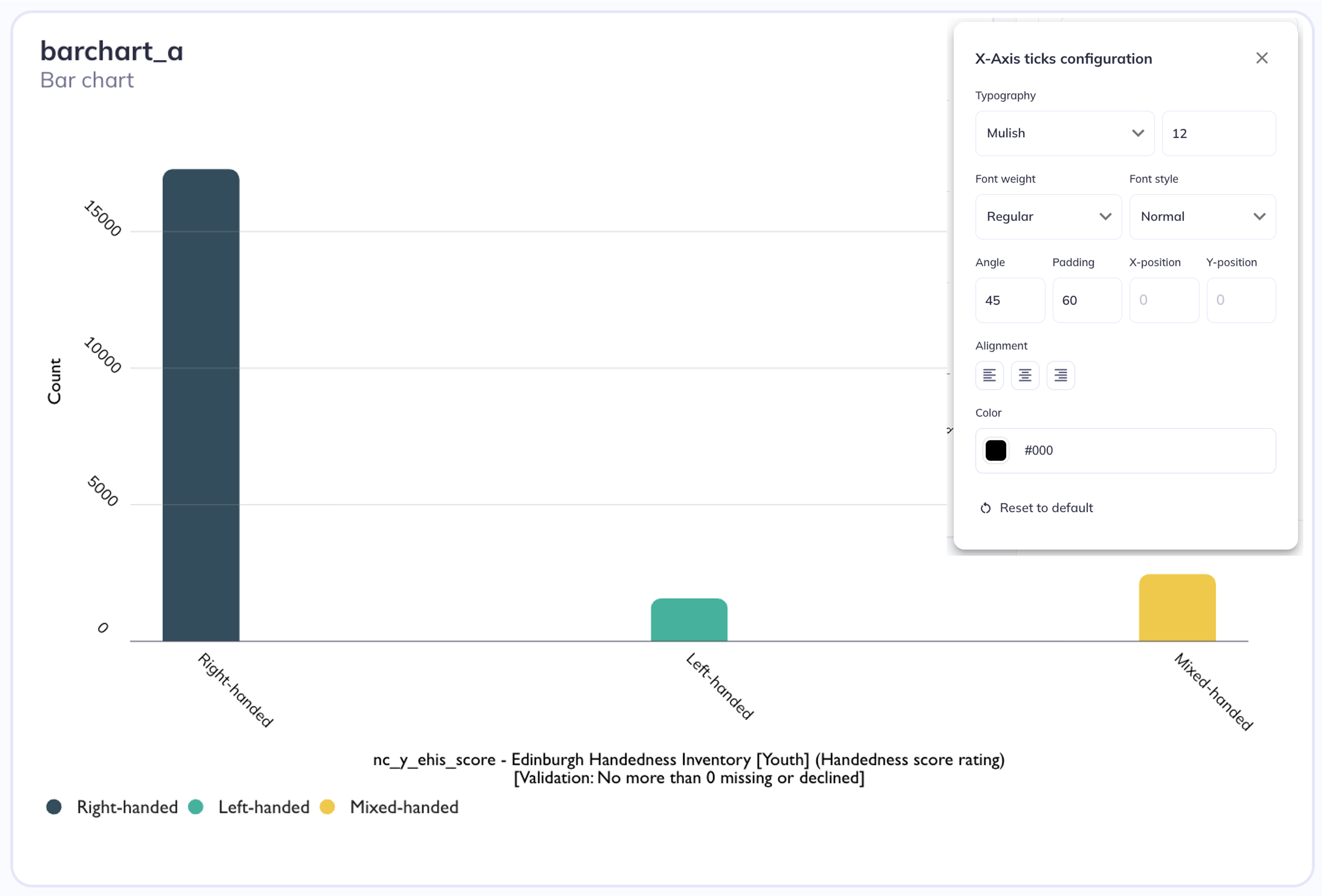
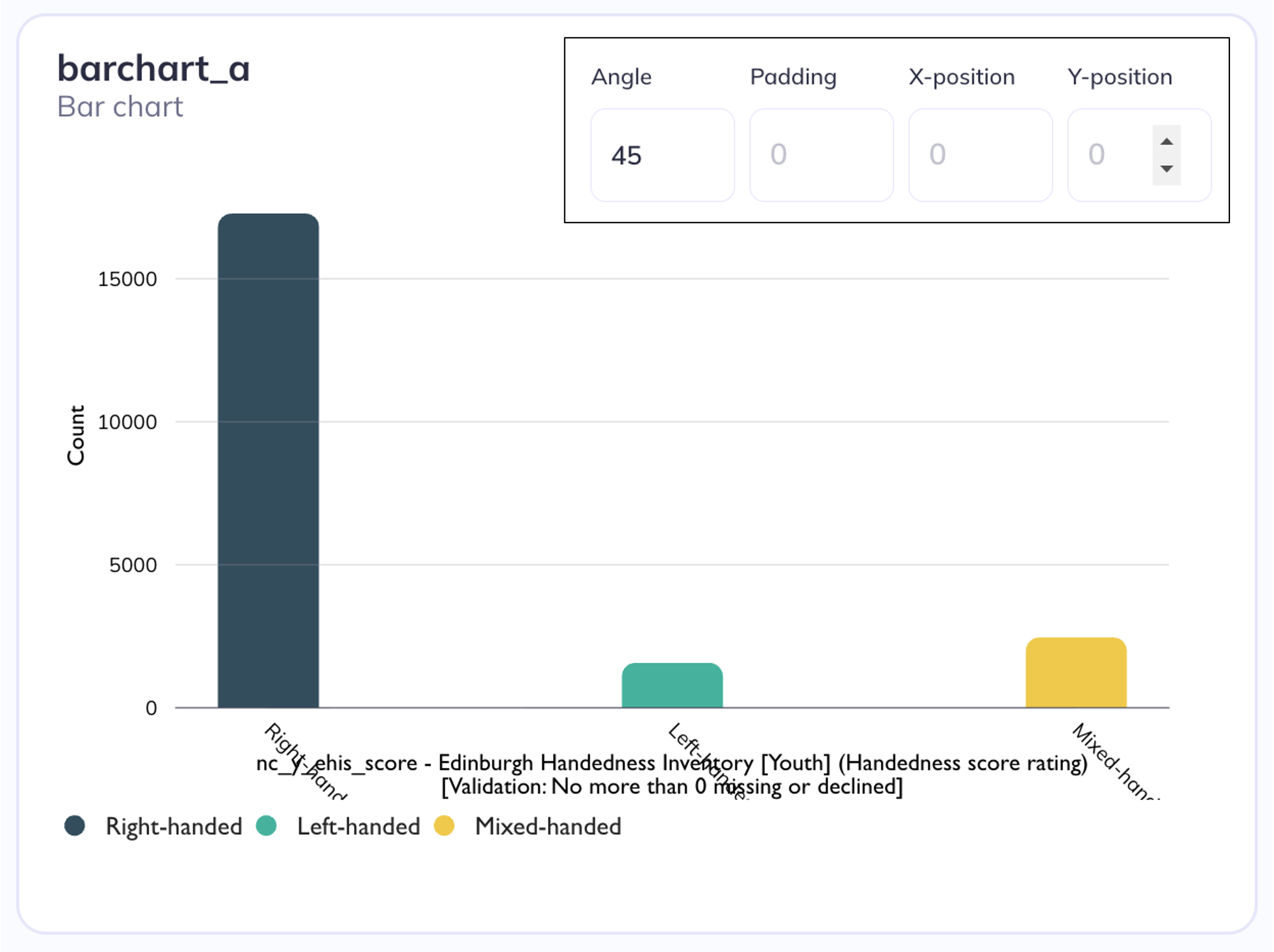
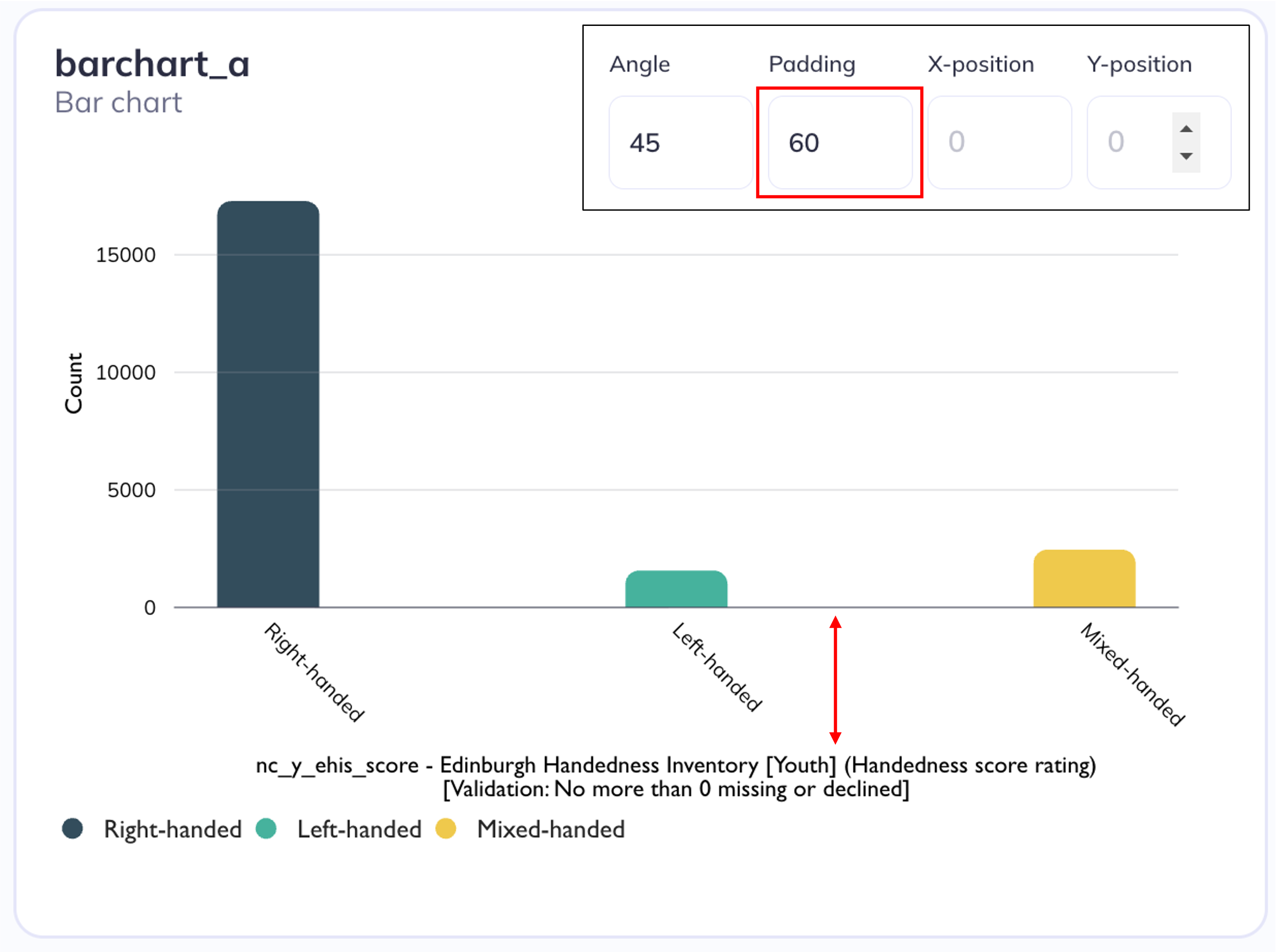
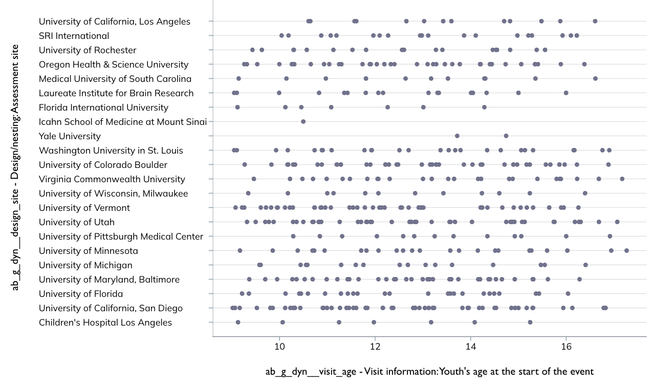
DEAP explorations is built with flexibility in mind so some plots may not look appropriate until the user adjusts the sessions. For example, axes ticks may overlap if the label and/or variable name is long in which case the angle and padding can be adjusted to accommodate the longer text. See below for examples of the original settings and modified settings to accommodate chart differences.
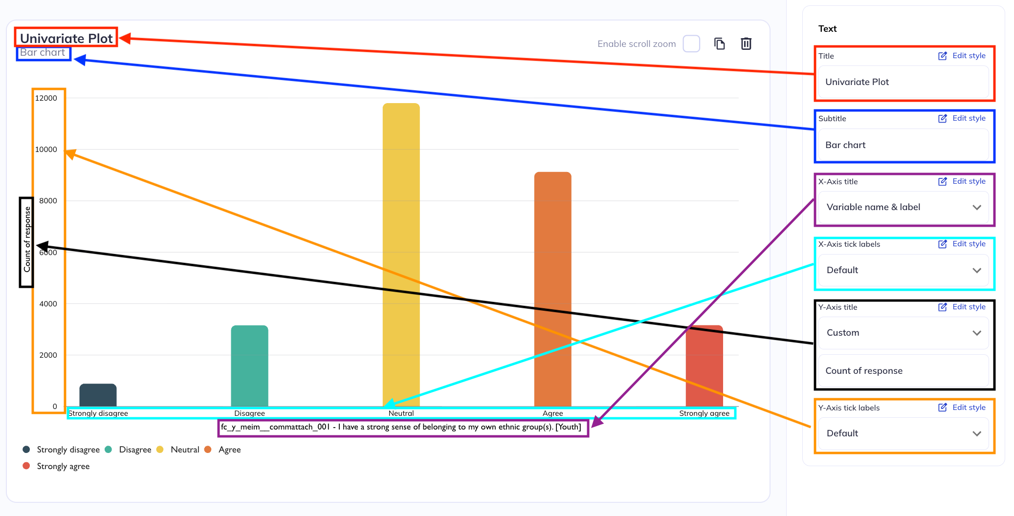
Axes titles
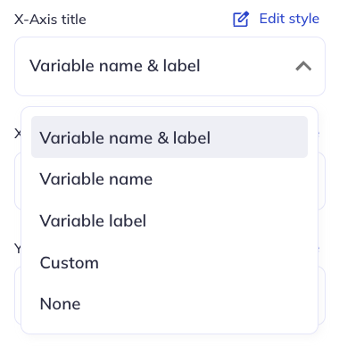
In chart (non-table) visualizations axes will likely be indicative of a variable’s responses (numeric or categorical); a count; or a percentage of responses. For an axes representing a variables responses you can set the axes label to the variable name, variable label, both, or neither (blank). You can also set a custom label if the variable name/label is insufficient or is too long for your charts purpose.
For an axes representing a quantity of responses the default will either be ‘Percent’ or ‘Count’. You can also set the axes label to a custom choice or to be blank.
Ticks
X/Y-Axis tickets are the labels for the values on the axes (counts, percentages, response options, etc). In addition to having the standard text editing options (size, font, etc) you can also adjust the tick’s angle, padding, and position relative to an x/y coordinate grid.
You often may need to adjust the angle, padding, and position of tick markets to make the visual styling cohesive. Learn more about how VictoryCharts handles these elemehts here.
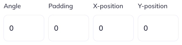
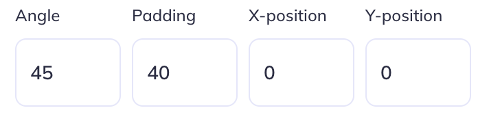
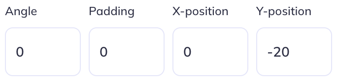
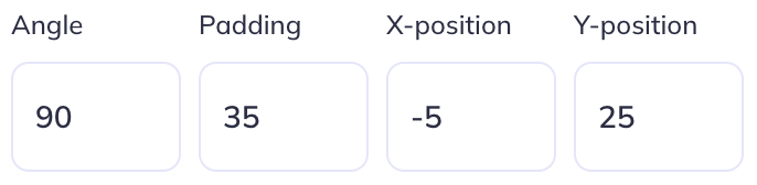
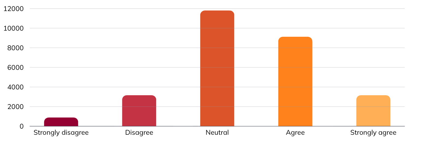
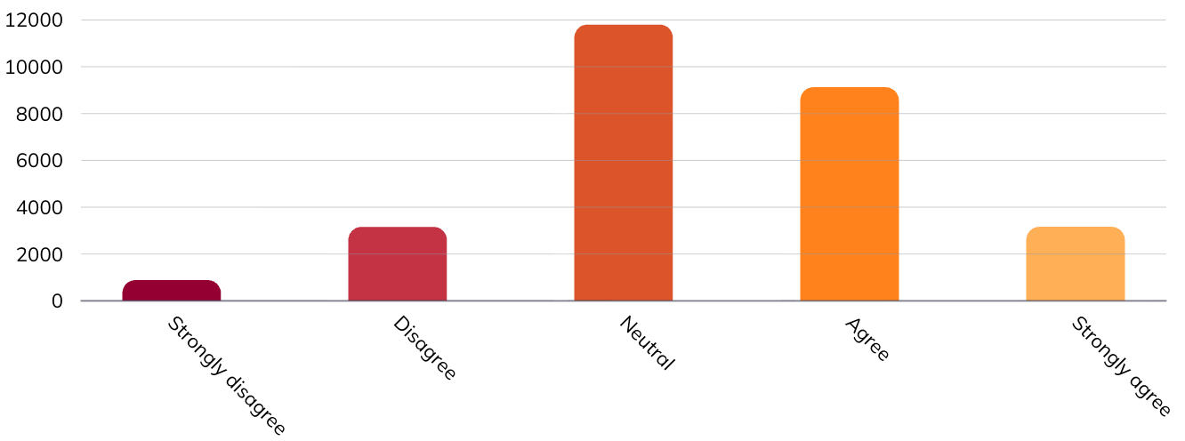
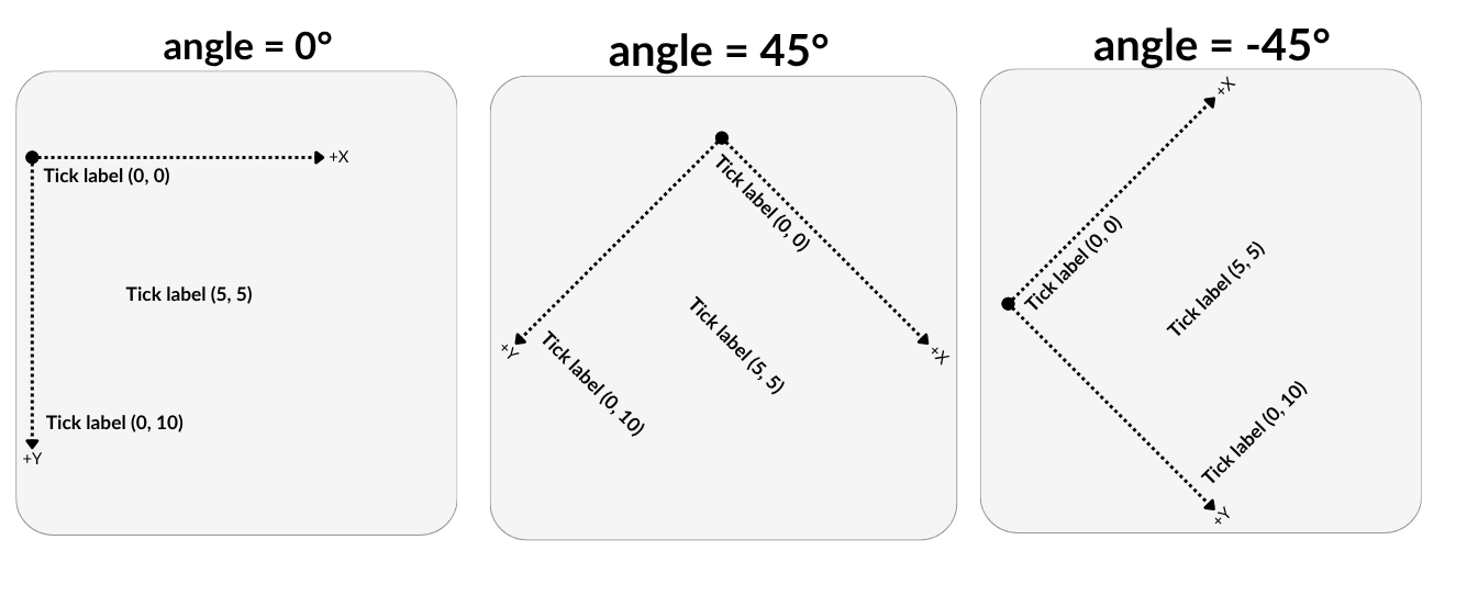
Angle is the position of the tick relative to its self (default reading angle = 0°). You can adjust the angle to make tick marks more legible. Tick marks can be adjusted in either the positive or negative direction. You may need to add ‘Padding’ to ticks to move them away from the axes.

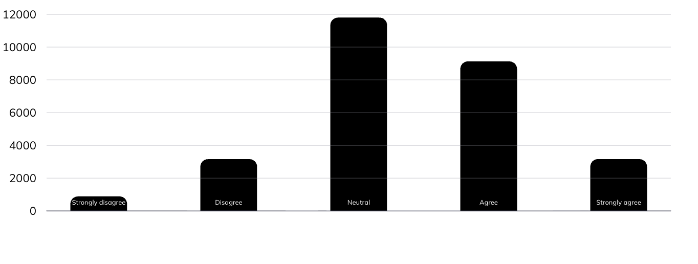
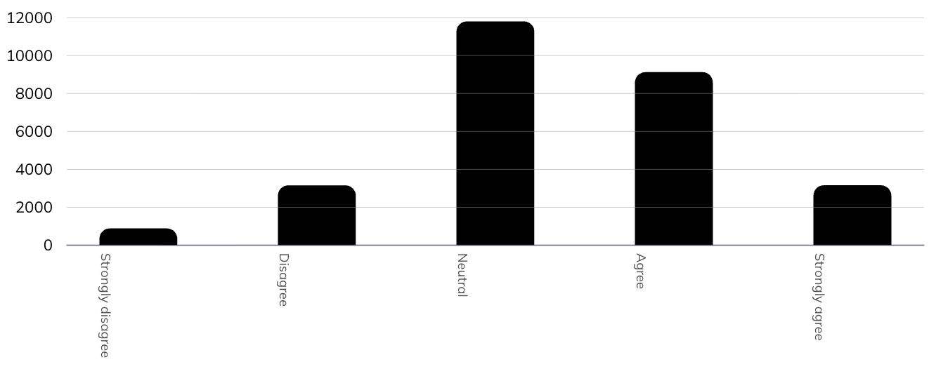
Angle of ticks
X & Y Axes Ticks at 45°
Padding refers to the space between where the ticks are anchored to the axes and the edge of the chart (where the axes label is located). Another way to think about this is to stretch out the x or y axis to move it away or towards the axes title. A positive padding will move the axes away from the axes lable (give the label more space) a negative padding will move the padding towards the label
Position is the location of the tick labels based on a combination of x/y coordinates and dx/dy offsets on the VictoryLabel component. These coordinate positions do not correspond to a cartesian plane (+X Right; + Y Up; -X Left; -Y Down) but instead are set using scalable vector graphic (SVG) coordinate positioning where the origin (0, 0) is the top-left of the canvas and y increases downward.
In SVGs, dx and dy are offsets from the label’s current position. dy={30} moves the label 30 pixels downward from where it would otherwise sit, while dy={-30} moves it 30 pixels upward. Similarly, dx={30} moves it 30 pixels to the right and dx={-30} to the left. When an angle is applied to a label, these directions rotate with the text; so “down” in dy terms no longer means down on screen, but down relative to the label’s own rotated orientation.
See above for examples of how angle & X/Y position interact.
Alignment changes where the text is anchored to. By default (when axes are not flipped) the x-axis will center align and the y-axis will right align. The anchor point of your text will also impact the X/Y positioning of the text if you adjust that. Learn more about label alignment here.
Left align
Center align
Right align
Colors
For numeric type charts (scatter, line, etc) and tables (count, crosstab, etc) users can define the background color for a chart. For categorical charts (bar, lollipop, etc) the background and bar elements can be defined. For category colors you can manually define each column or use a pre-defined pallette as well as define the column outline color. When modifying the background color you will also likely need to modify the text elements colors.
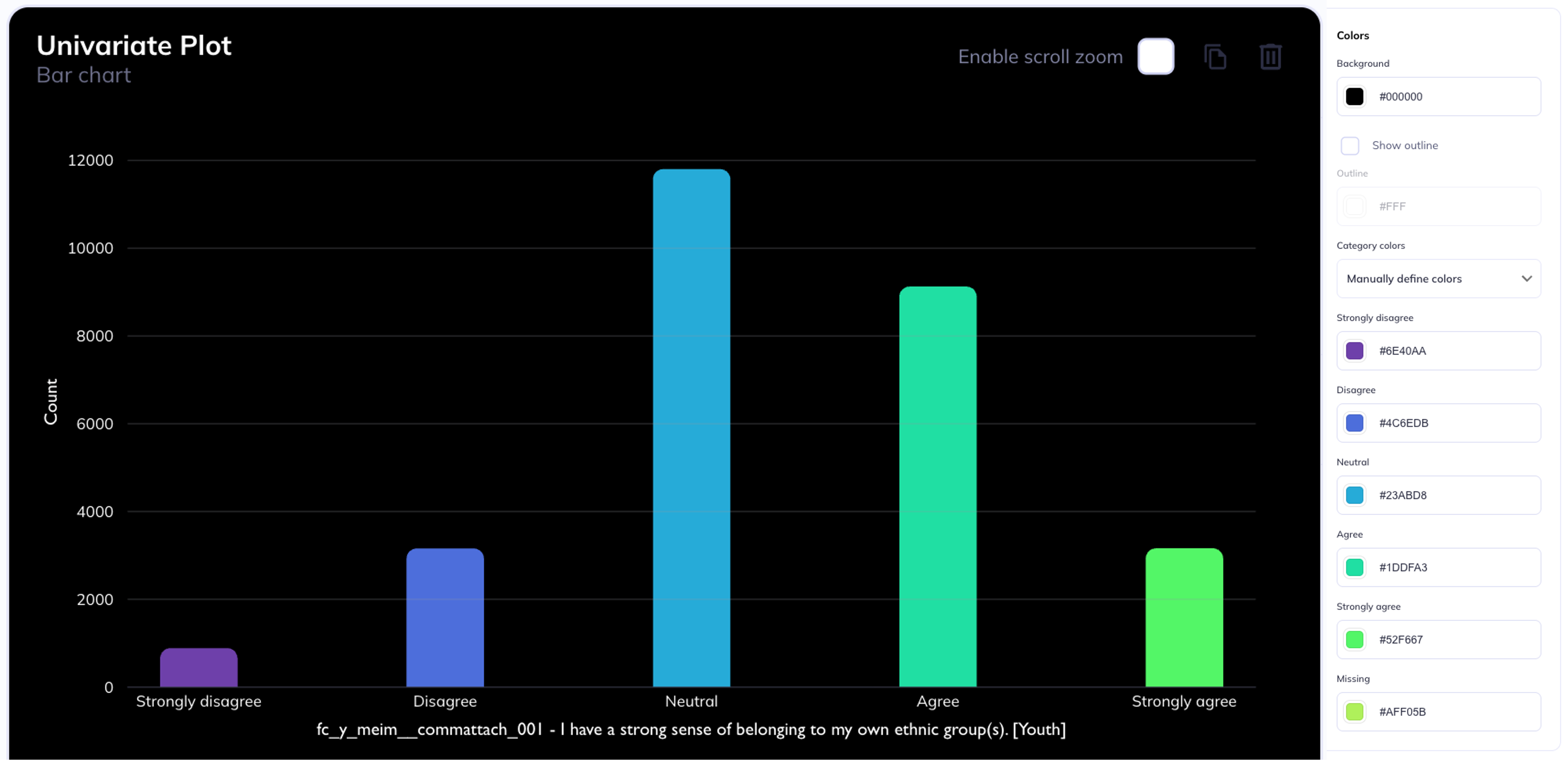
All color elements can be defined using hexidecimal color codes
Data viewer
The data viewer allows you to see your dataset in a tabulated format (as if you were viewing it as a csv). The data viewer is helpful for tasks such as identifying outlier values, locating participant_ids who meet a criteria, or viewing individual level responses to inform longitudinal analyses.
You can filter who is shown in the data viewer page by clicking . Columns in the data viewer can be hidden/added using the icon.